Blanca
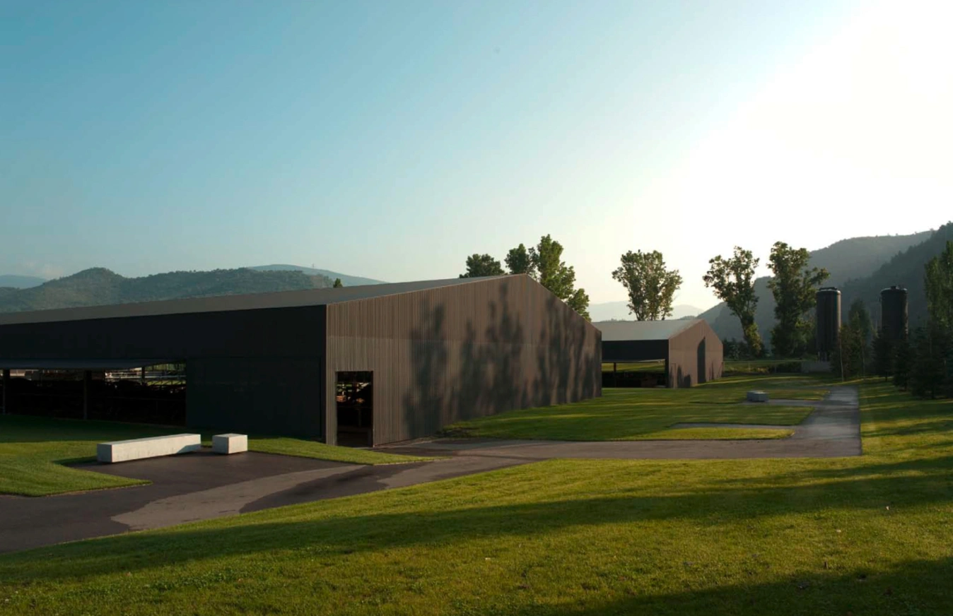
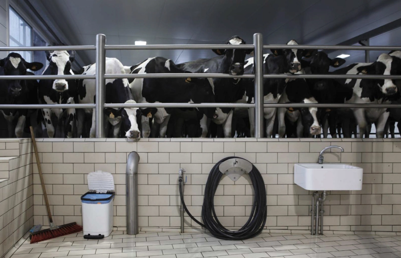
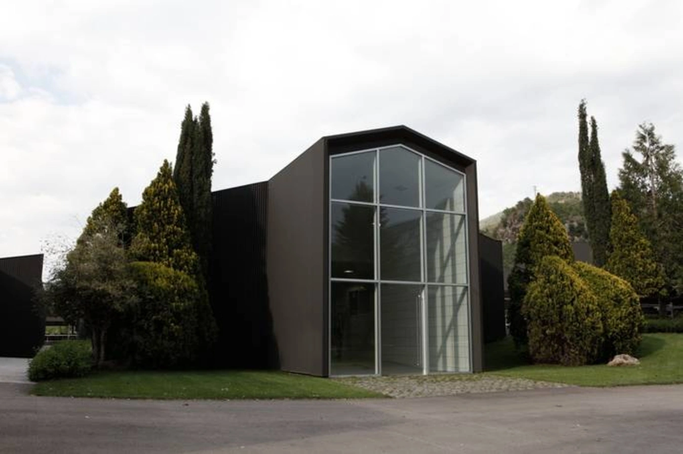
BLANCA was born from a clear vision: to transform a leading livestock farm into a brand capable of conveying excellence, innovation, and respect for the land.
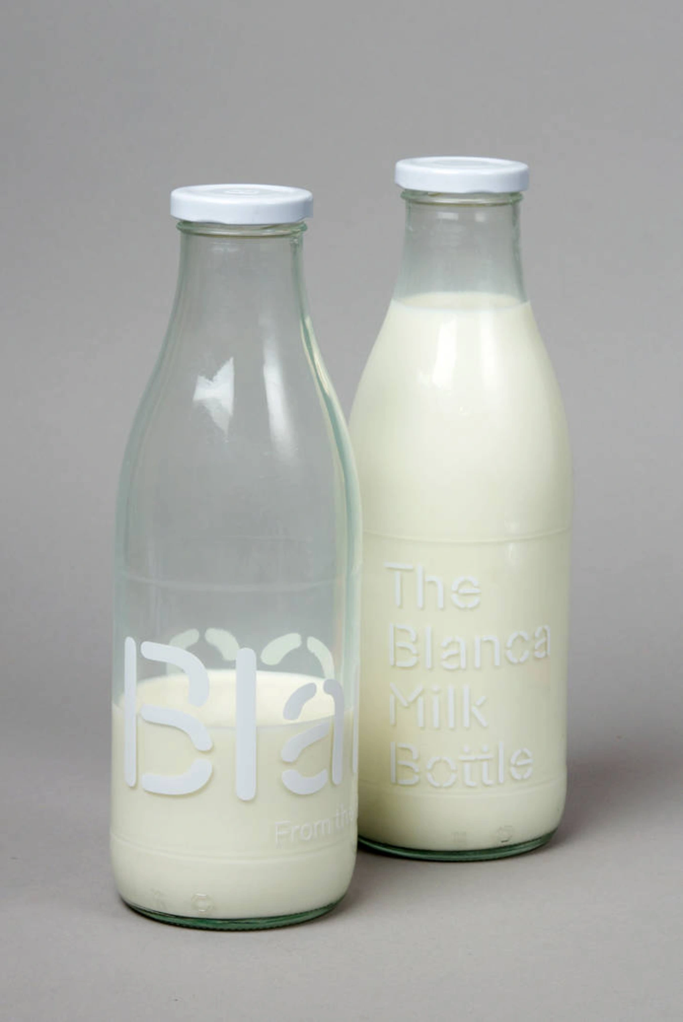
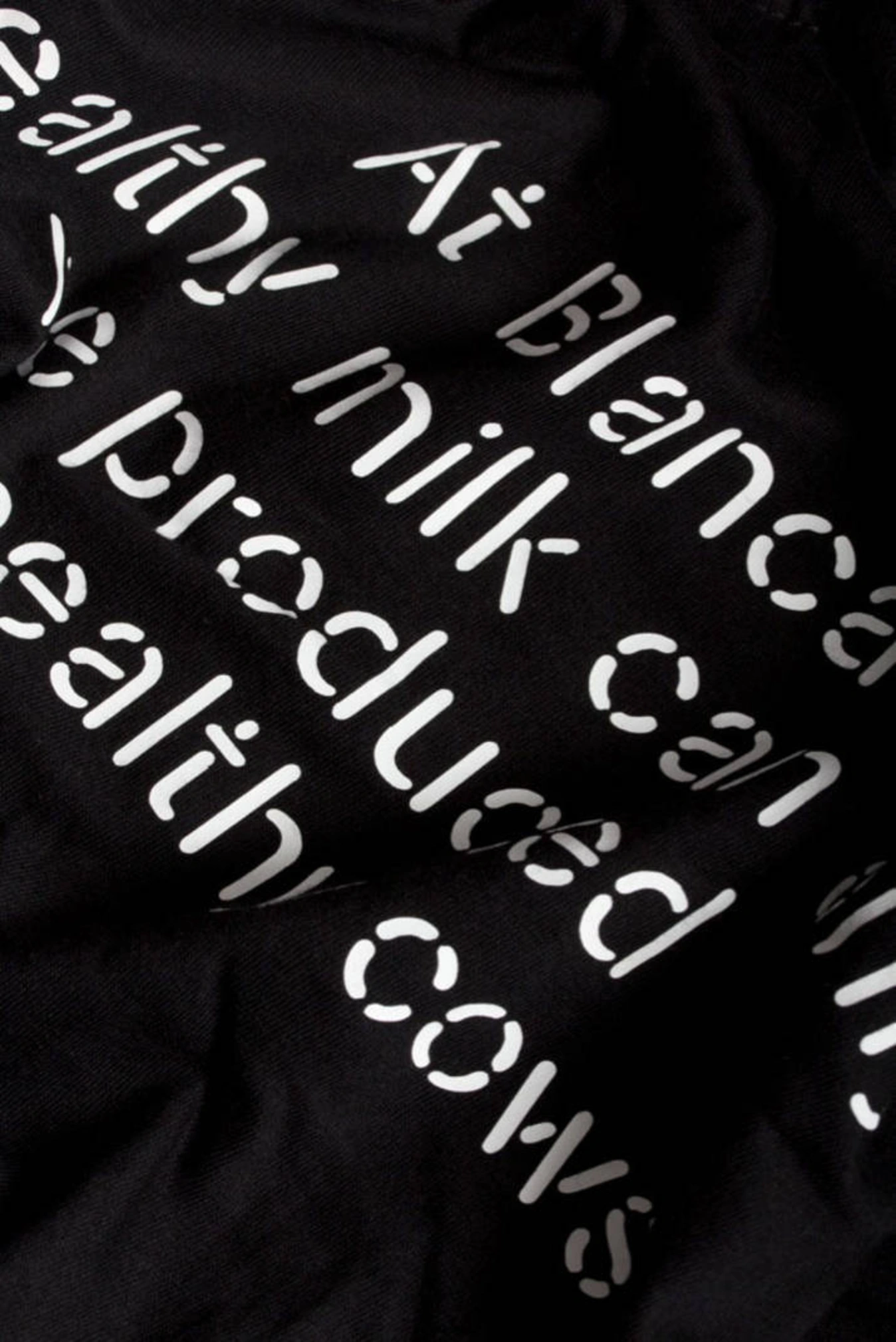
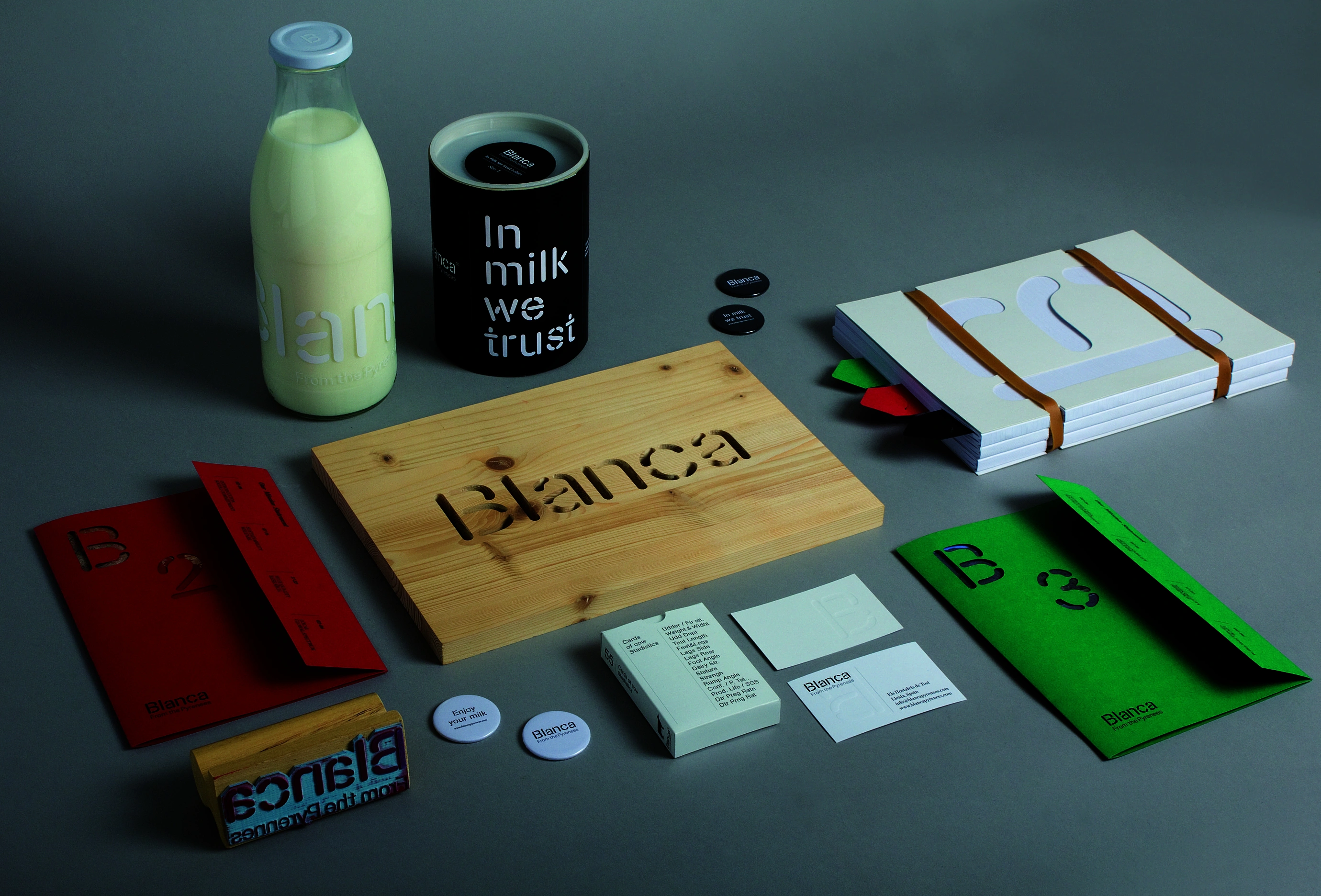
Our work encompassed the comprehensive development of the brand identity, from the creation of the name to the design of all its applications, building a coherent visual universe that reflects the company’s values and its close connection with the Pyrenees.
The name BLANCA arises from the very essence of the product. It evokes the purity of milk, the snow of the mountains, and the transparency of a production process meticulously managed down to the last detail.

It is a simple, memorable name, rich in meaning, capable of connecting both with the geographical origin and with the exceptional quality that defines the brand.
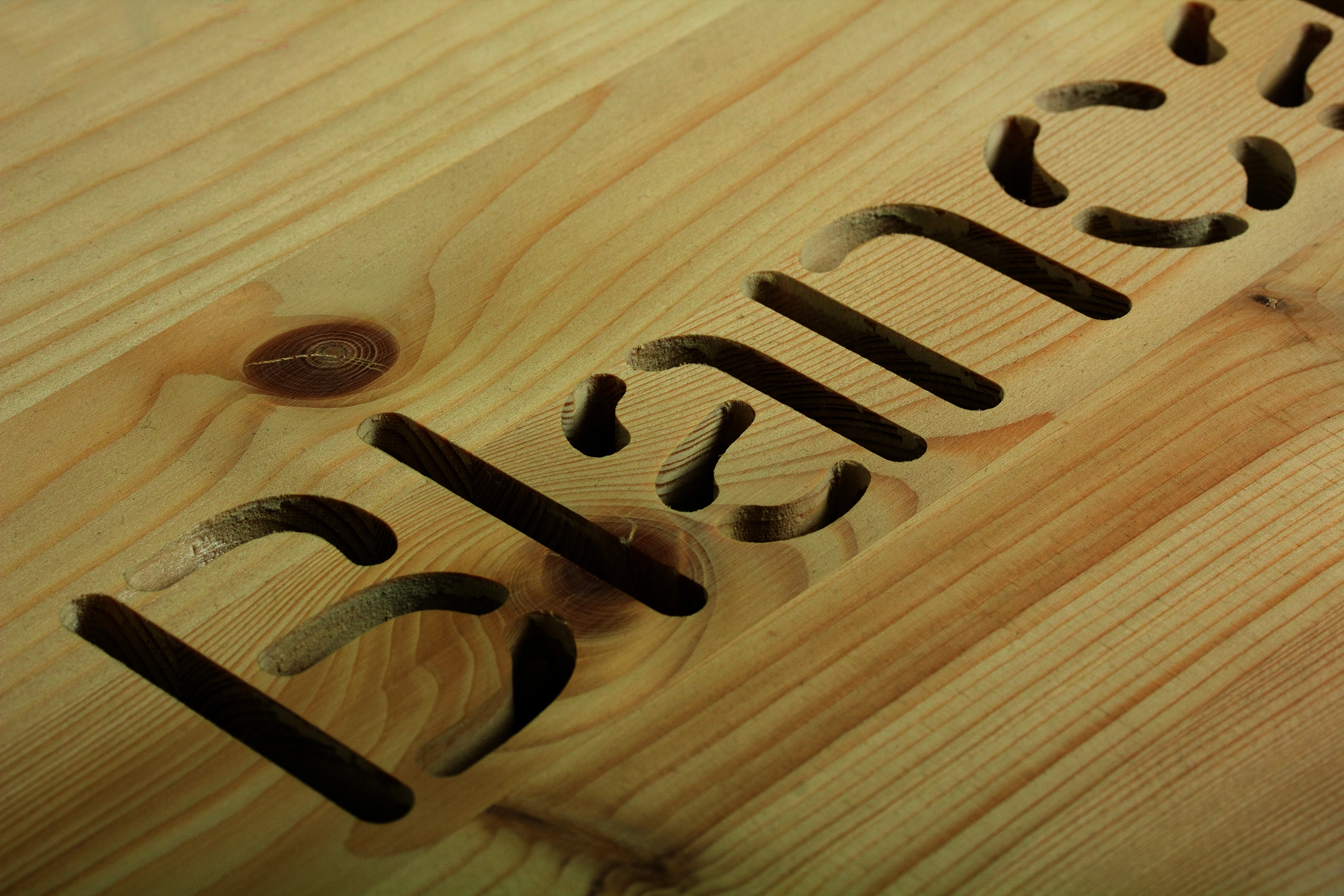
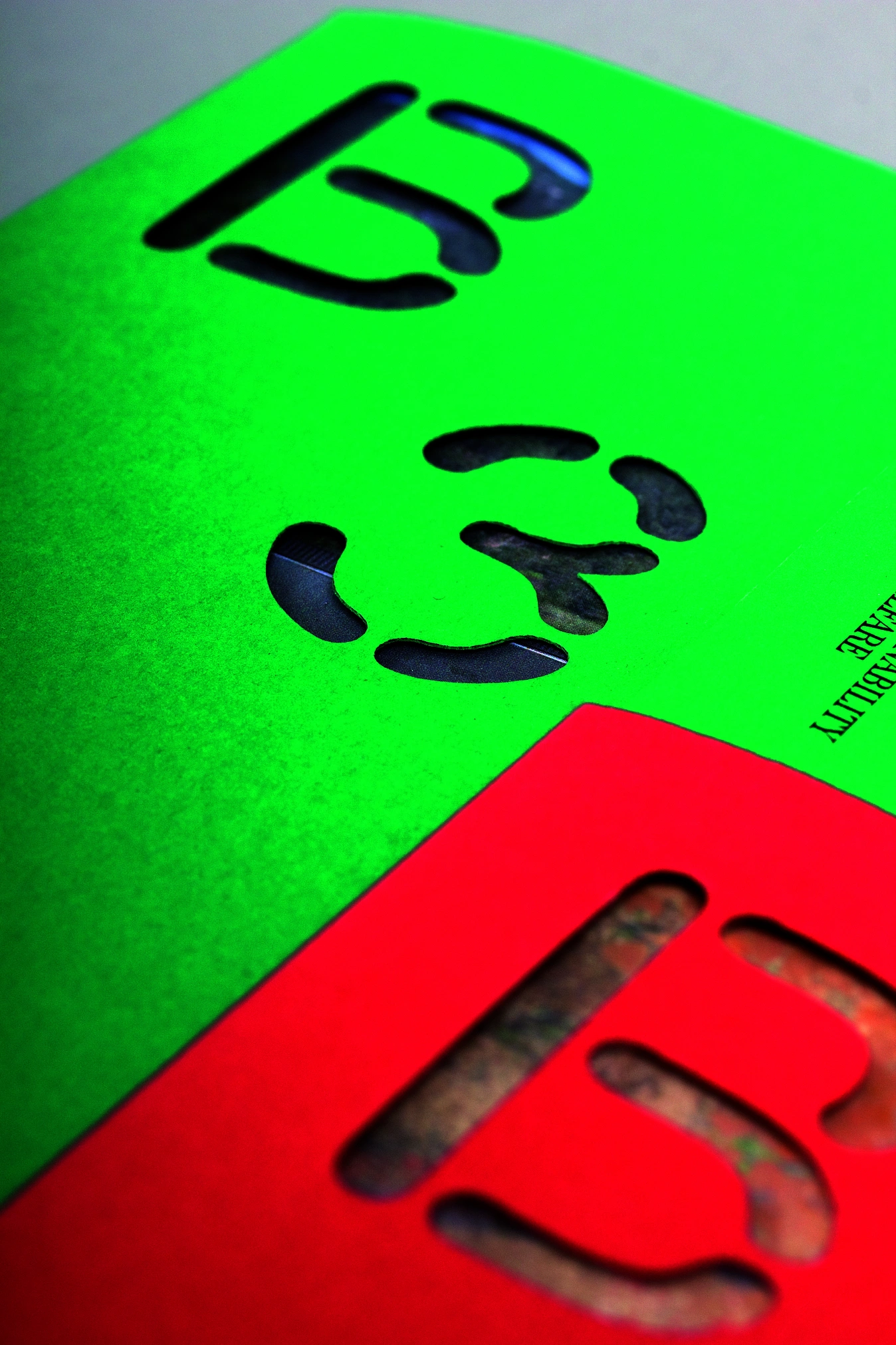
Building on this concept, we developed a distinctive and contemporary visual identity. The logo is constructed using rounded, open geometric shapes, creating a unique typeface that lends personality and recognisability.
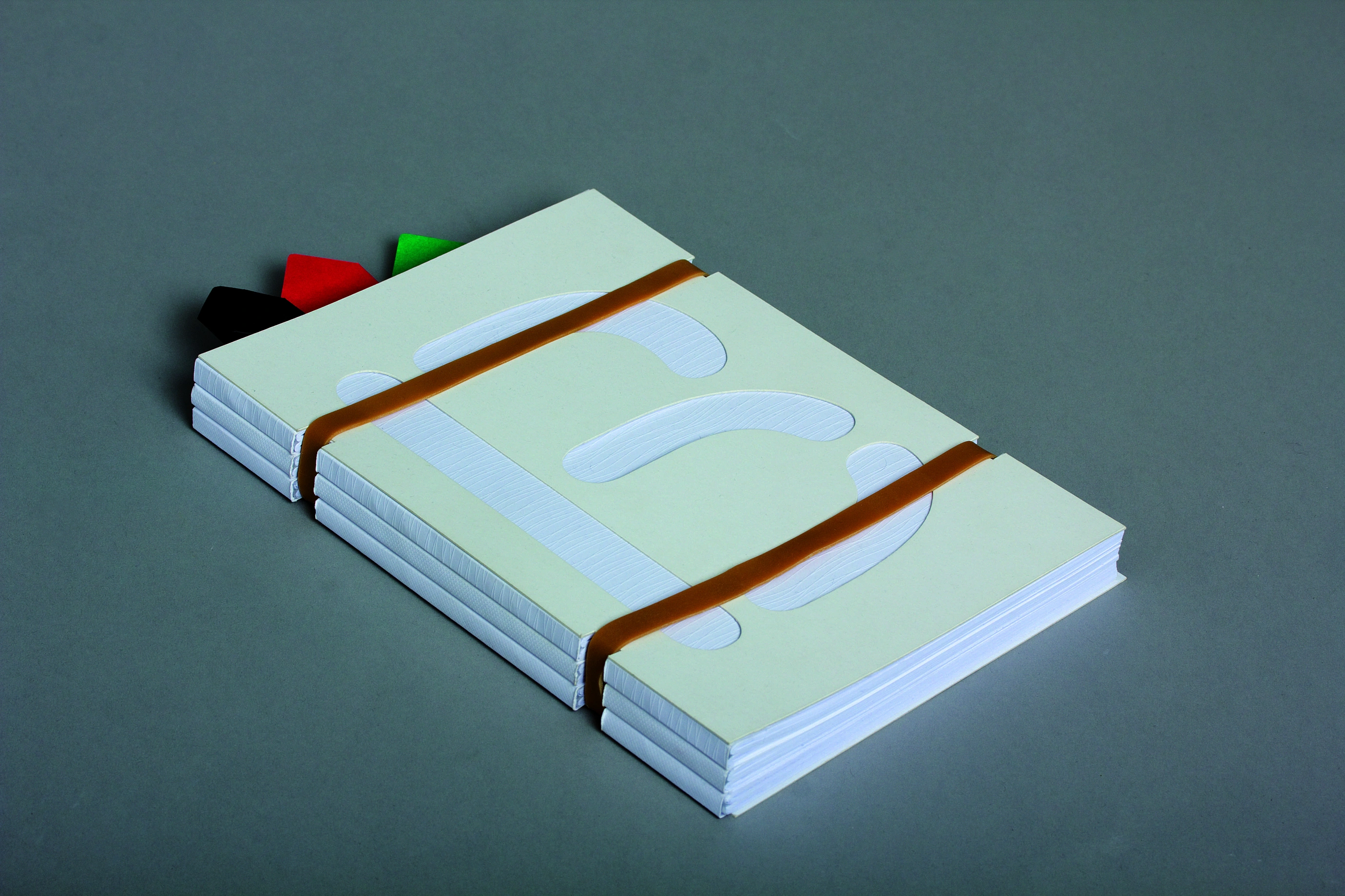
Its design conveys approachability and modernity, moving away from the sector’s traditional conventions to position BLANCA as an innovative and distinctive brand. The graphic system is complemented by minimalist iconography inspired by essential elements of its world, such as a drop of milk, reinforcing the idea of purity and origin.