Esnaf
ESNAF reinterprets Istanbul’s culinary tradition from a contemporary perspective. Honest cuisine, prepared with fresh produce and time-honoured recipes, which finds a new context in Barcelona without losing its essence.
ESNAF reinterprets Istanbul’s culinary tradition from a contemporary perspective. Honest cuisine, prepared with fresh produce and time-honoured recipes, which finds a new context in Barcelona without losing its essence.
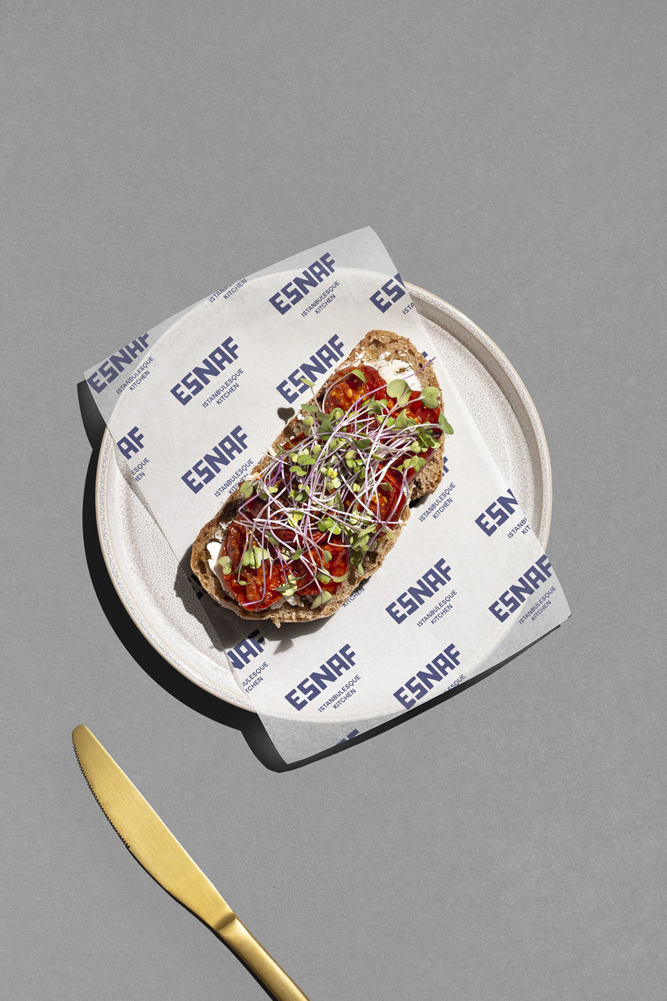
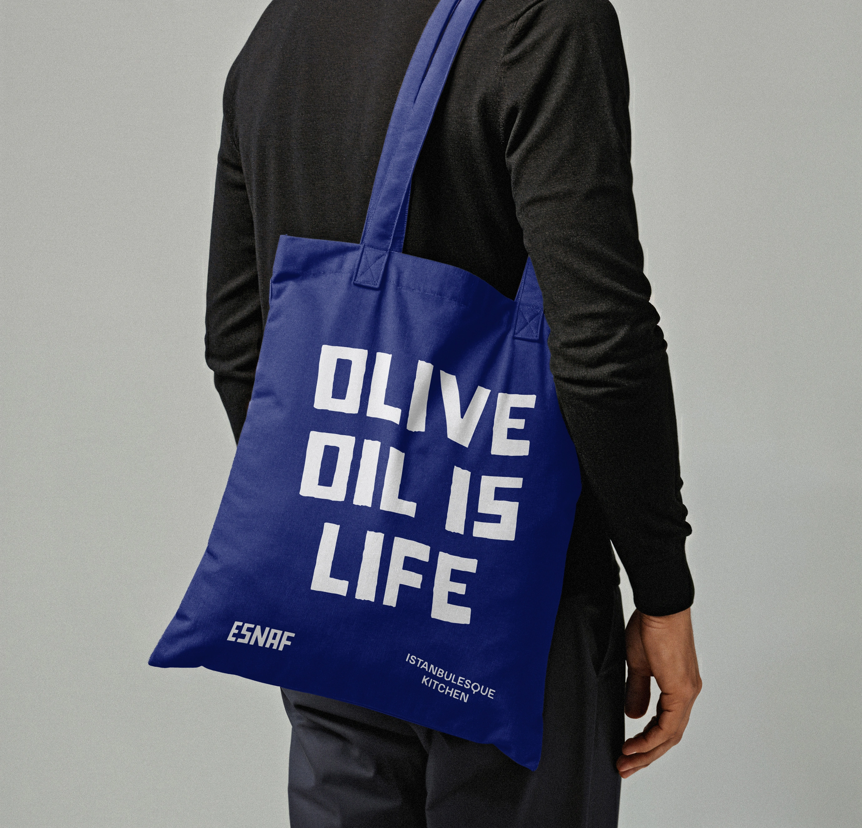
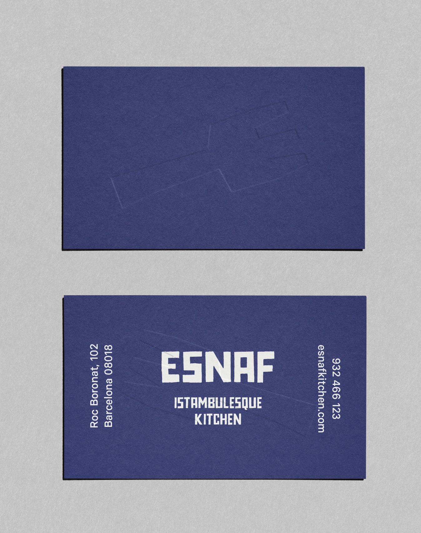
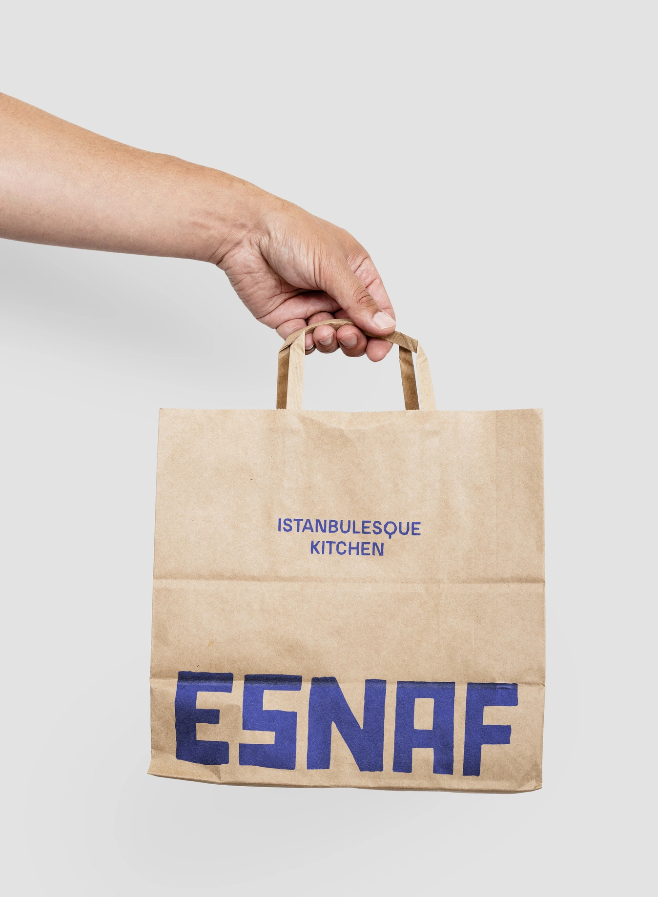
At Lo Siento, we developed the complete brand identity, creating a visual system capable of expressing that balance between tradition and modernity.
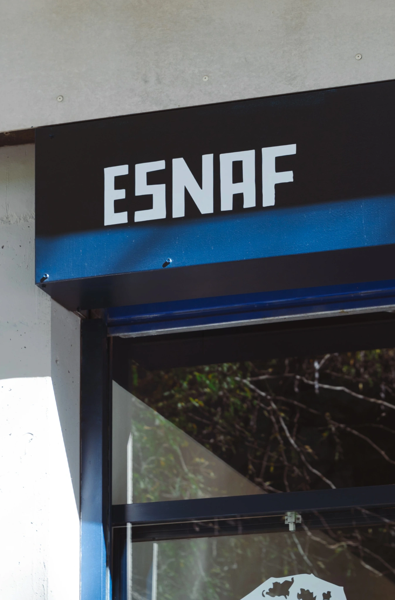
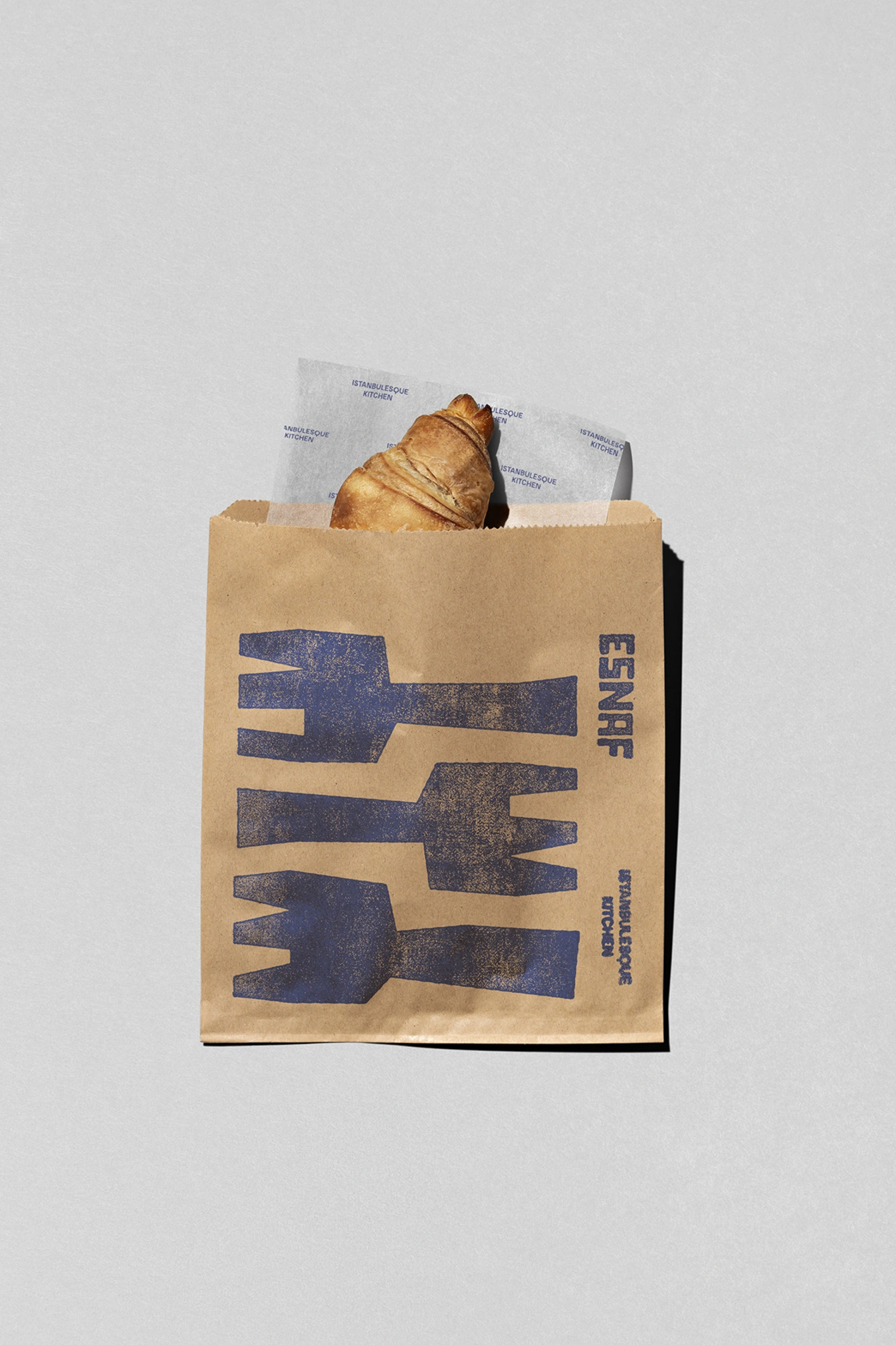
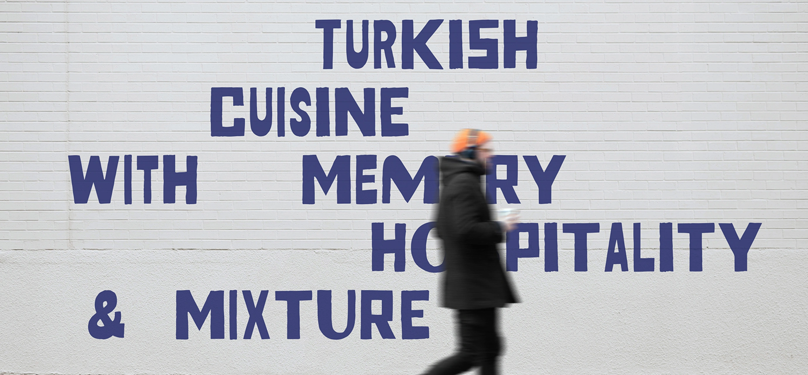
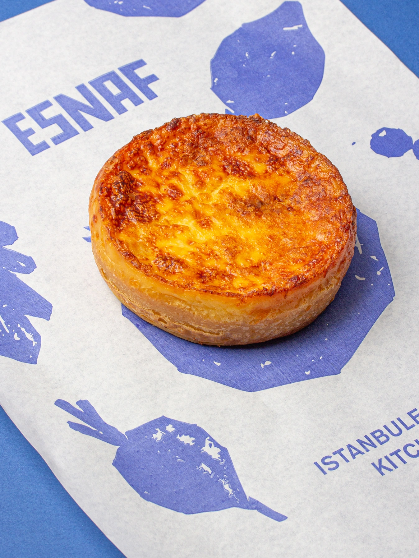
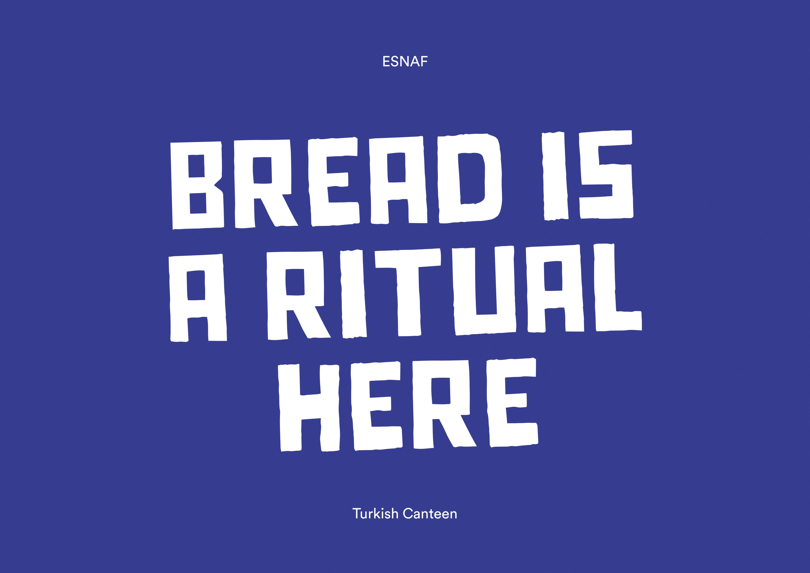
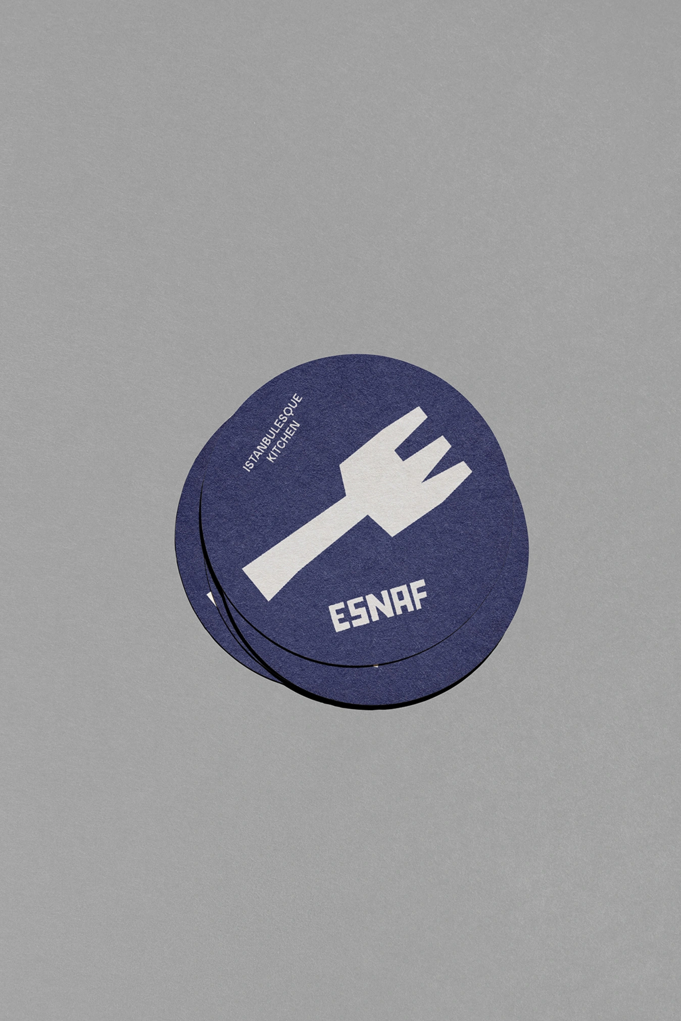
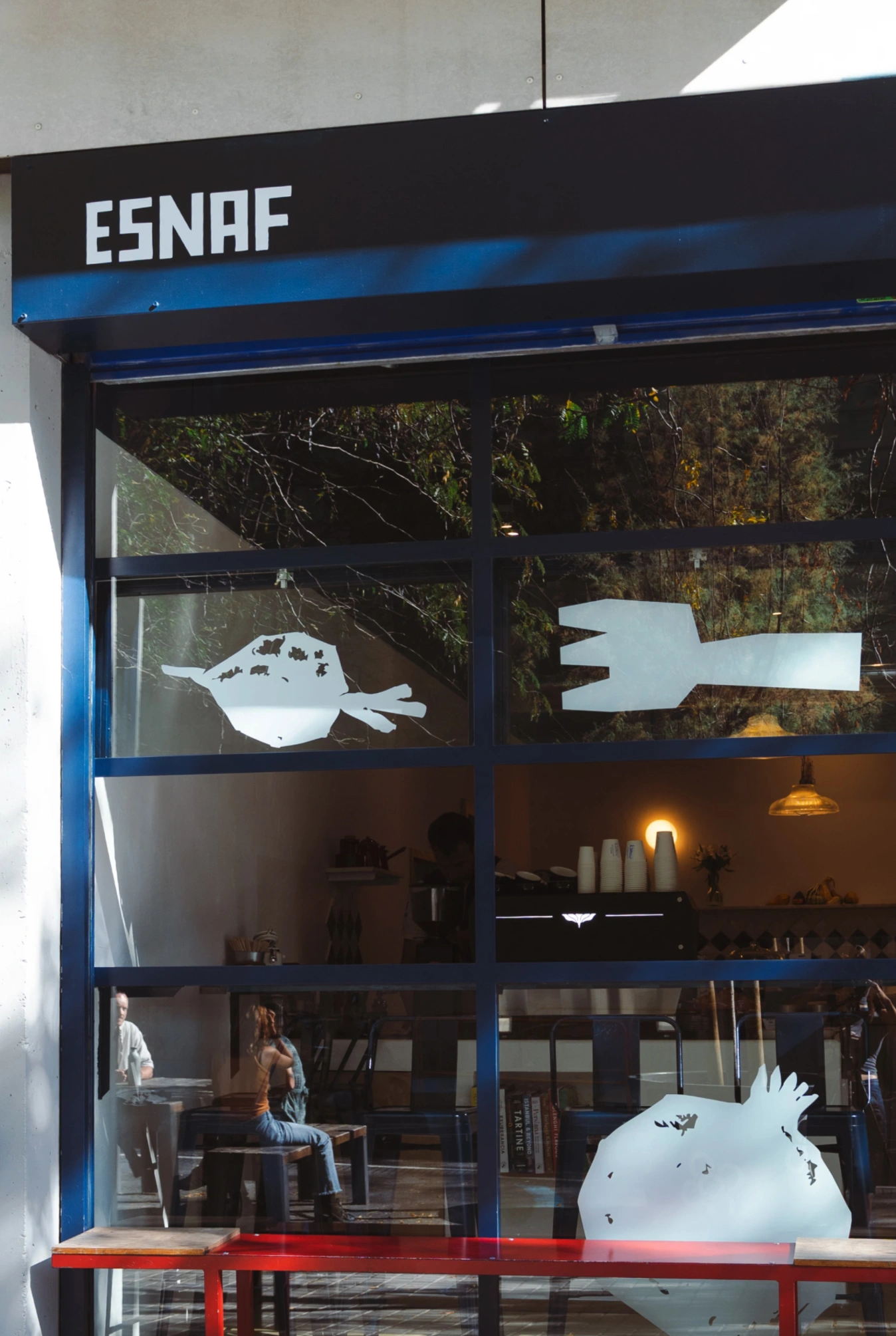
The identity is built around a typeface with great personality – compact and bold – inspired by traditional street signage and the urban character of traditional shops. A single deep blue dominates the visual universe, becoming a highly recognisable colour that brings strength, consistency and presence to all applications.
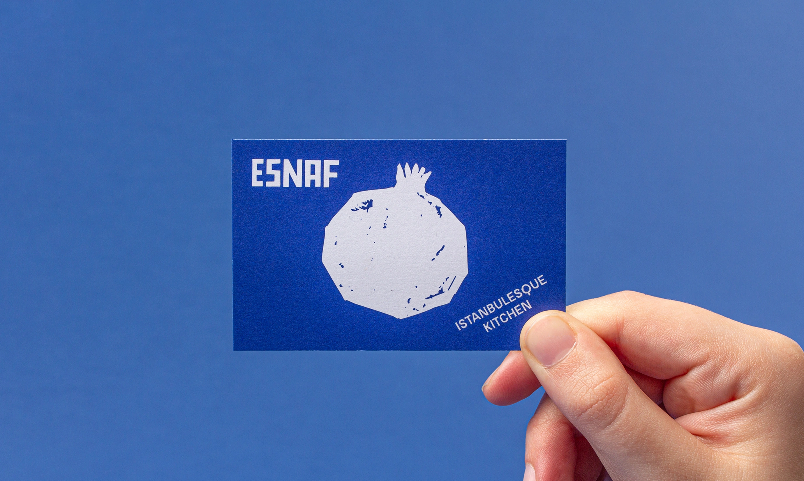
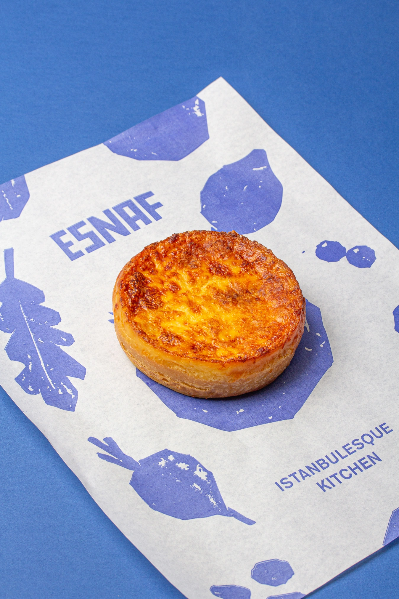
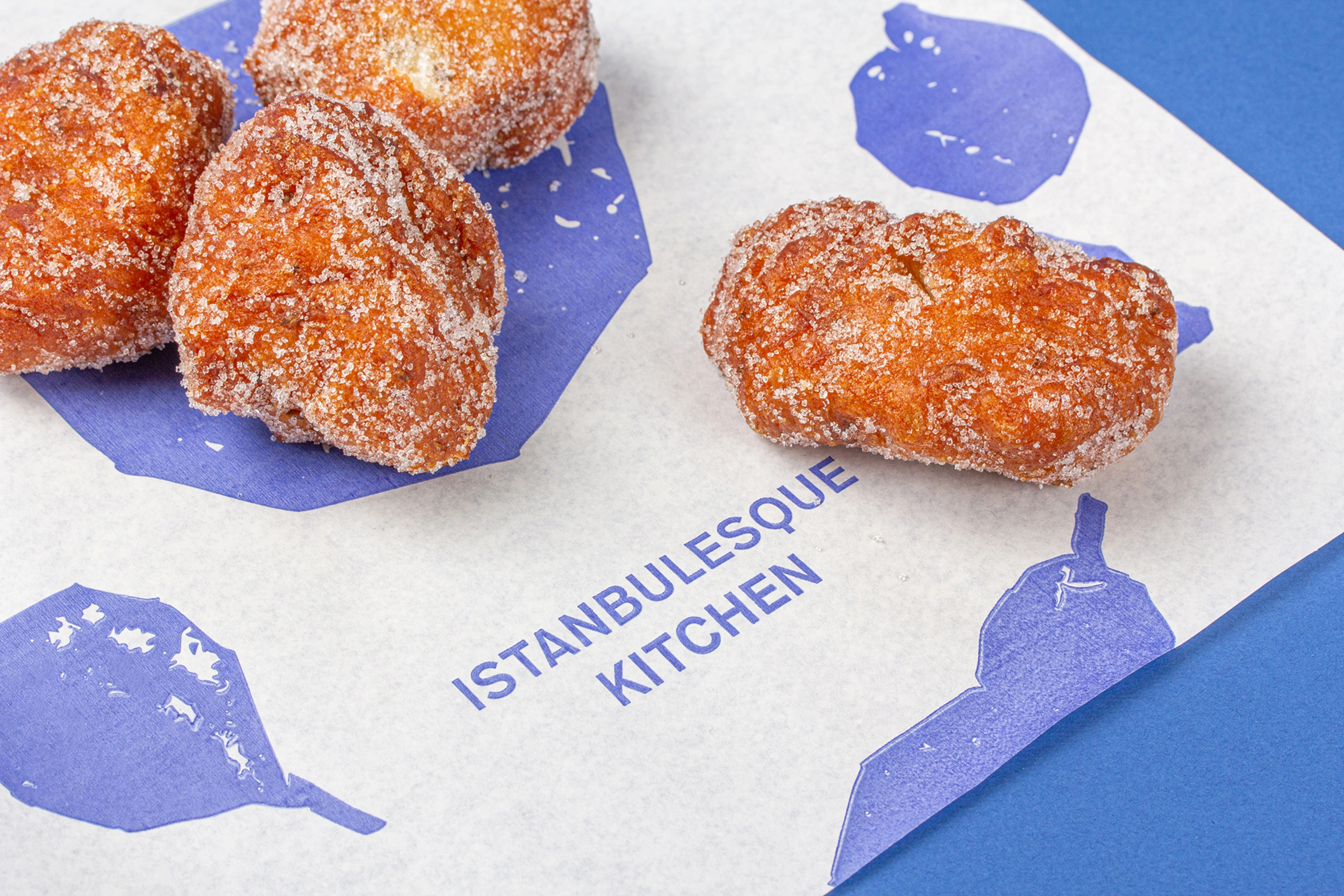
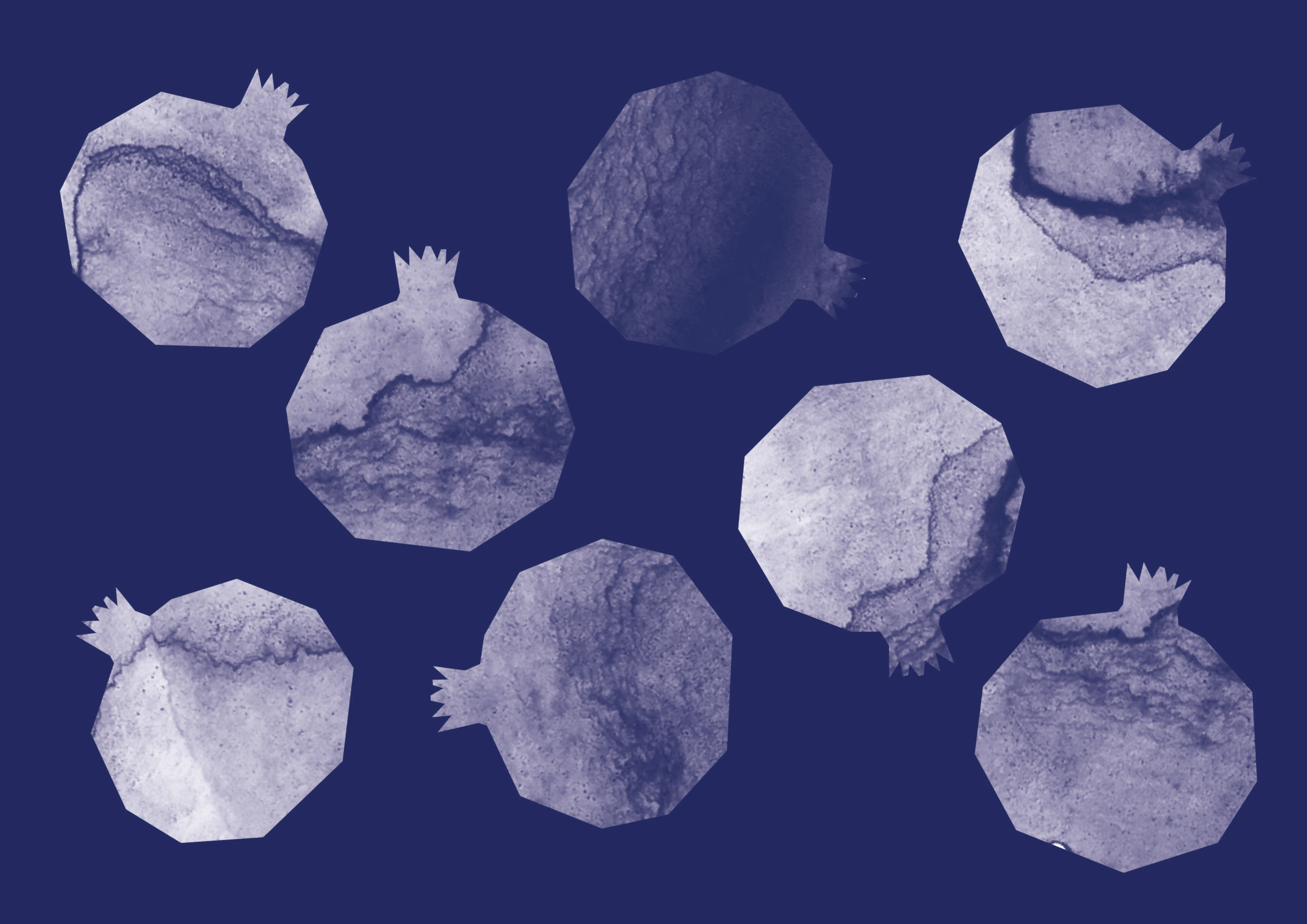
As a counterpoint, a series of illustrations of fruit and vegetables, drawn using irregular, textured silhouettes, introduces a more human and artisanal dimension.
Their imperfections evoke manual labour, fresh produce and the authenticity of cuisine prepared with time and care.
The graphic system is naturally applied to packaging, signage, the retail space and communication materials, creating a flexible and consistent identity where each element helps to reinforce a brand that is approachable, genuine and full of personality.

Credits
Client
Basak
City
Barcelona
Interiors
A Space About
Videos
BFE Digital Media
Year
2025