Ragú
Packaging design with a taste of tradition and typography with character.
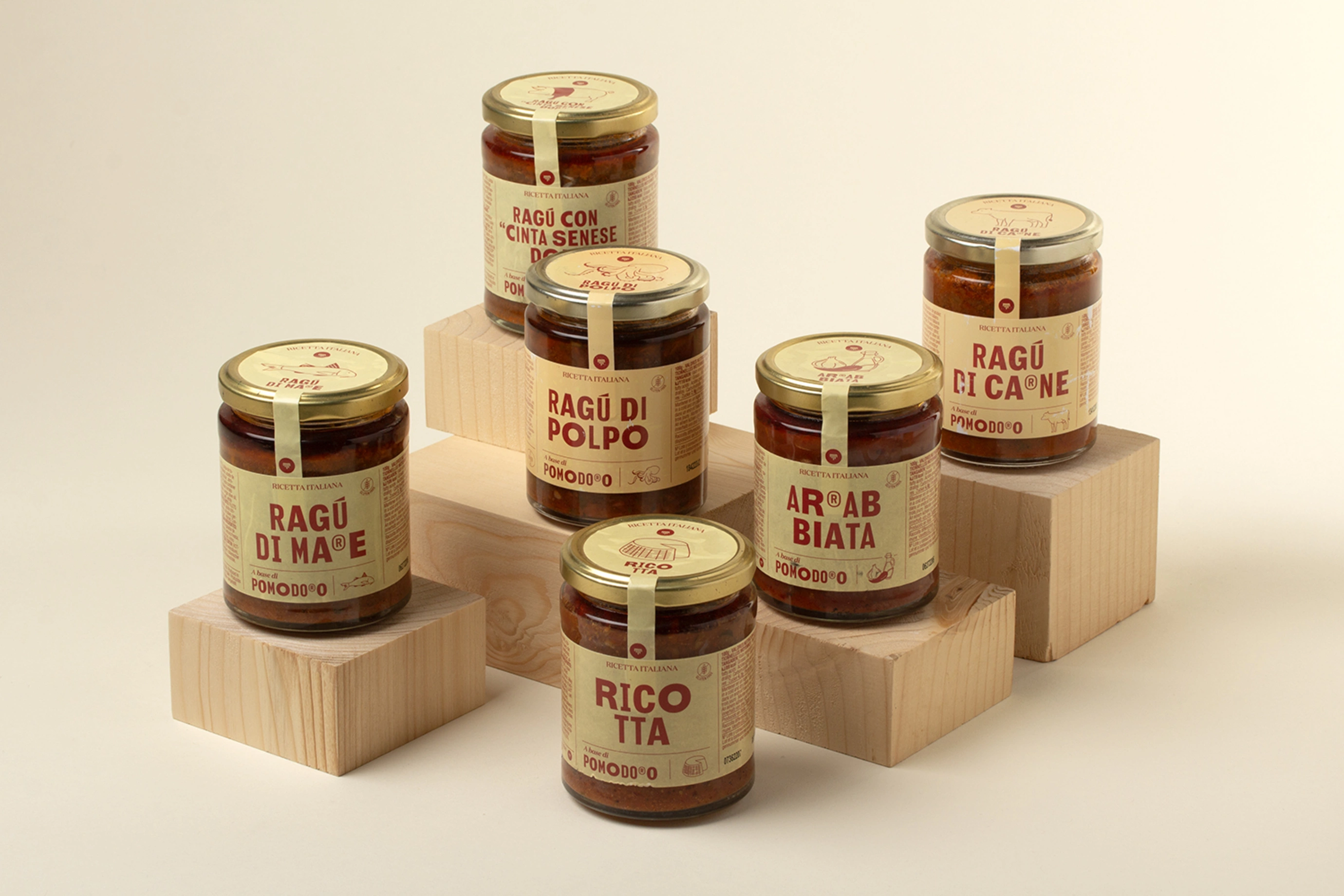
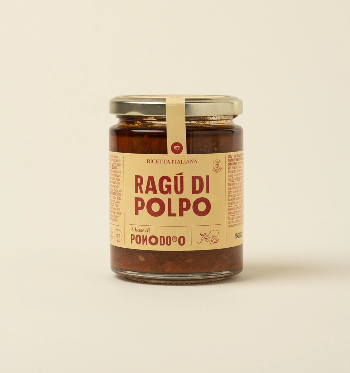
The design of this family of tomato sauces and Italian ragùs by Mammafiore highlights the origin, tradition and authenticity of the homemade Italian recipe, translating it into a coherent, recognisable visual identity with a strong typographic component.
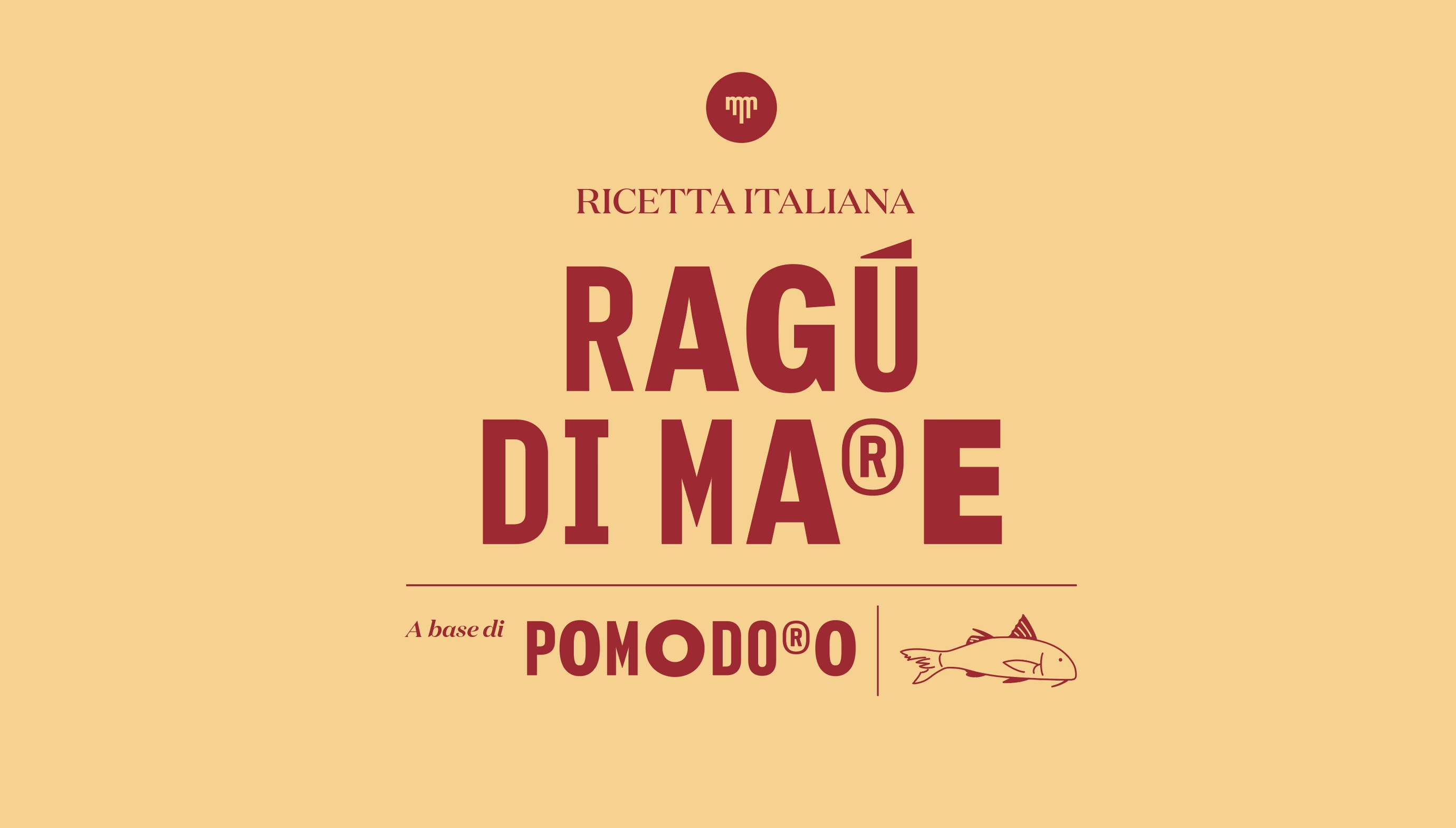
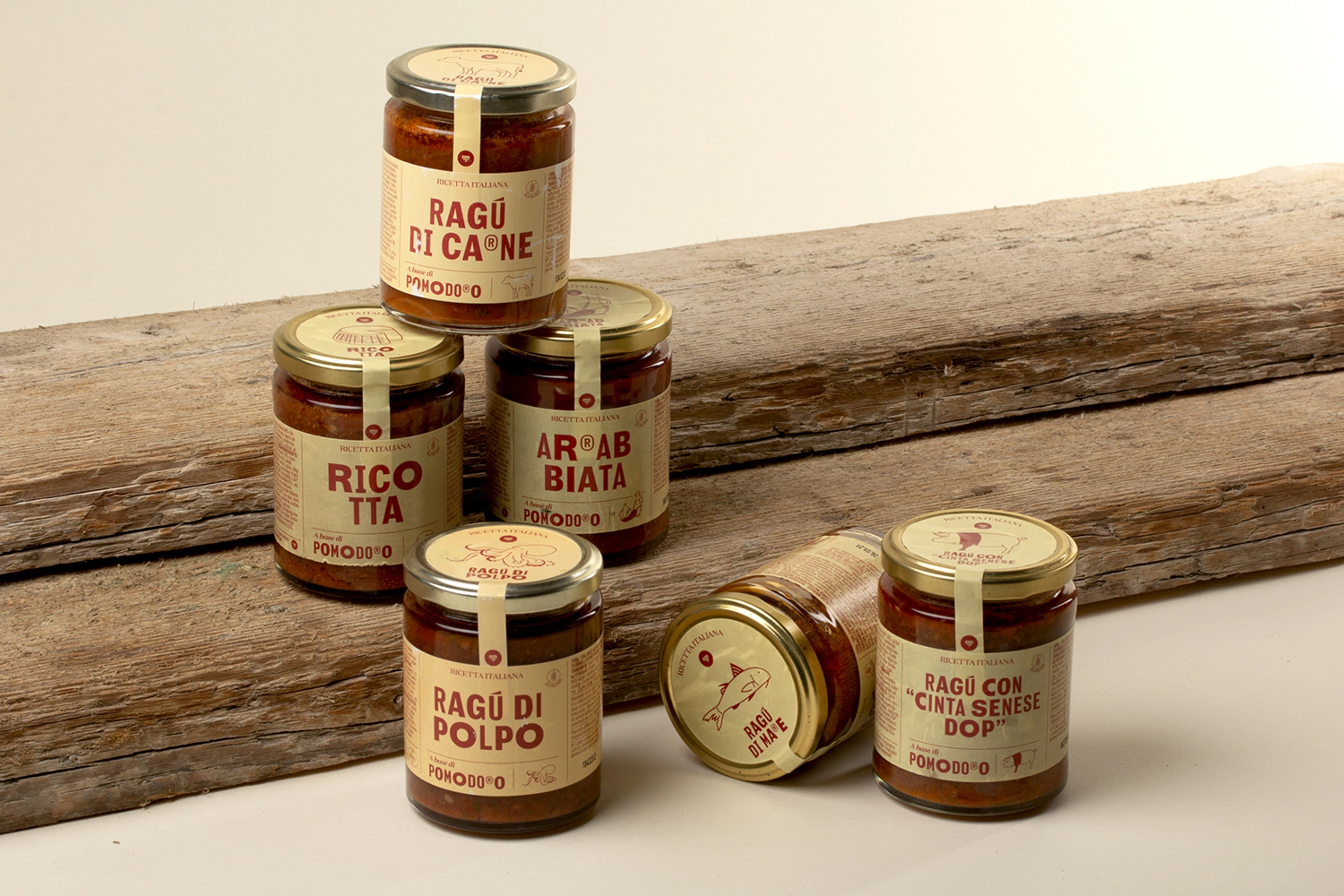
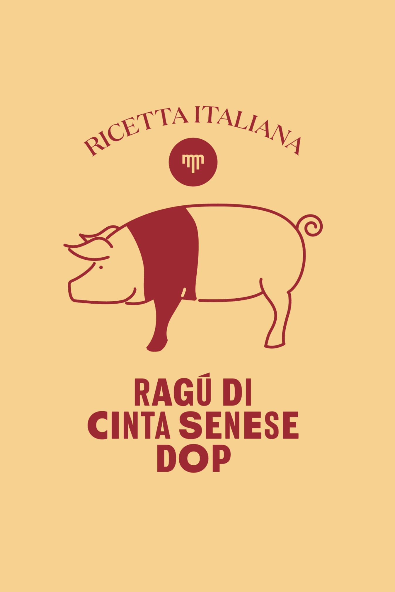
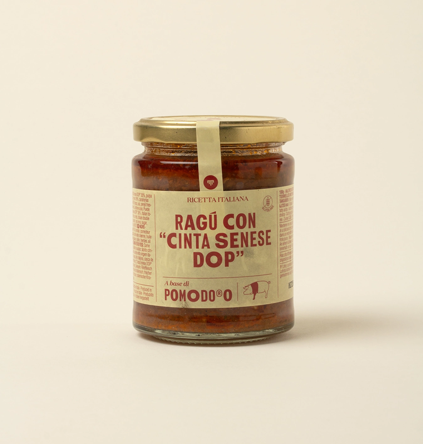
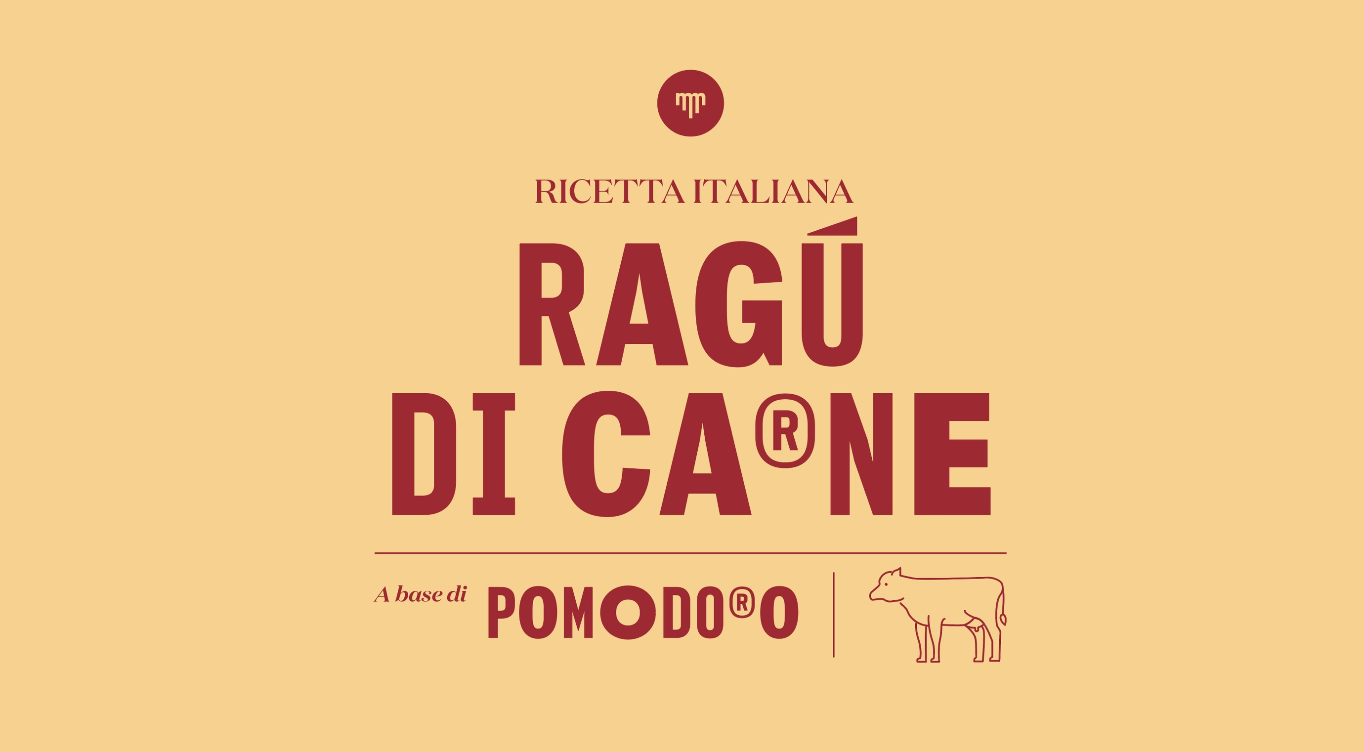
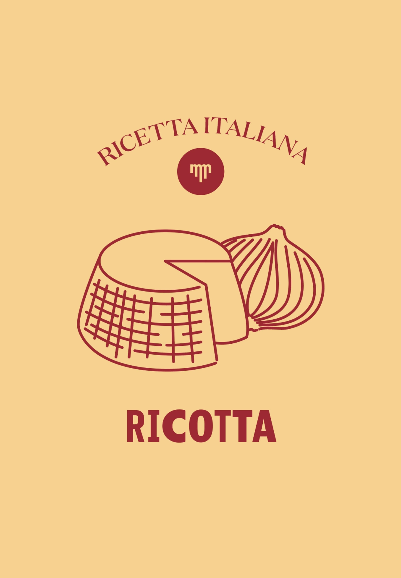
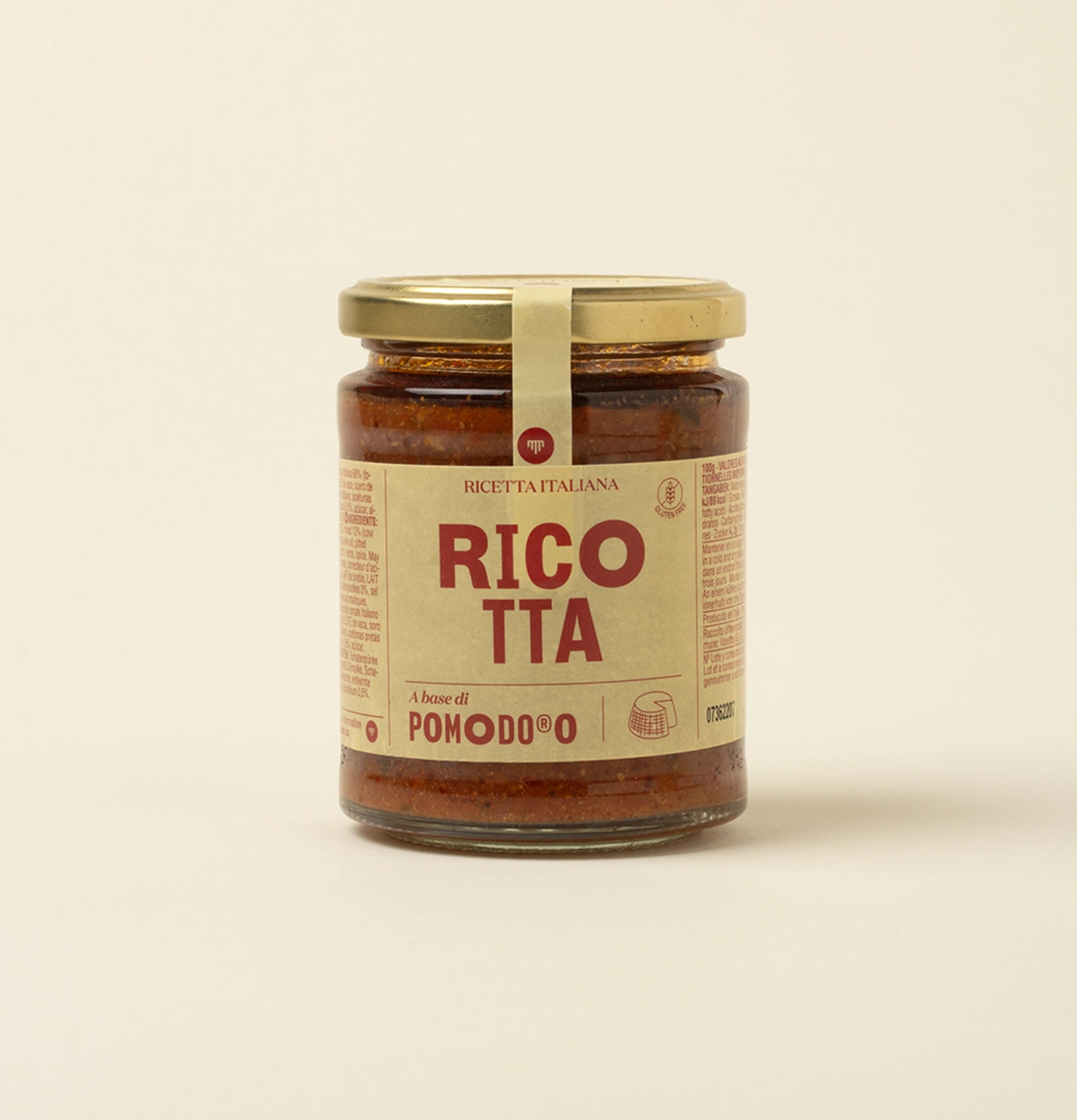
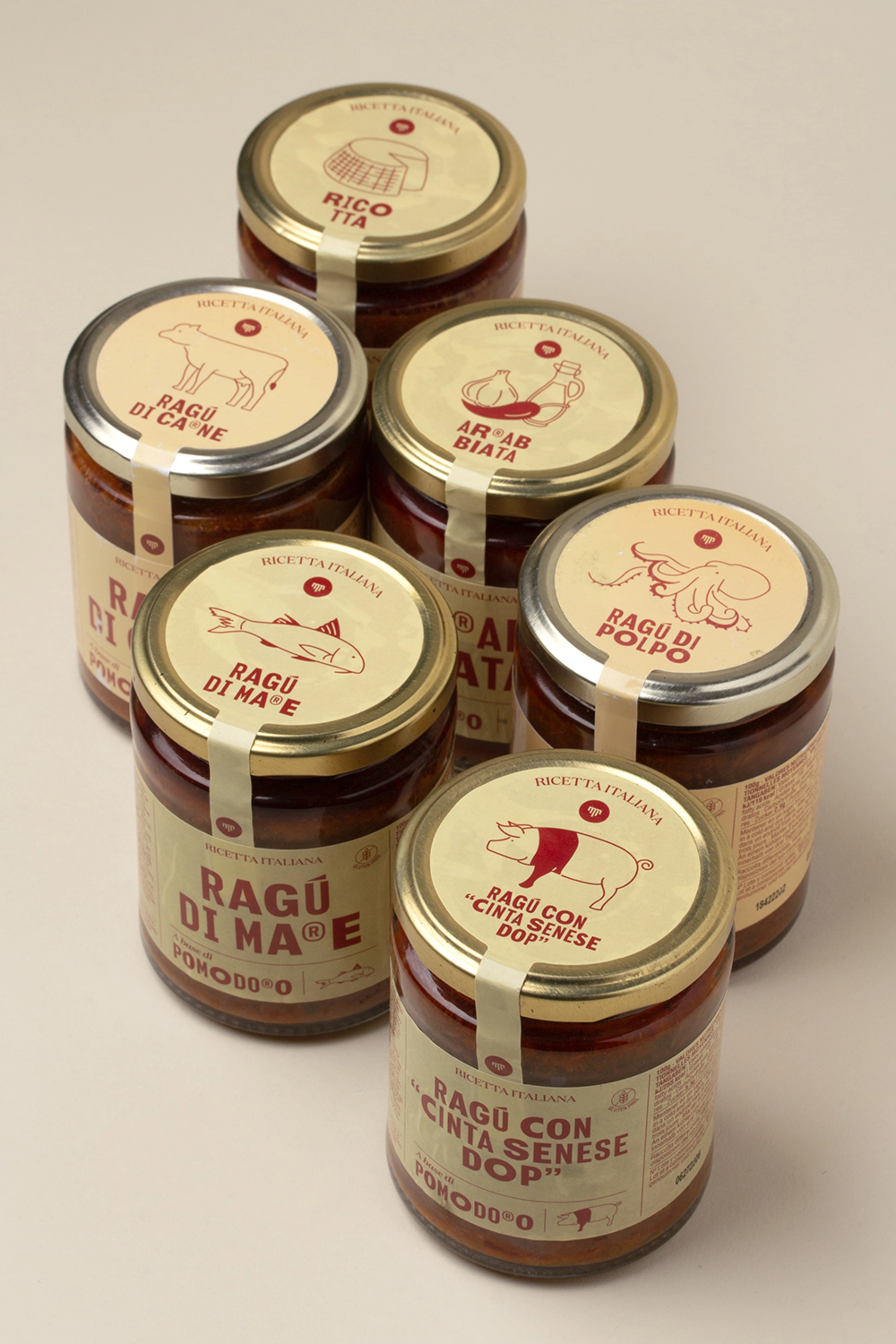
The labels are constructed on the basis of a modular and hierarchical system that prioritises the name of the product, composed with a strong, retro-inspired typography, with rhythmic variations and a slightly gestural character.
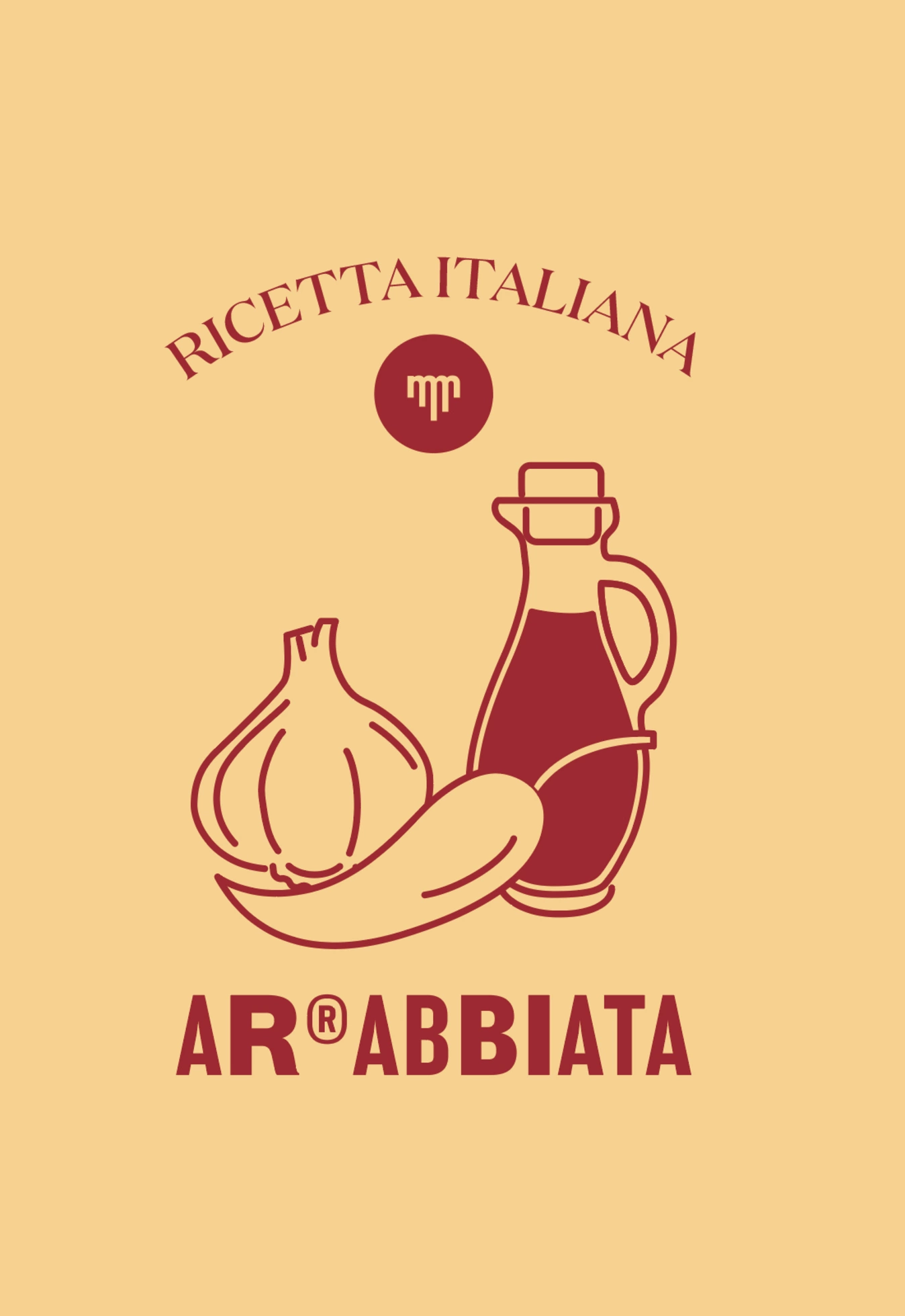
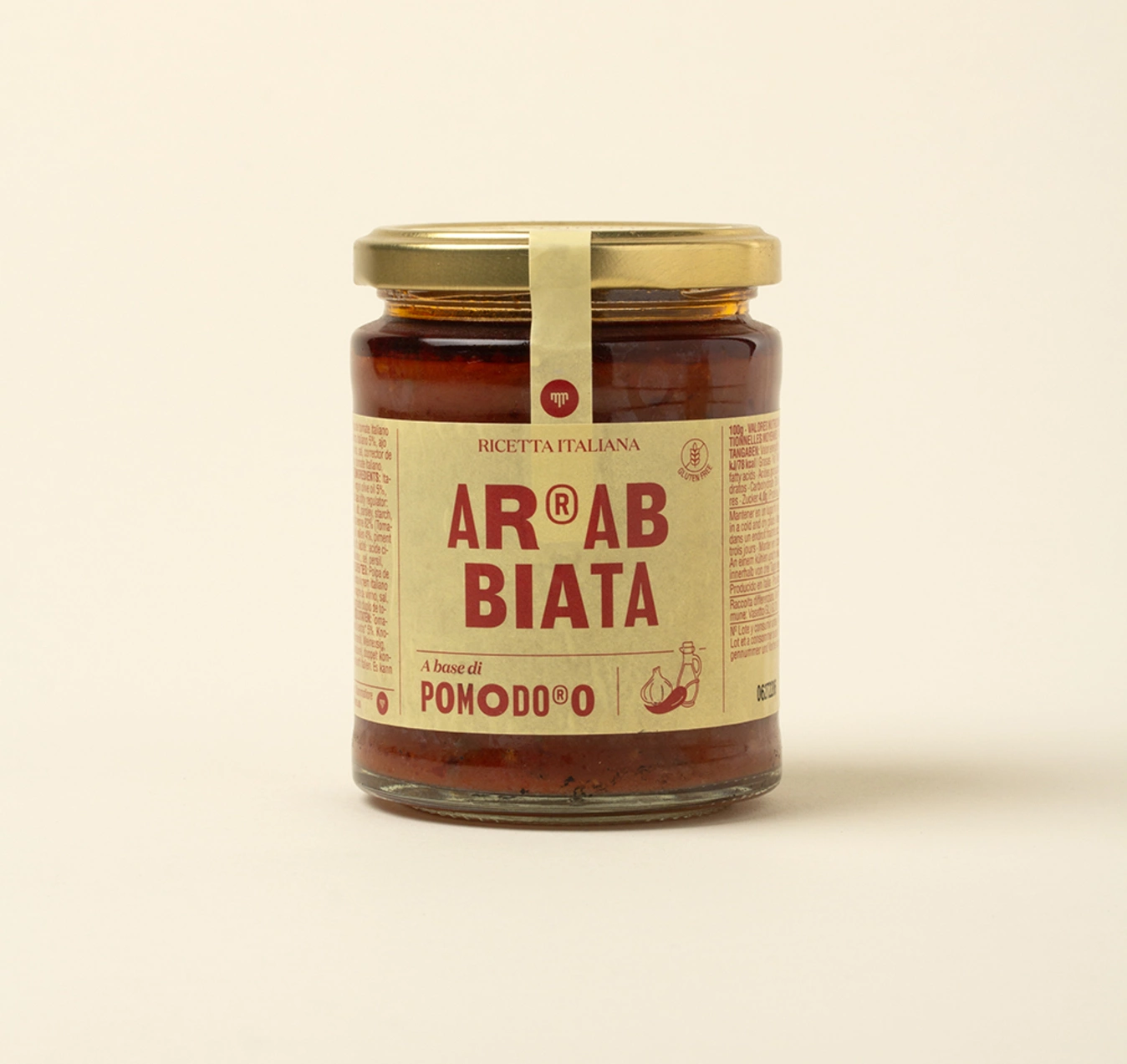
The use of ® symbols within certain words adds a distinctive and ironic touch, playing with the visual language and the idea of a "home-made trademark".
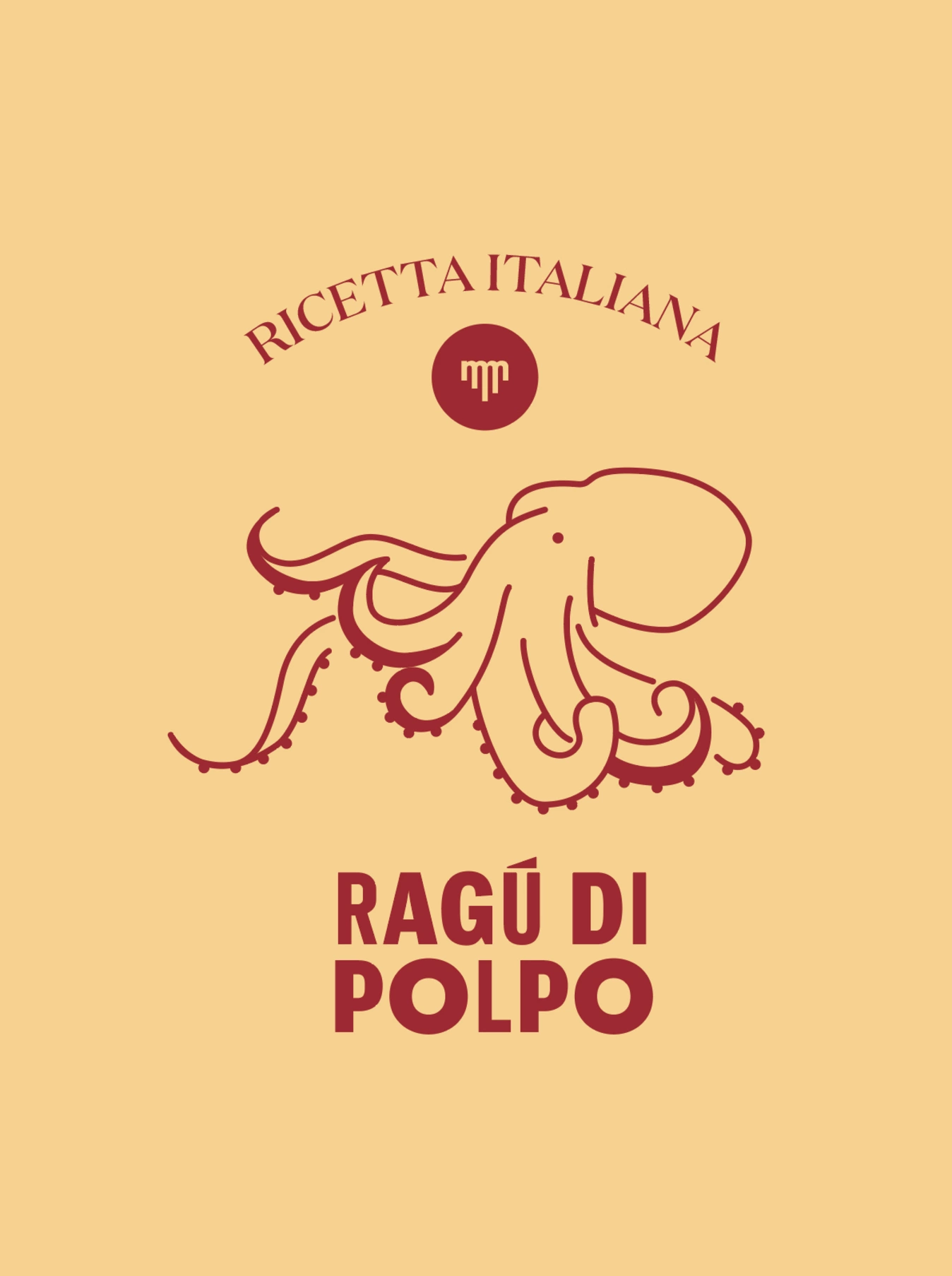
The chromatic universe is sober but warm, dominated by cream, red and brown tones that evoke natural ingredients, ripe tomatoes, wood and slow cooking. Small illustrations accompany the content in a functional way, supporting the understanding of the type of sauce: fish, meat, octopus, cheese...
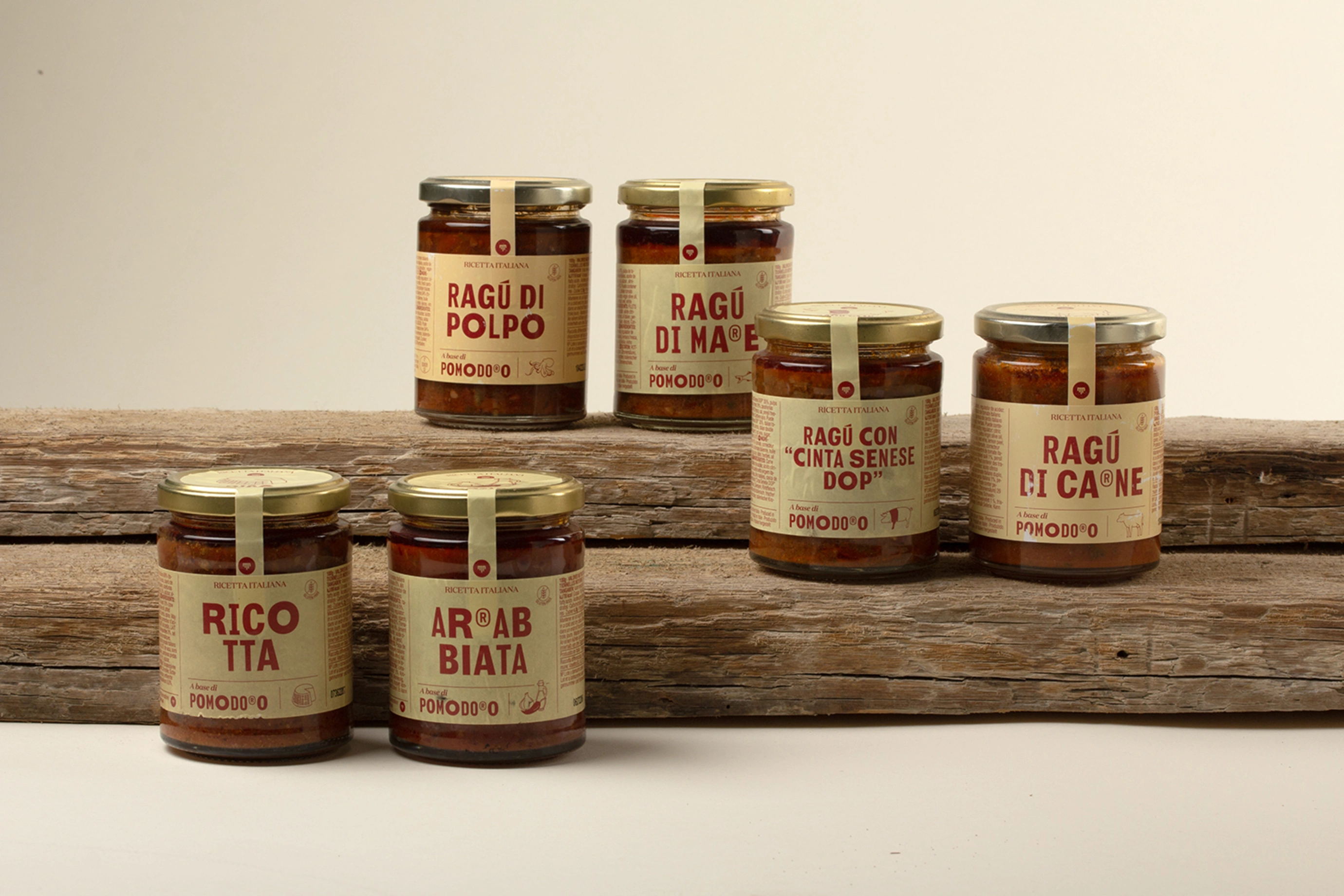
The graphic seal on the cover adds a detail of artisan care, reinforcing the perception of a product made with care and dedication. Overall, this graphic family manages to unite Italian tradition with a contemporary editorial aesthetic, where typography becomes the main ingredient, and the design communicates flavour, heritage and authenticity from the first glance.
Credits
Client
Mammafiore
City
Barcelona
Year
2024