
Solera
When SOLERA, a Barcelona bar-bodega with a Cádiz spirit, commissioned us, they did so with a clear but ambitious idea: to capture the essence of Cádiz and transfer it to the heart of their proposal, a space that combines reinterpreted Cádiz tapas with a menu of over 600 wines. They wanted more than a design; they were looking for an identity that was as vibrant and authentic as the typical bars of Cádiz, those corners where history, tradition and creativity meet over a glass of wine and a simple but unforgettable dish.


‘We want that when someone enters SOLERA (essence or pleasant experience), they feel that they are stepping into the soul of Andalusia, with the salt of the sea and the bustle of a Cádiz bar, but with a contemporary touch,’ we were told. The challenge was clear: to build a visual and conceptual universe that would pay homage to the Cádiz of always, with a fresh and original look.


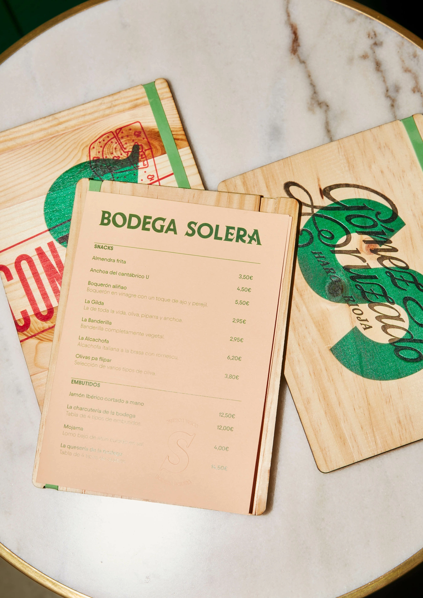
The solution we proposed revolved around a key element: the design of a unique typographic alphabet customised for the client, inspired by the traditional letters that adorn the blackboards, posters and façades of the bars of Cádiz. These letters, with their artisanal and spontaneous character, are an essential part of the visual landscape of Cádiz. Our aim was not only to recover them, but to reinterpret them, modernise them and turn them into the heart of SOLERA's identity.

Each letter was designed by hand, capturing the irregular strokes and full of personality that evoke Cadiz posters or signs. This typography is not only aesthetic; it is a visual homage to the authenticity of Cádiz bars and their unique way of communicating, inviting and telling stories.


Even in the smallest details, the design is present: the cloth napkins printed with the typographic alphabet, which seem to have been torn out of a catalogue of old letters, offer a unique touch. Each napkin is like a small graphic manifesto of the essence of Cádiz.


All the graphics of the space revolves around this calligraphic composition applied to the signage, the menus or the uniforms of the bar staff. Chromatically we opted for green, white and black.


The signage not only guide the customer, but become part of the ambience.
A corner dedicated to Lola Flores emerged as a special tribute within the space. Here, the typography was influenced by the energy and art of the Faraona, where we covered walls with the most emblematic covers of the flamenco singer.


Even in the smallest details, the design is present: the cloth napkins printed with the typographic alphabet, which seem to have been torn out of a catalogue of old letters, offer a unique touch. Each napkin is like a small graphic manifesto of the essence of Cádiz.
The design is not just about the physical applications. We created a series of photographs that captured the space in all its splendour. The closed shots of the light boxes with offers, the textures of the paper on the cards and napkins, the light coming through a glass of wine, all contribute to tell a visual story that goes beyond the design: an invitation to experience Cádiz through the eyes, touch and palate.

SOLERA has become much more than a bar-bodega. Every detail, from the lettering to the colours, from the light boxes to the tables, speaks of Cádiz. Not in an obvious or repetitive way, but from the heart, with an authenticity that can be felt in every corner.
The identity created not only accompanied the experience, it enhanced it. It is impossible to be in SOLERA without being carried away by the magic of a design that not only pays homage to the typical bars of Cádiz, but reinvents their essence, taking it to a level where the traditional and the contemporary dance to the sound of a well-served wine.
At SOLERA, design is not just an adornment; it is part of the soul. And like good wines, it has character, history and a spark of duende.
Credits
Client
DIAZ / REBORDOSA / CASADO
Awards
LAUS - Silver - Visual ID - 2024
Photography
Carmen Palma
City
Barcelona
Year
2024