The Pil Pil Family
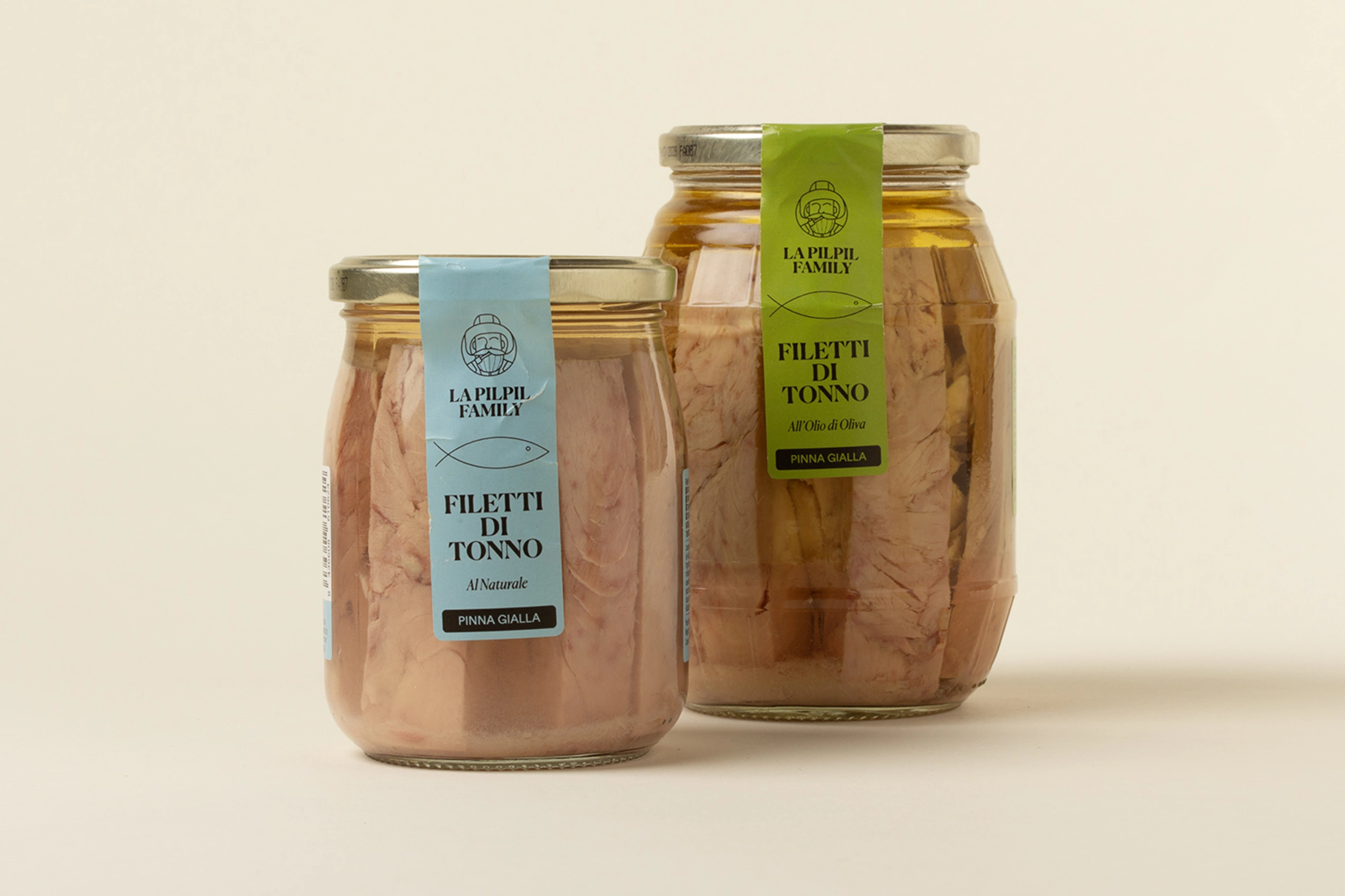
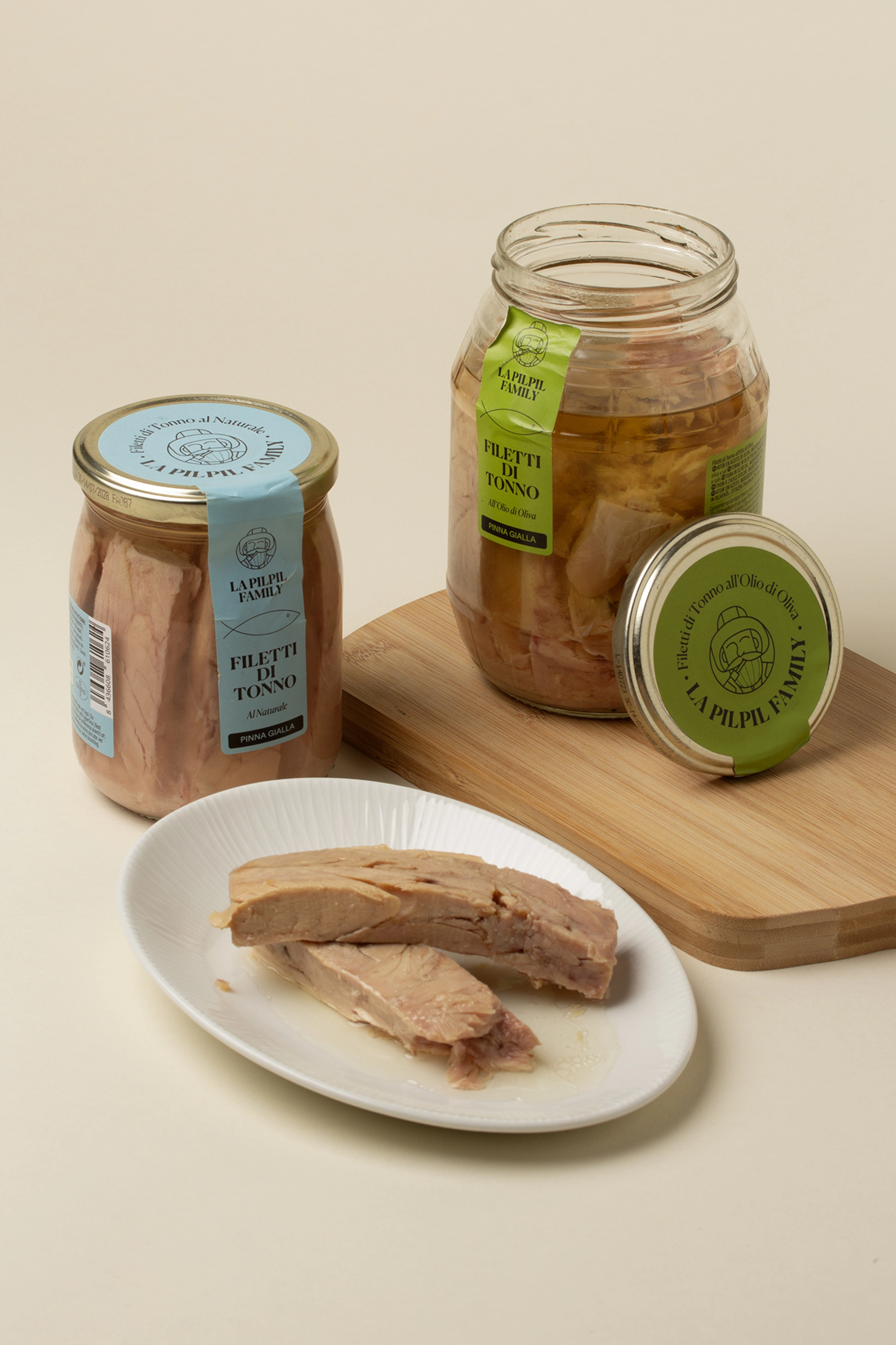
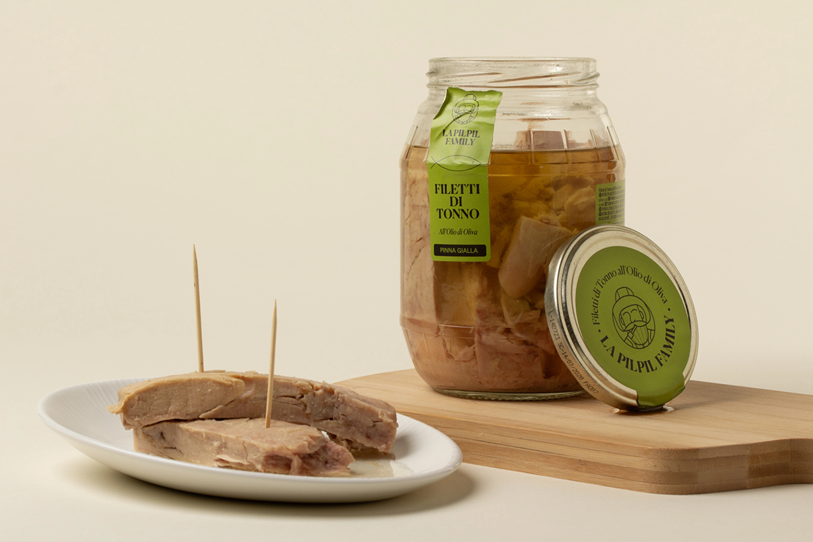
Packaging for tuna fillets "Pinna Gialla".
This packaging project is built from an honest and close look at the product: high quality tuna fillets preserved naturally or in olive oil, presented in glass jars that enhance the raw material from transparency and simplicity.
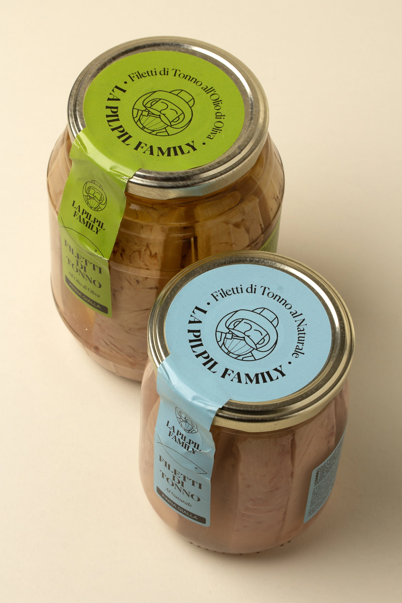
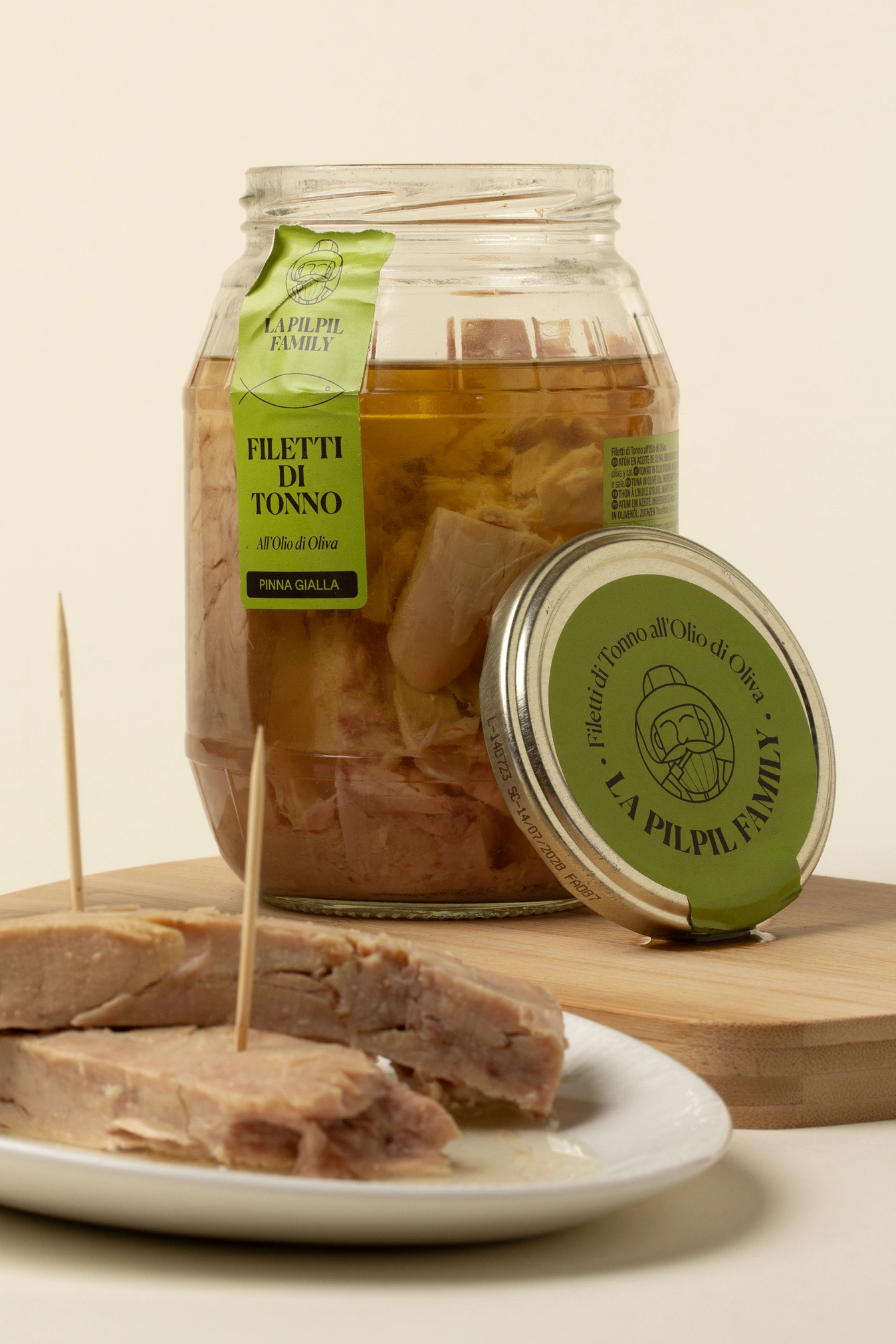
The graphic proposal is based on a clean and direct aesthetic, with vertical labels that act as a seal and visual axis. The use of colour - blue for the natural variety and lime green for the preserved oil - allows the ranges to be easily identified and brings freshness and contemporaneity to the whole.
The brand name, THE PIL PIL FAMILY, is accompanied by an illustrated symbol inspired by the sea, reinforcing the artisanal, family and Mediterranean character of the product.
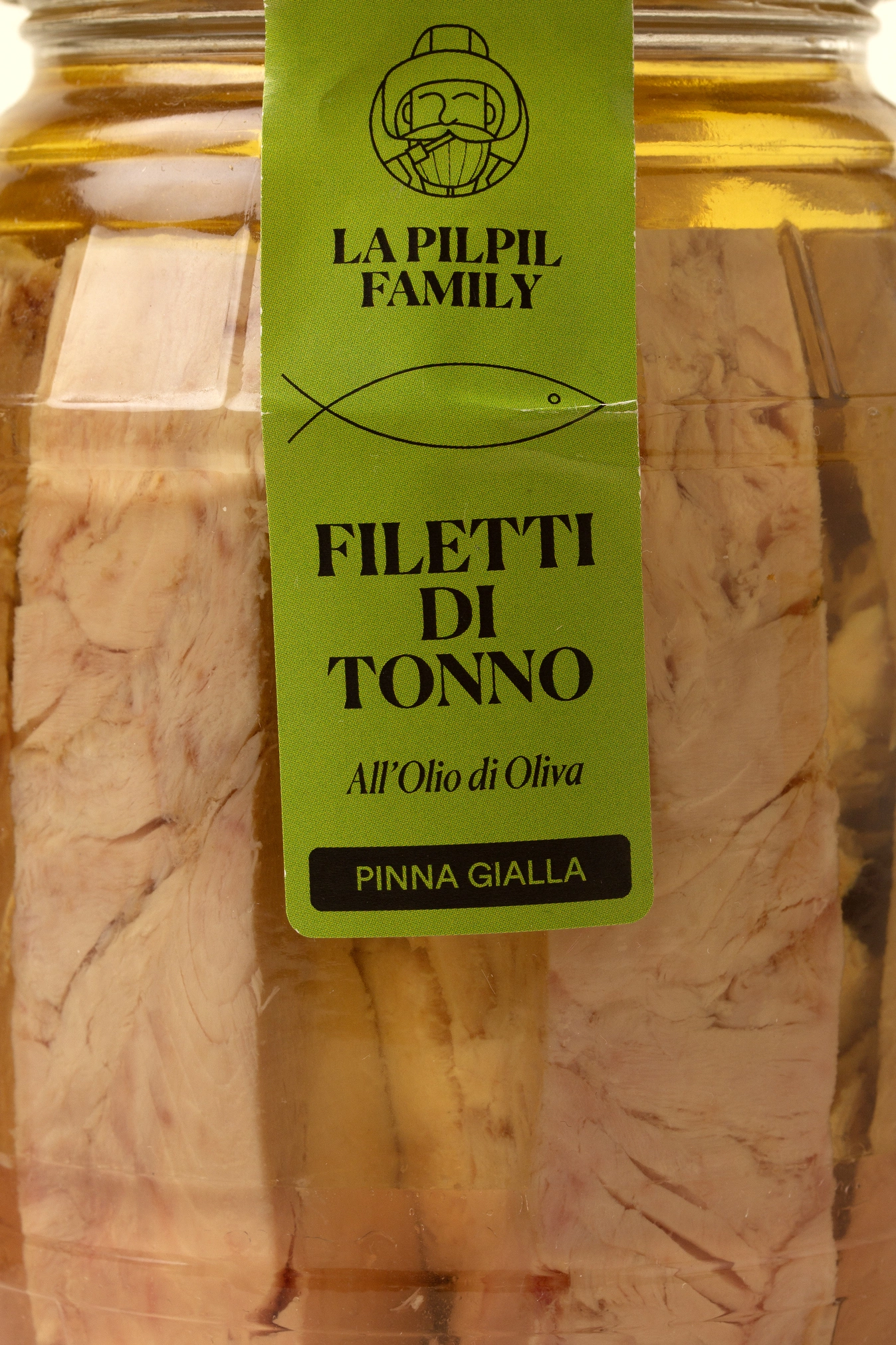
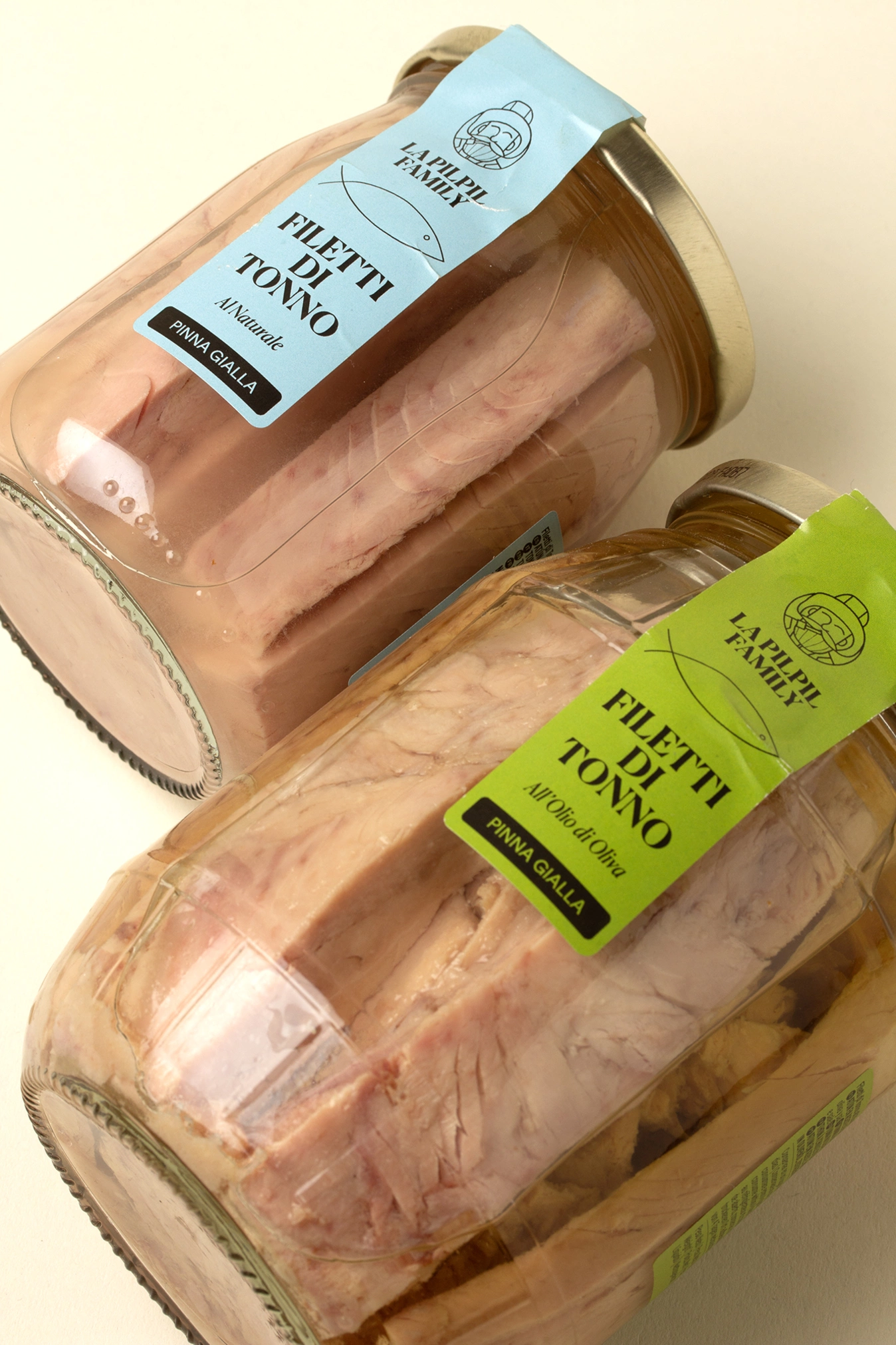
Typographically, the design combines a high-contrast serif typeface that adds elegance, with a clear and well-structured hierarchy. The overall tone of the packaging communicates confidence, naturalness and quality, without the need for superfluous ornamentation.
An honest, visually memorable design with a friendly touch that connects with the authenticity of the sea and family know-how.


Credits
Client
Mammafiore
City
Barcelona
Year
2024