
Topotype For Cdp
The design of this volumetric typeface was born from the challenge of translating a deeply organic concept into a tangible and visually striking form. Inspired by topographical forms, each letter is constructed from layers of papier-mâché that, like geological strata, create a unique sense of depth and texture.
- Sector
- Product design
- Services
- Typography


The starting point was the pure and functional geometry of Helvetica, a typeface that we decided to transform into something much more irregular and organic, almost as if it had been shaped by nature itself.


This typographic project is a direct extension of the work for Awareness Cure, a hair cosmetics line by Claudia di Paolo, where the packaging is also made of papier-mâché and is inspired by polyhedral shapes that evoke the essence of a stone.


The three-dimensional alphabet created dialogues with this visual language, turning each character into a unique, almost sculptural piece that transcends the purely functional.


Each of the 27 letters was designed, machine-cut with millimetre precision and assembled by hand, layer by layer. This handcrafted process brings a tactile and emotional dimension to the project, turning the alphabet into something that is not only read, but also experienced.
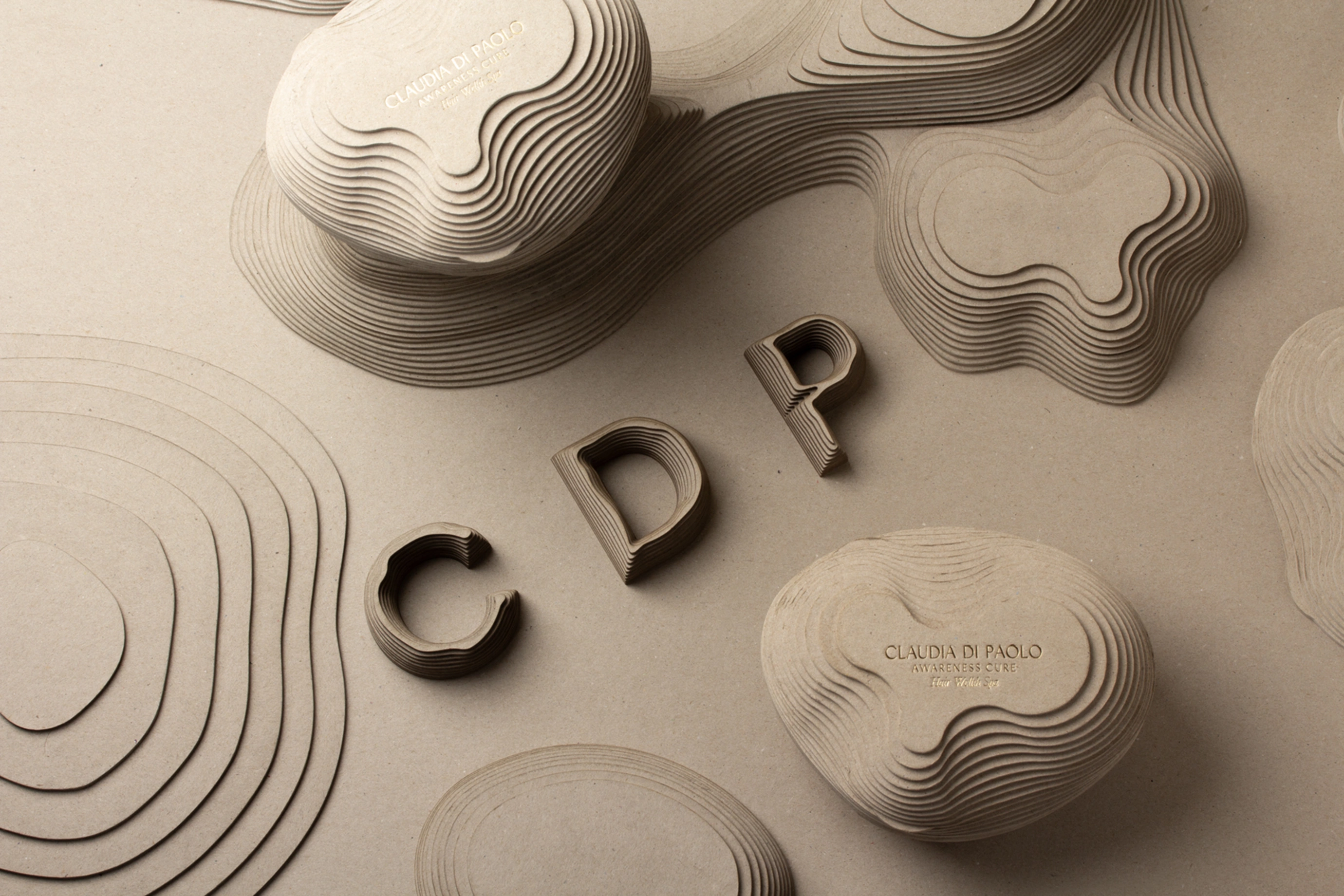
The result is a typeface that not only communicates, but tells a story of care, detail and connection to the land. It is a bridge between the precision of design and the irregularity of the natural, which finds its perfect balance in the graphic language of Awareness Cure.

Credits:
Client
Claudia Di Paolo
Photography
Lo Siento
City
Barcelona
Year
2024