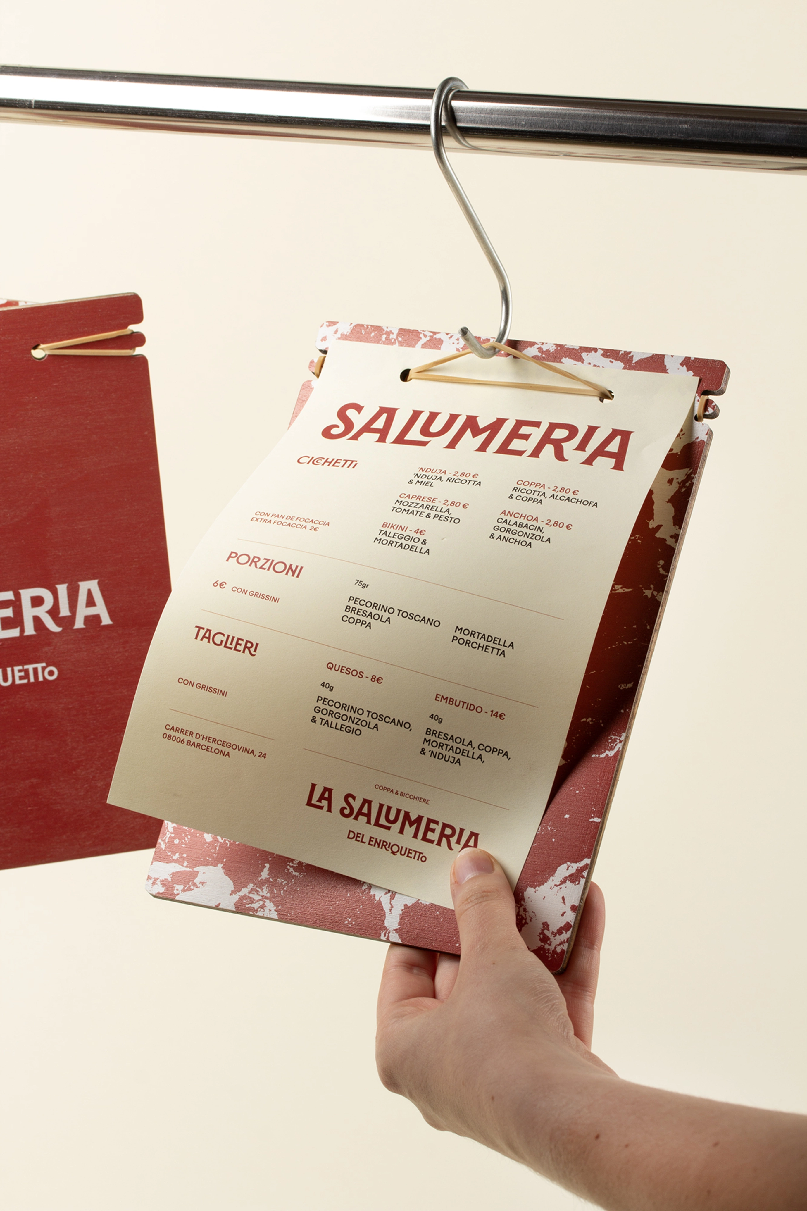

La Salumeria
The graphic image of La Salumeria, located in the Monterolas park in Barcelona, strongly transmits a clear concept: a visual and emotional tribute to the world of Italian charcuterie and traditional snacks, in a contemporary and popular environment.
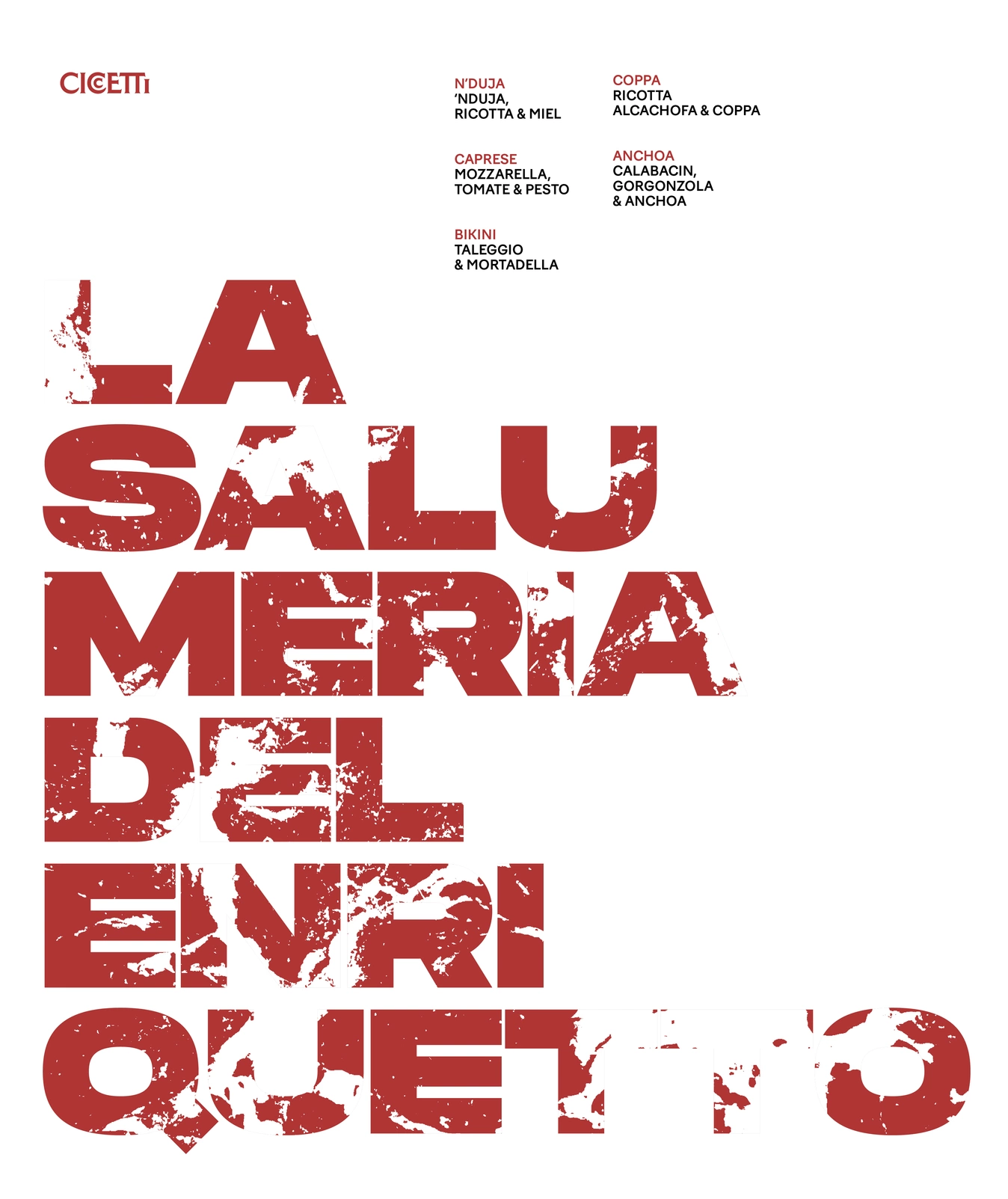
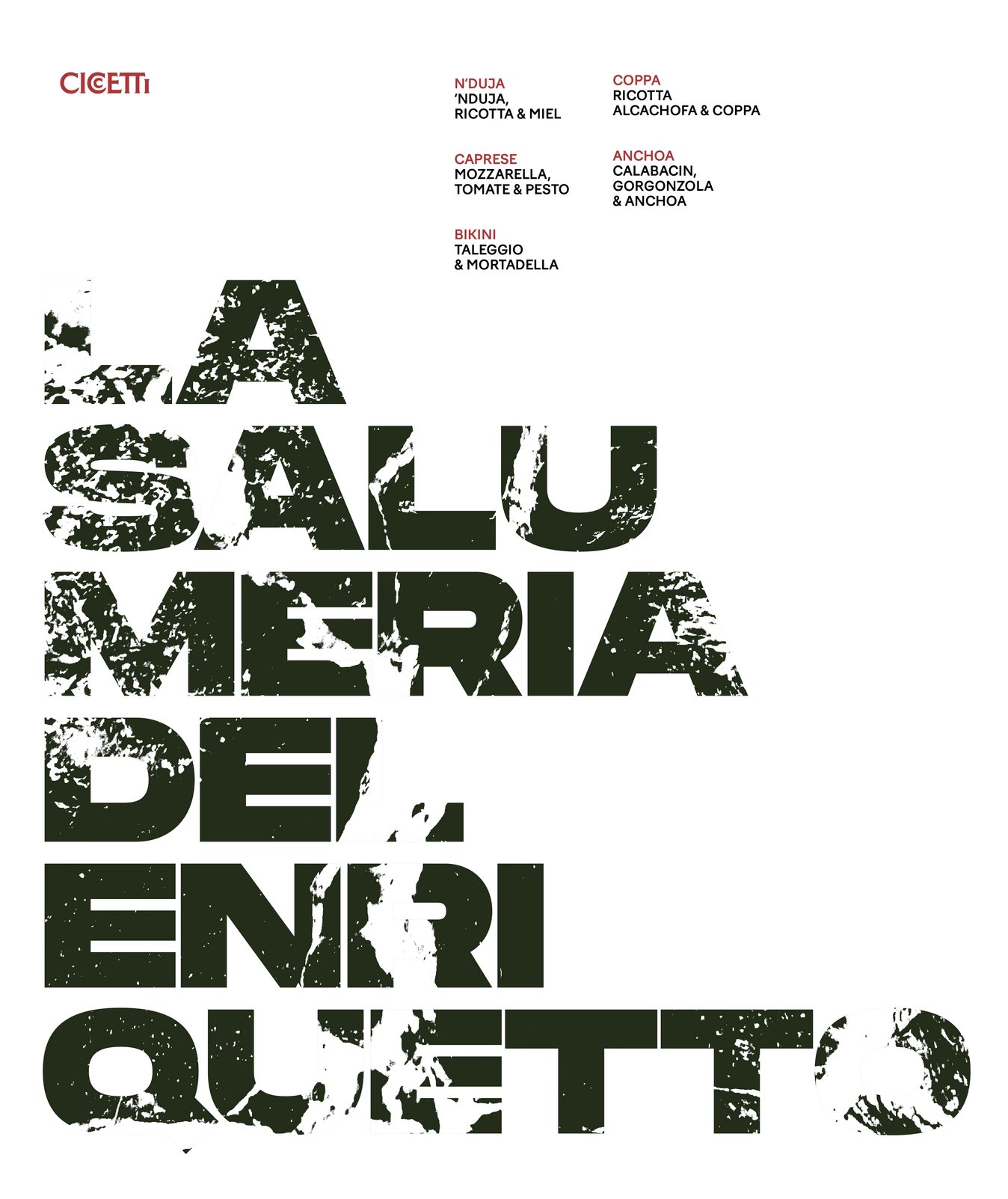
The design is articulated through a graphic system that combines the rustic and the sophisticated, the classic and the current.
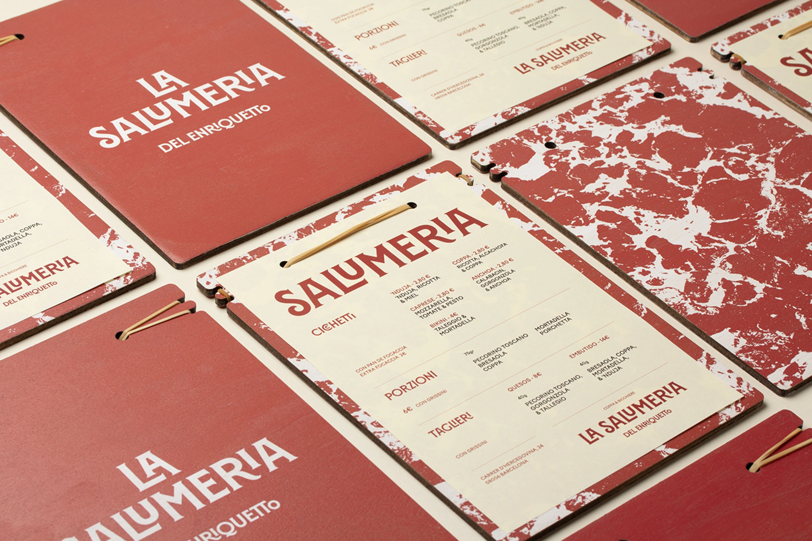

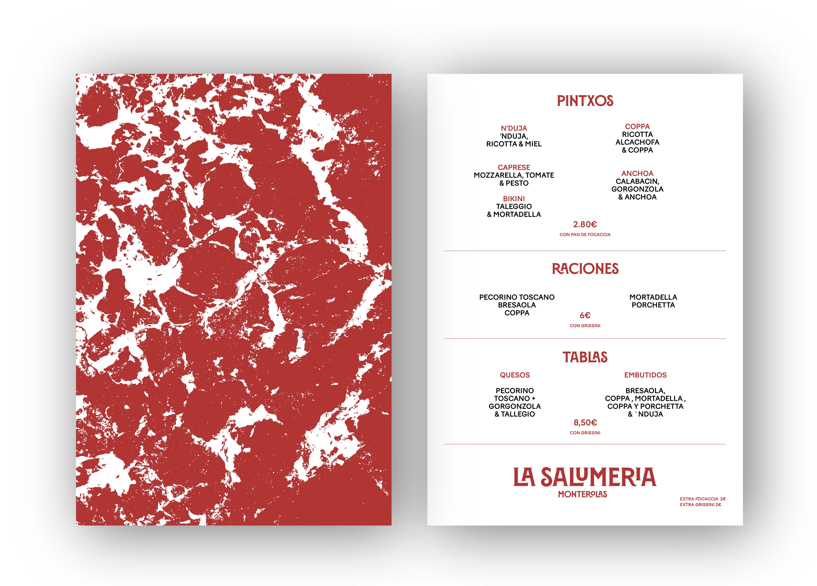
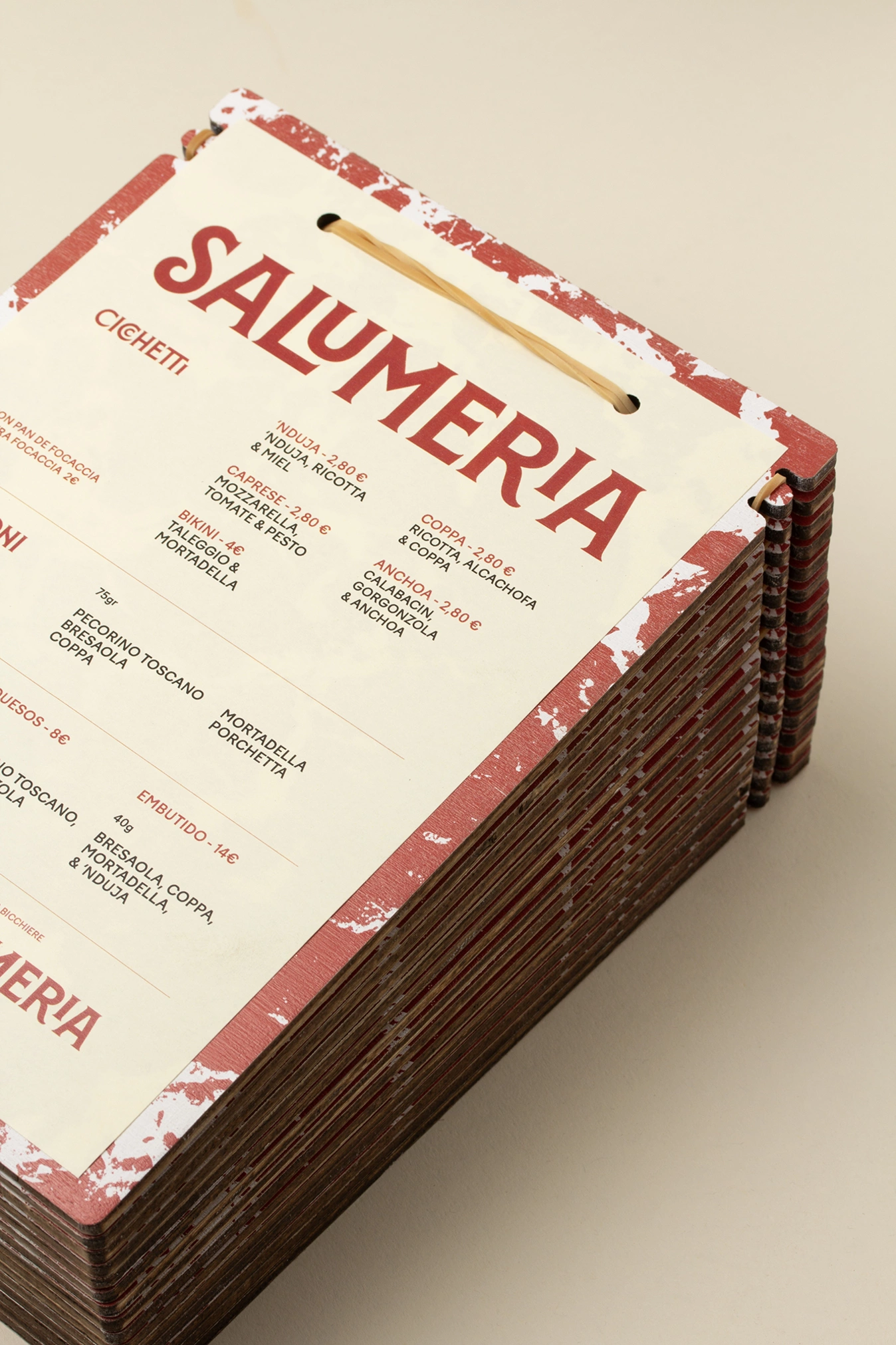
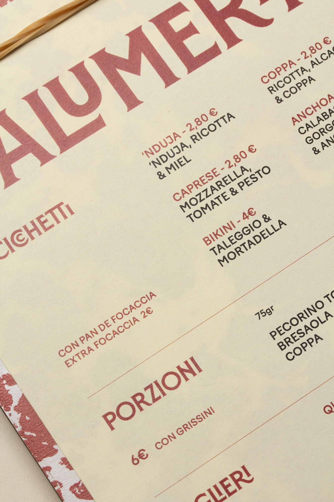
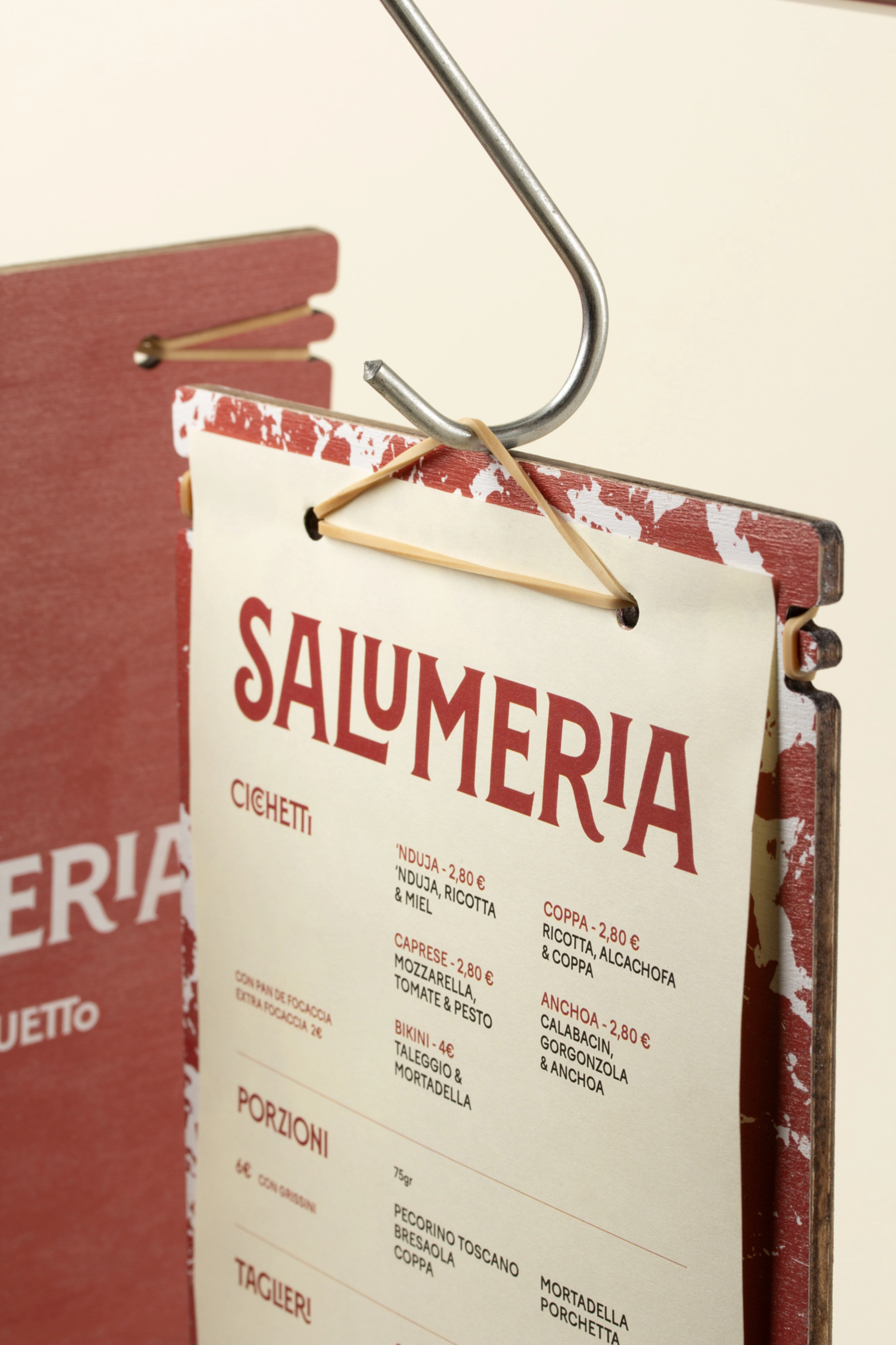
The typographic choice - with marked serifs, irregular cuts and a robust structure - refers directly to the imaginary of old Italian signs, evoking butcher's shops, trattorias and popular markets. Its treatment in intense red reinforces this link with cured meat, sausages and the aperitif as a social ritual.

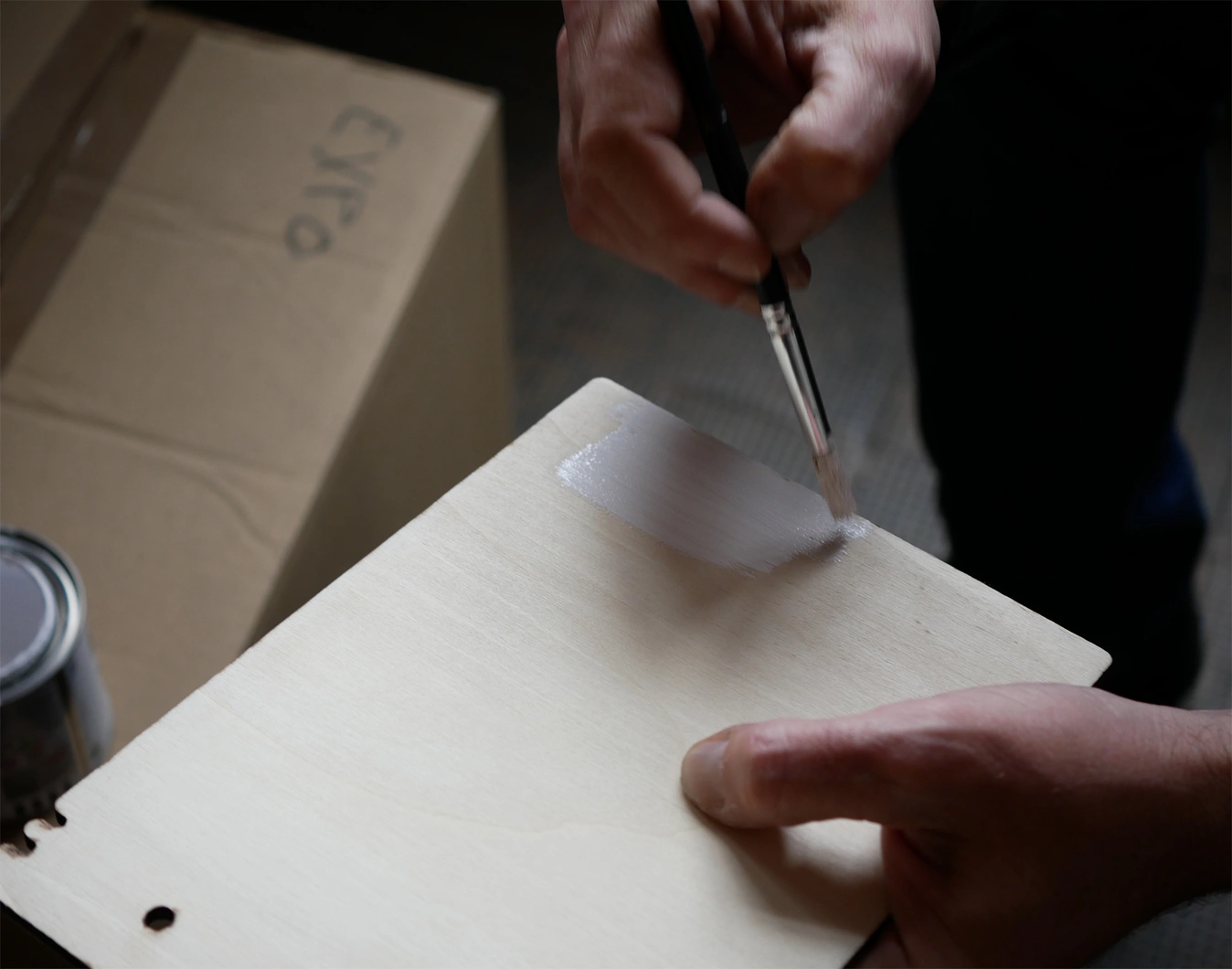
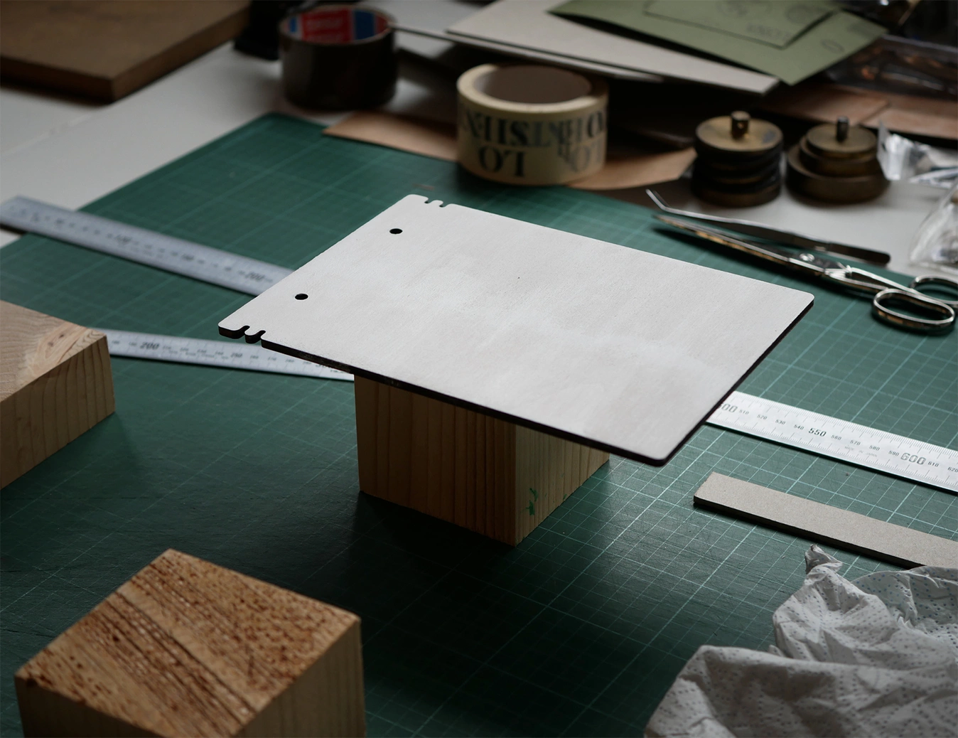
The graphic background of the back cover, an organic texture in red and white, recalls the veining of salami or mortadella.
This abstract but recognizable image transforms the food into a visual surface, making the graphic “smell and taste” like what it represents. It is a bold decision that turns the product into aesthetics.
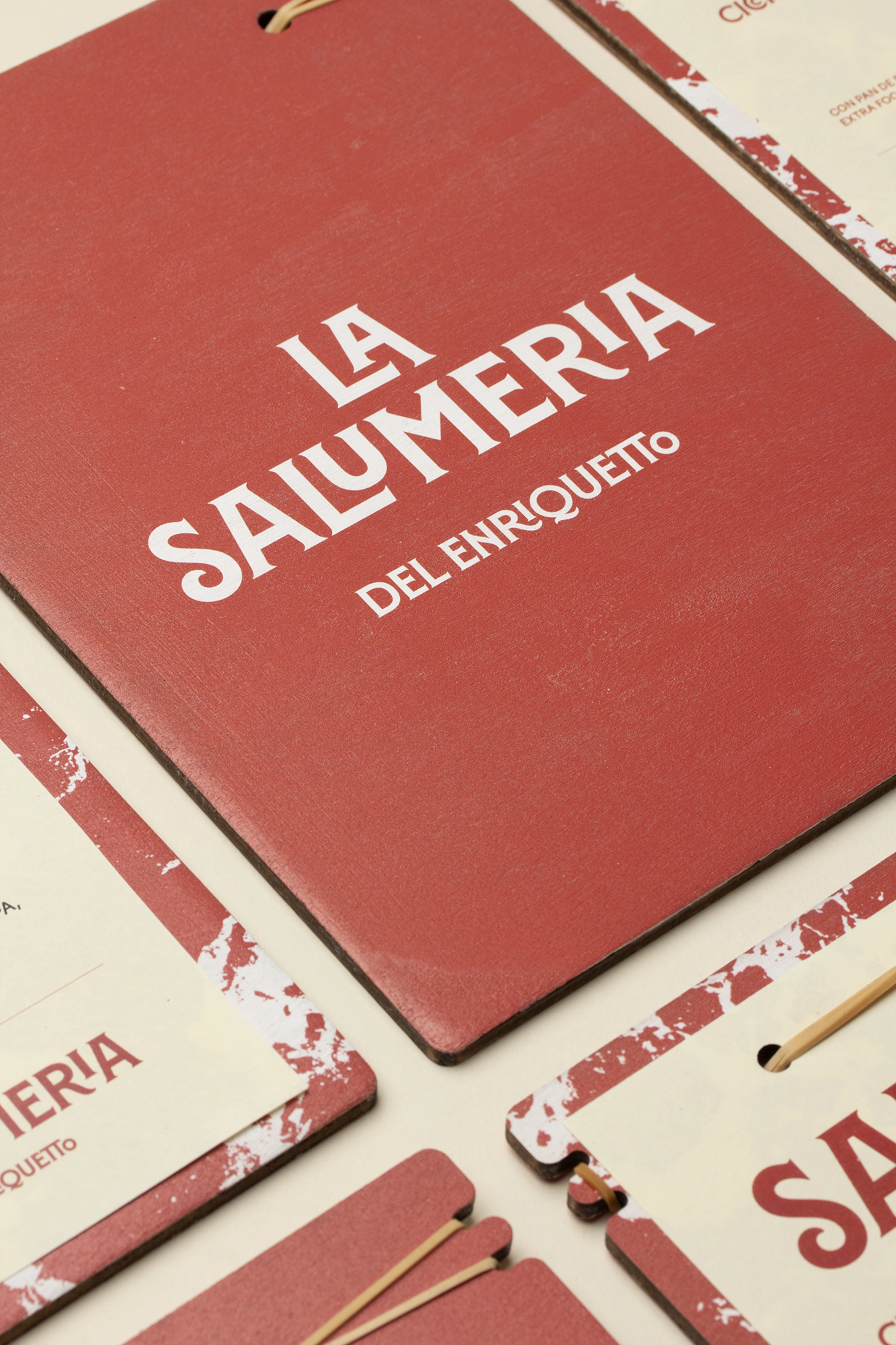
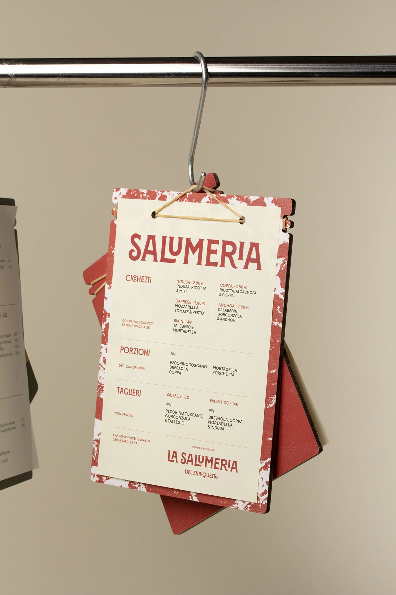
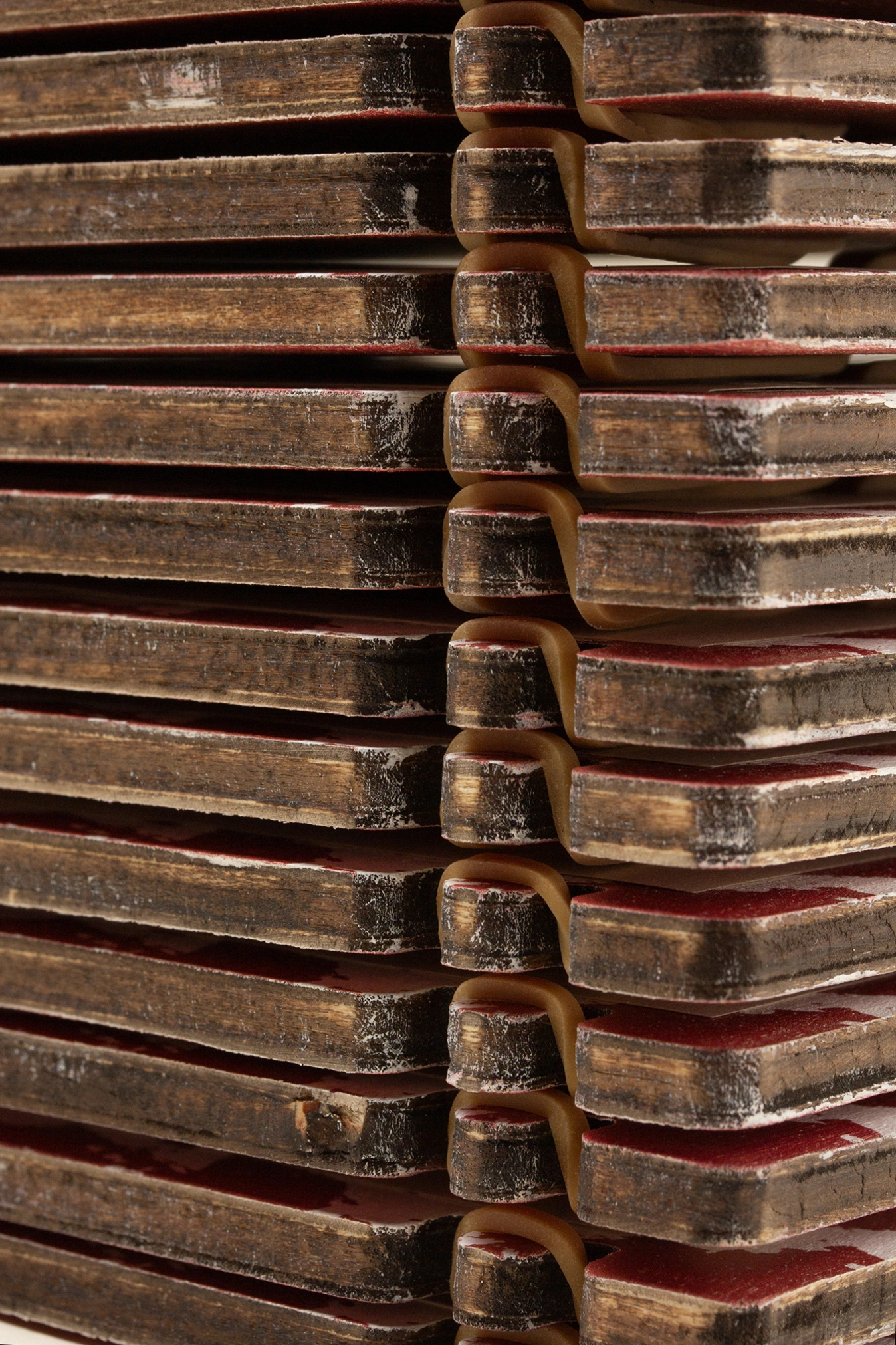
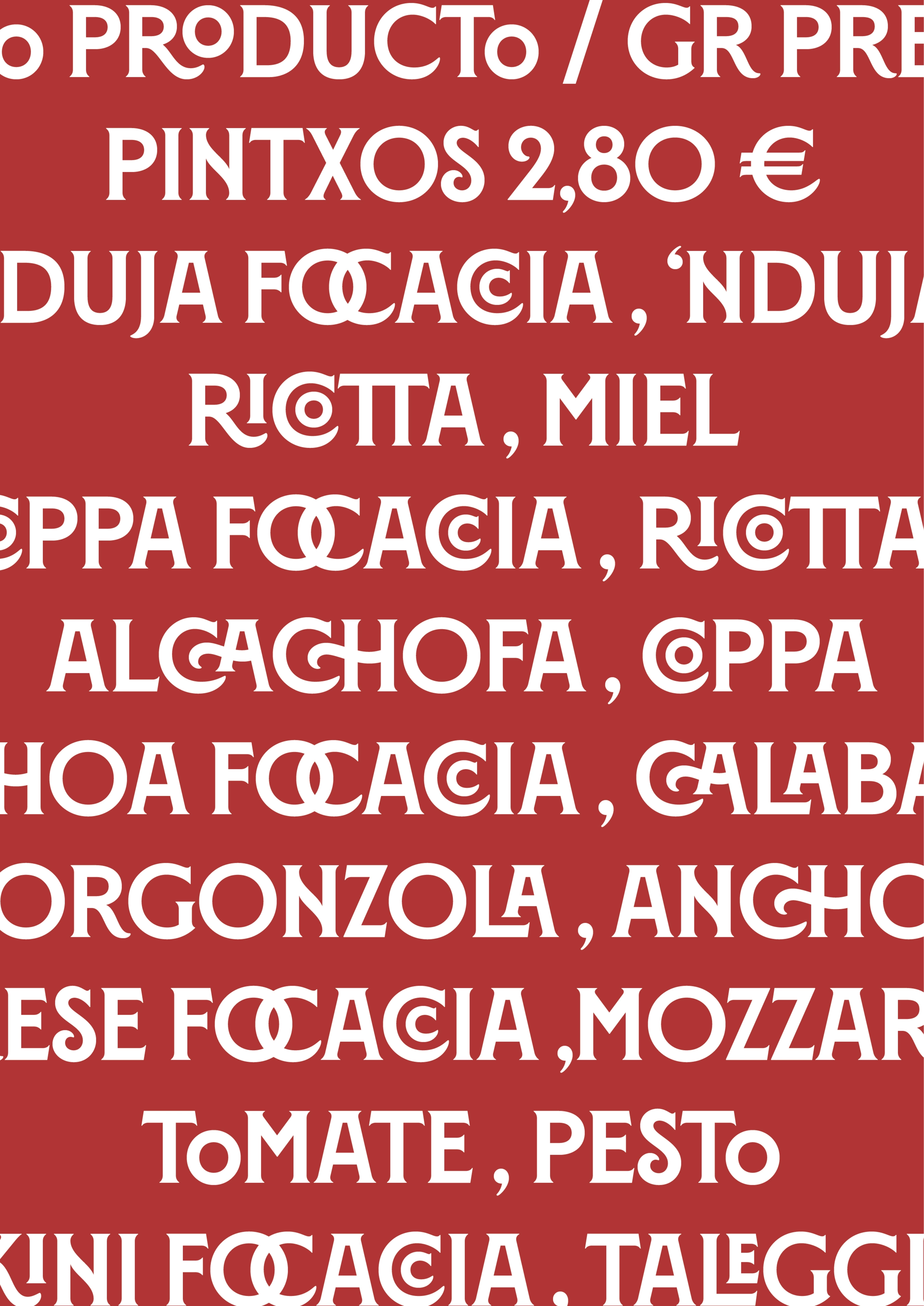
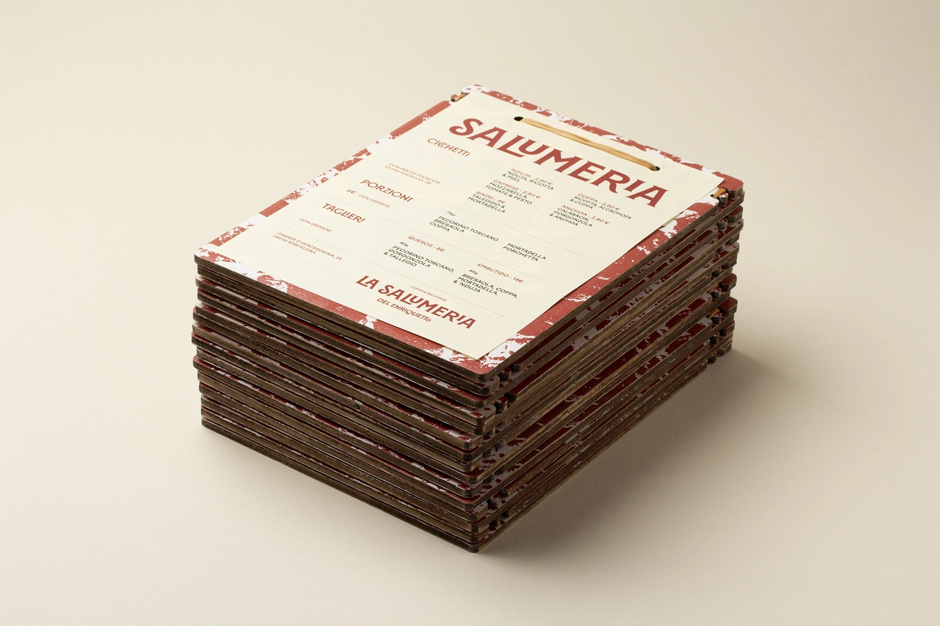
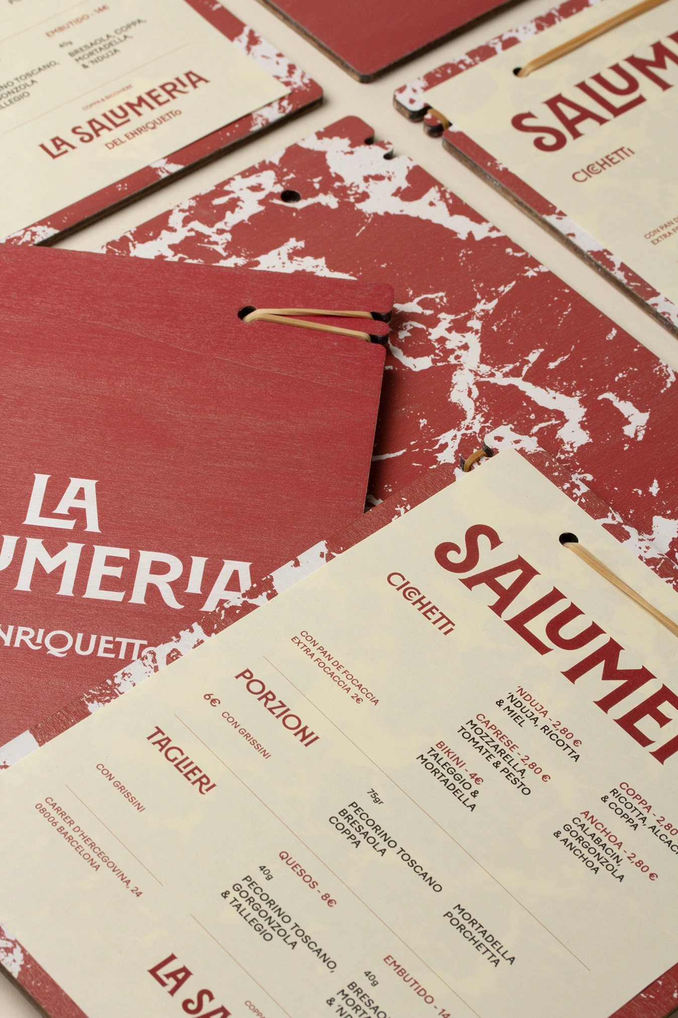
The menu layout is clean, with clear hierarchies, sober use of color and a functional organization that respects the informal but careful tone of the place. The balance between craftsmanship and graphics remains constant.
La Salumeria is presented, graphically, as a bar with soul, where design is not ornament but language: typography with character, text and graphics.
Credits
Client
Kim Díaz & Enric Rebordosa
Lettering on site
Leonel Signs
City
Barcelona
Year
2024