
Mammafiore
MAMMAFIORE is not just a distribution company of high quality Italian products; it is an emotional journey to the heart of the Italian culinary tradition. From Barcelona, this project, born from the complicity between a Catalan and an Italian, brings with it the most authentic flavours of Italy: parmesan, pasta, ragù, mozzarella, panettones and a careful selection of wines from the most emblematic regions of the peninsula.

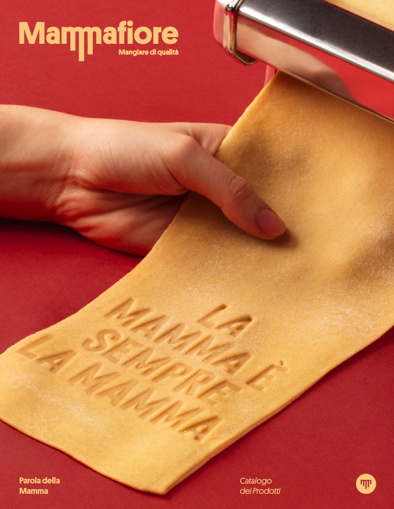
The design and branding of the brand takes this essence as a starting point.

In this way, we compile those endearing phrases that generations of grandmothers have repeated to their children and grandchildren about table manners, the importance of family and respect for food. These phrases, full of wisdom and affection, become the soul of the branding, imbuing the MAMMAFIORE identity with authenticity and warmth.


The logo, simple but deeply symbolic, combines the spirit of craftsmanship and Italian tradition: the two letters M evoke the image of pappardelle drying in the sun, a nod to the artisanal process of fresh pasta. It is a visual metaphor that connects with the origin, the land, and the art of cooking that MAMMAFIORE represents.

The brand's main colour is a vibrant red, a tribute to pomodoro, the tomato sauce that is the base of so many Italian dishes, and a colour charged with passion, life and strength, intrinsic elements of Italian culture. It also connects with the Italian flag, reinforcing the link to its national identity.


The graphic identity is built around a system of icons designed to represent the different product categories: pasta, pomodoro, formaggi, dolci, pane...

Each icon has a nostalgic feel, inspired by the negozi alimentari of the 1950s, those Italian neighbourhood shops where you could feel the closeness and love for fresh produce. This visual approach transports customers back to a time when quality and origin were everything.

Every detail of the design, from product labels to stationery and packaging, is designed to convey that authenticity, that love of good food and that unique Italian Mediterranean character. MAMMAFIORE not only distributes products, but also invites you to live a sensory experience that unites the best of Italy with the heart of Barcelona.

MAMMAFIORE is more than just products; it is culture, it is history, it is a celebration of the small rituals that make food sacred.


Credits
Client
Marc Canillo
Illustrations
Lo Siento
City
Barcelona
Year
2021