Tallers Oberts
TALLERS OBERTS 2025 - Graphic Campaign
A visual identity inspired by the process, the hand and modular creation.
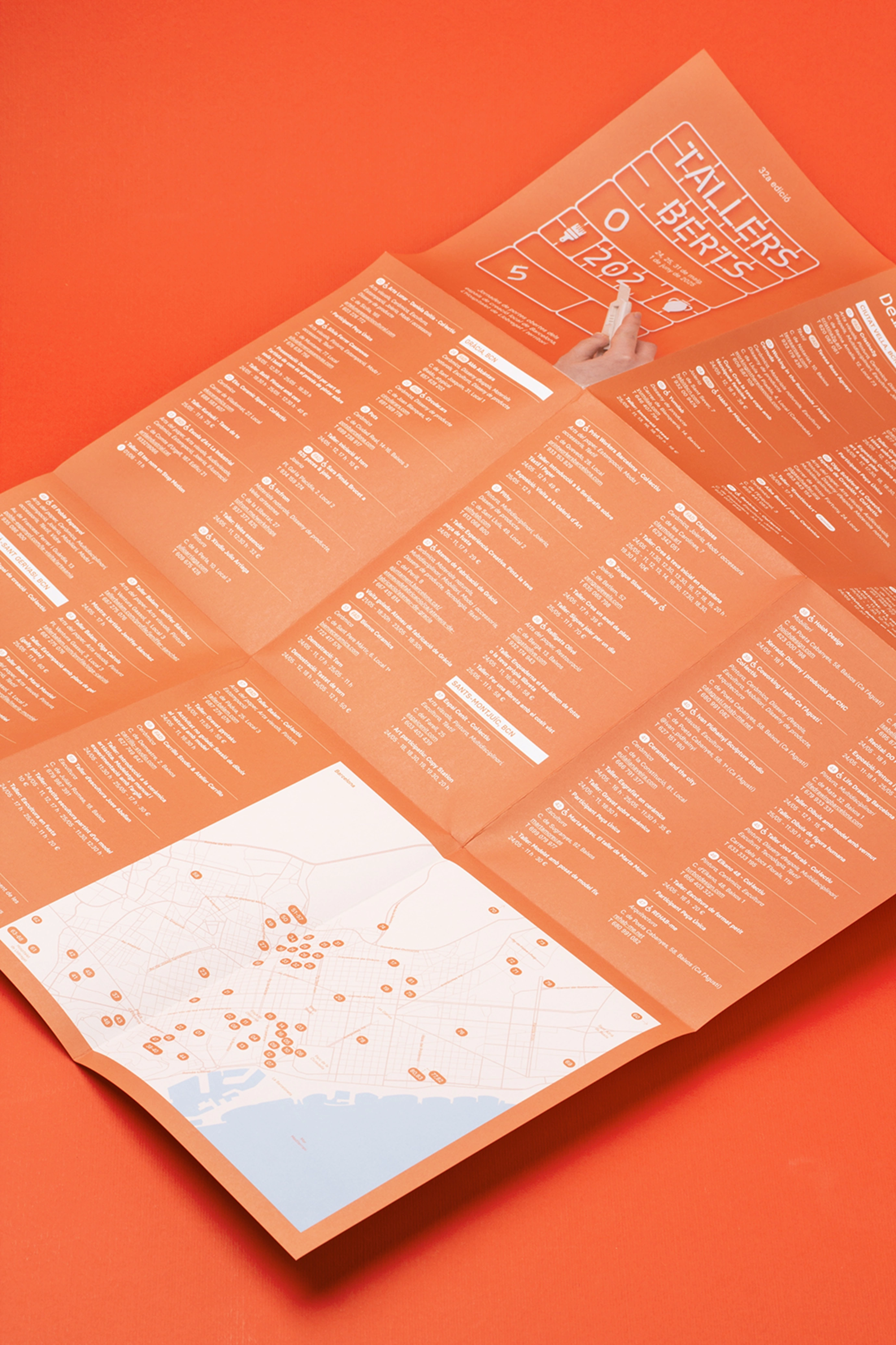
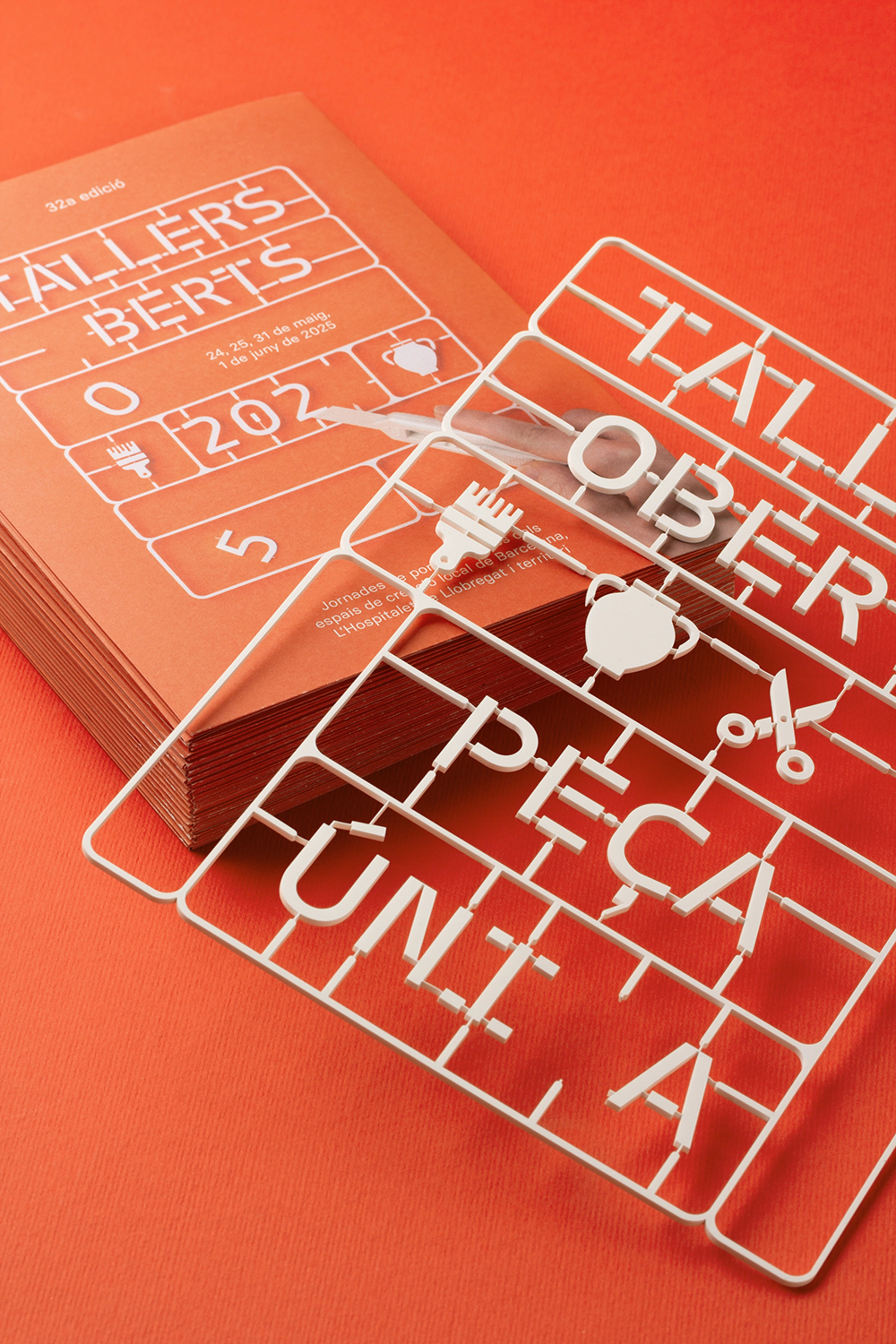
For the 32nd edition of Tallers Oberts, a graphic campaign is proposed that pays homage to the universe of handmade creation from a contemporary and symbolic point of view.
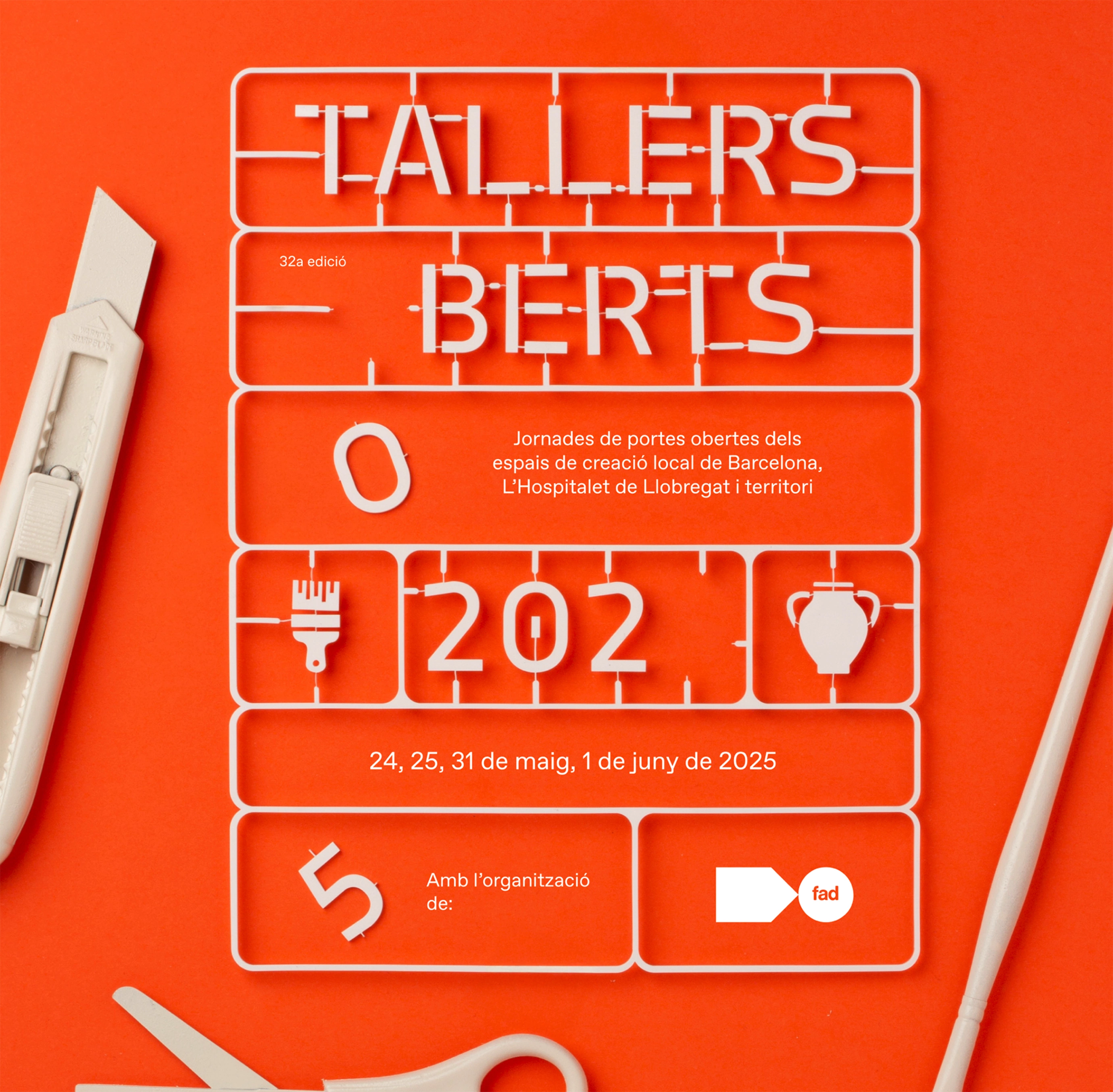
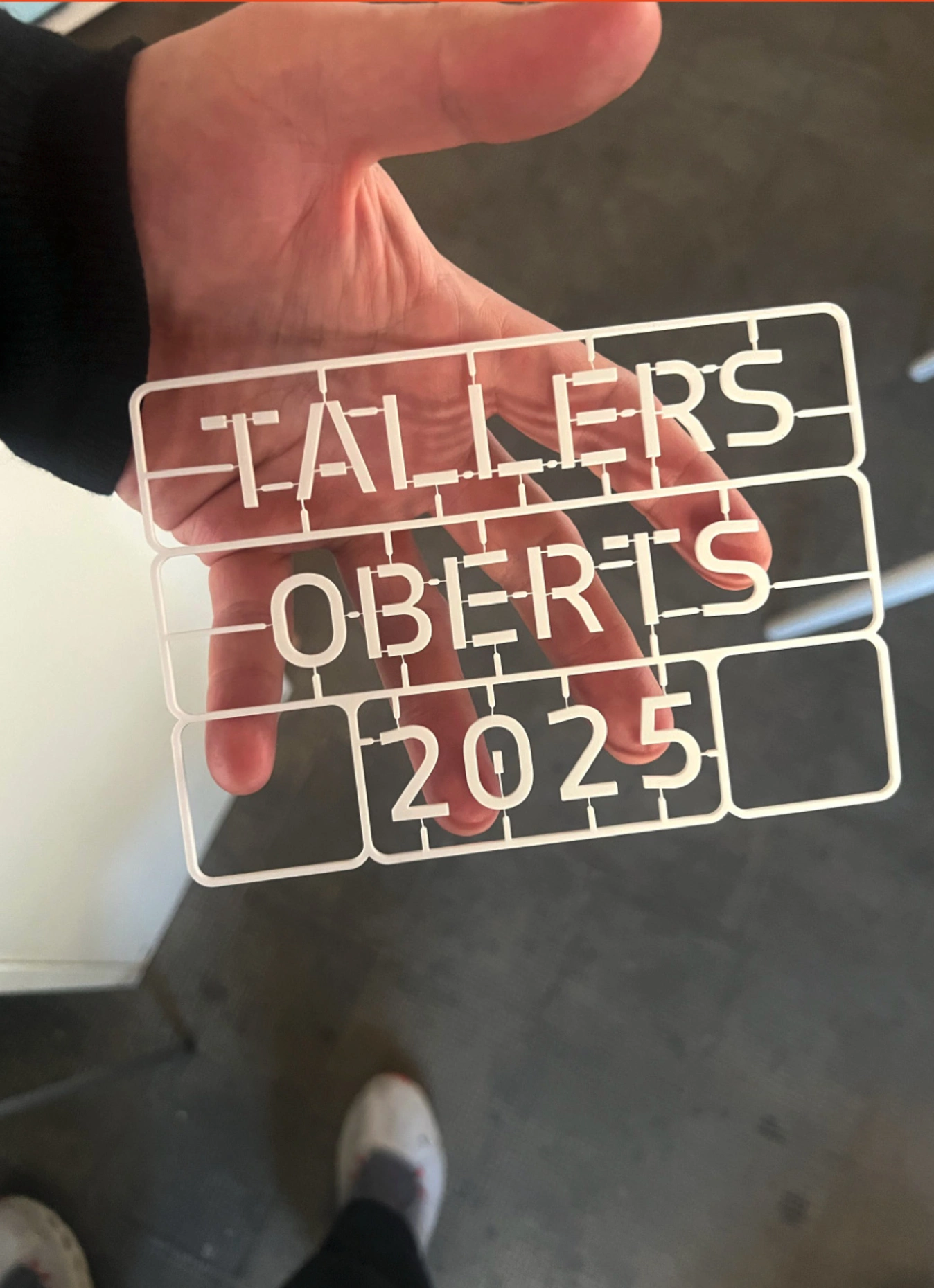
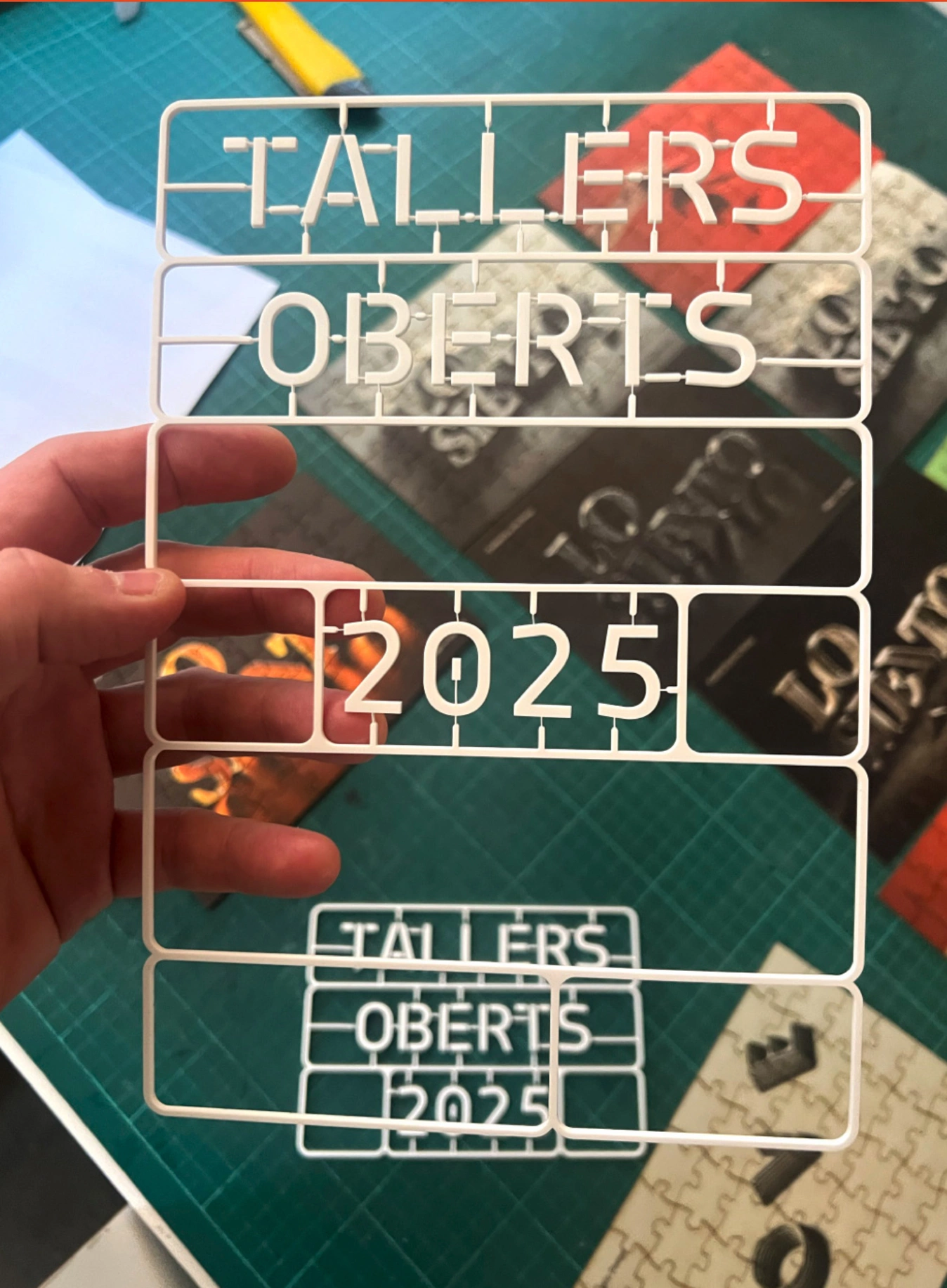
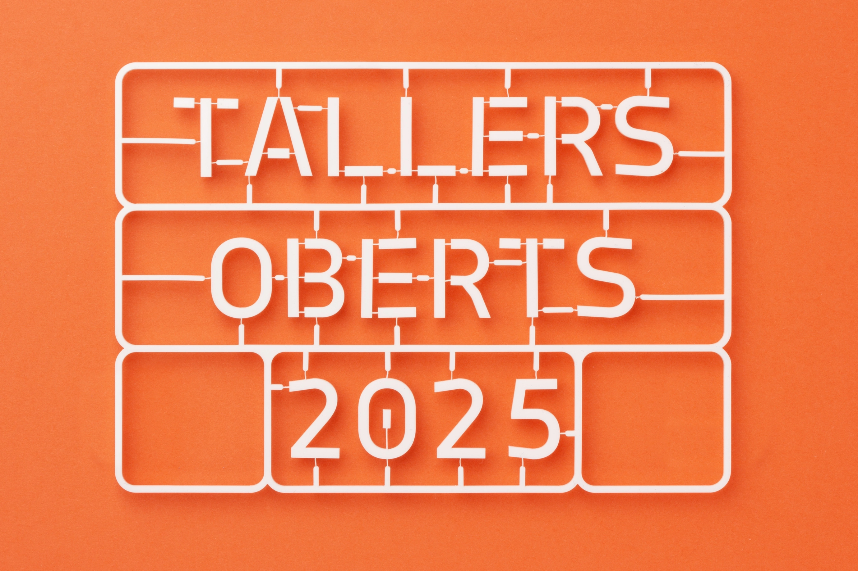
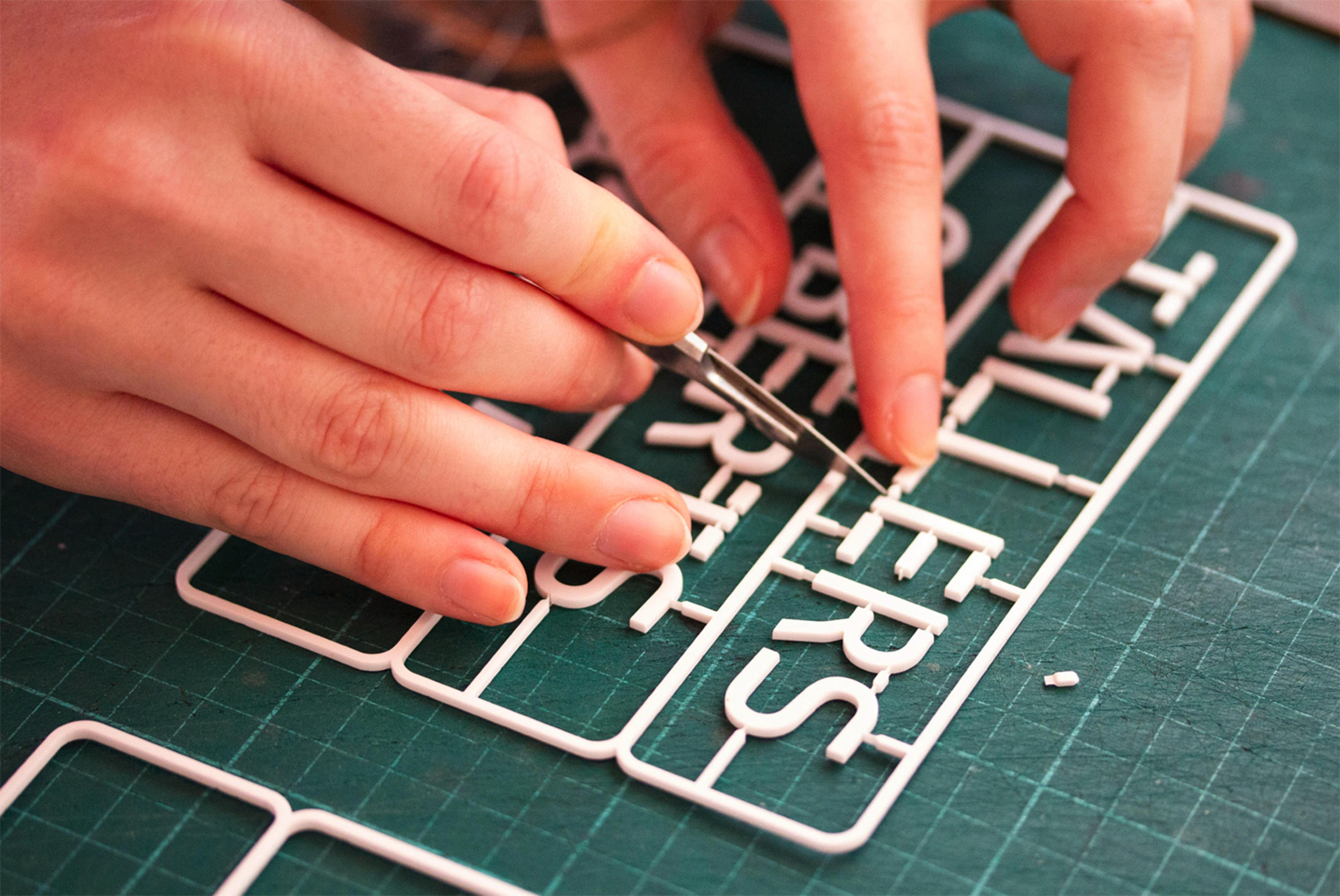
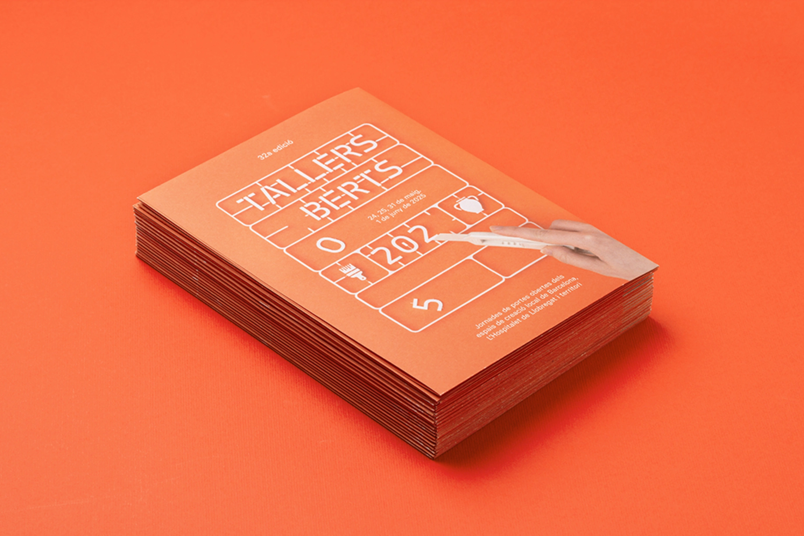
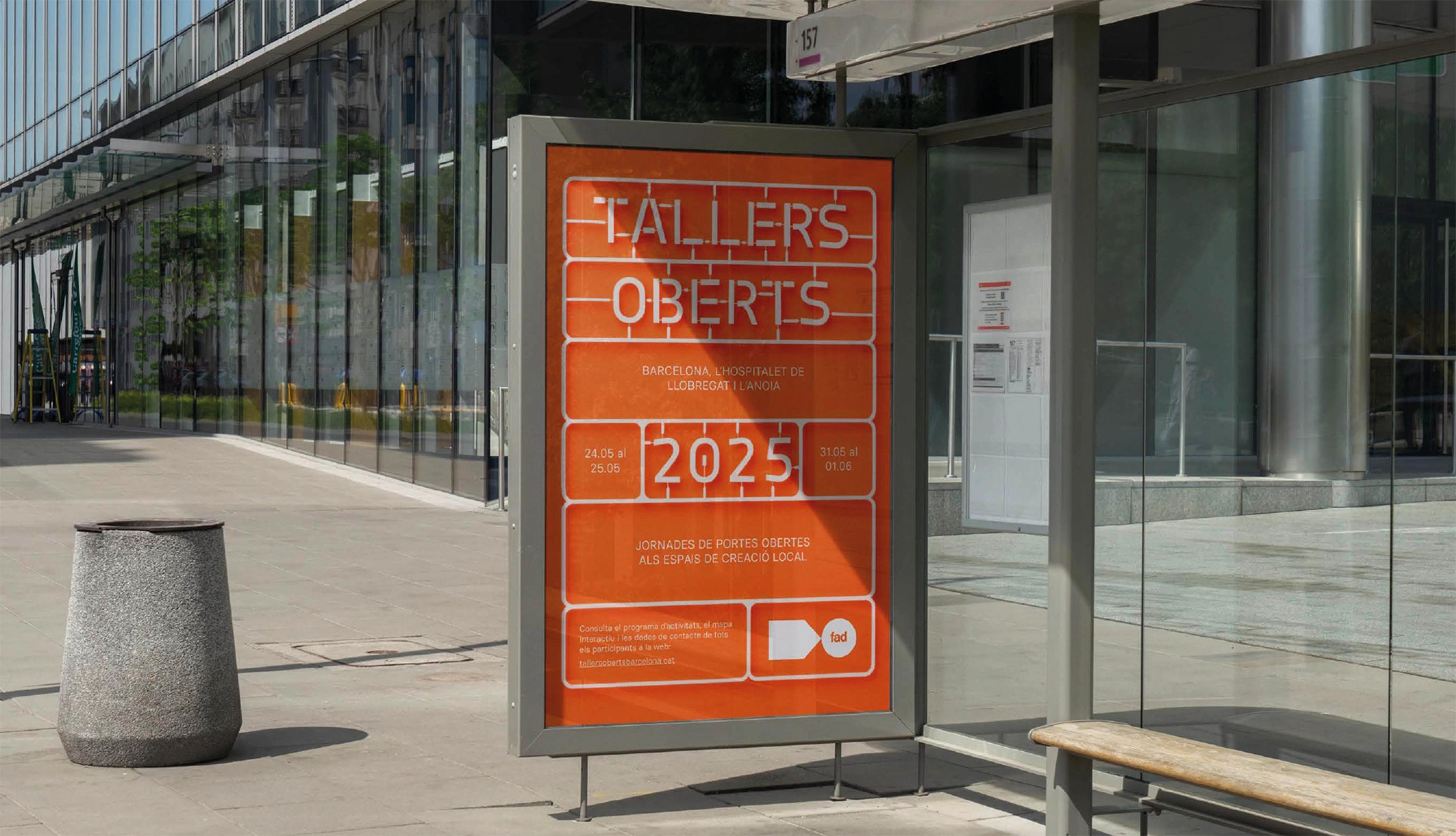
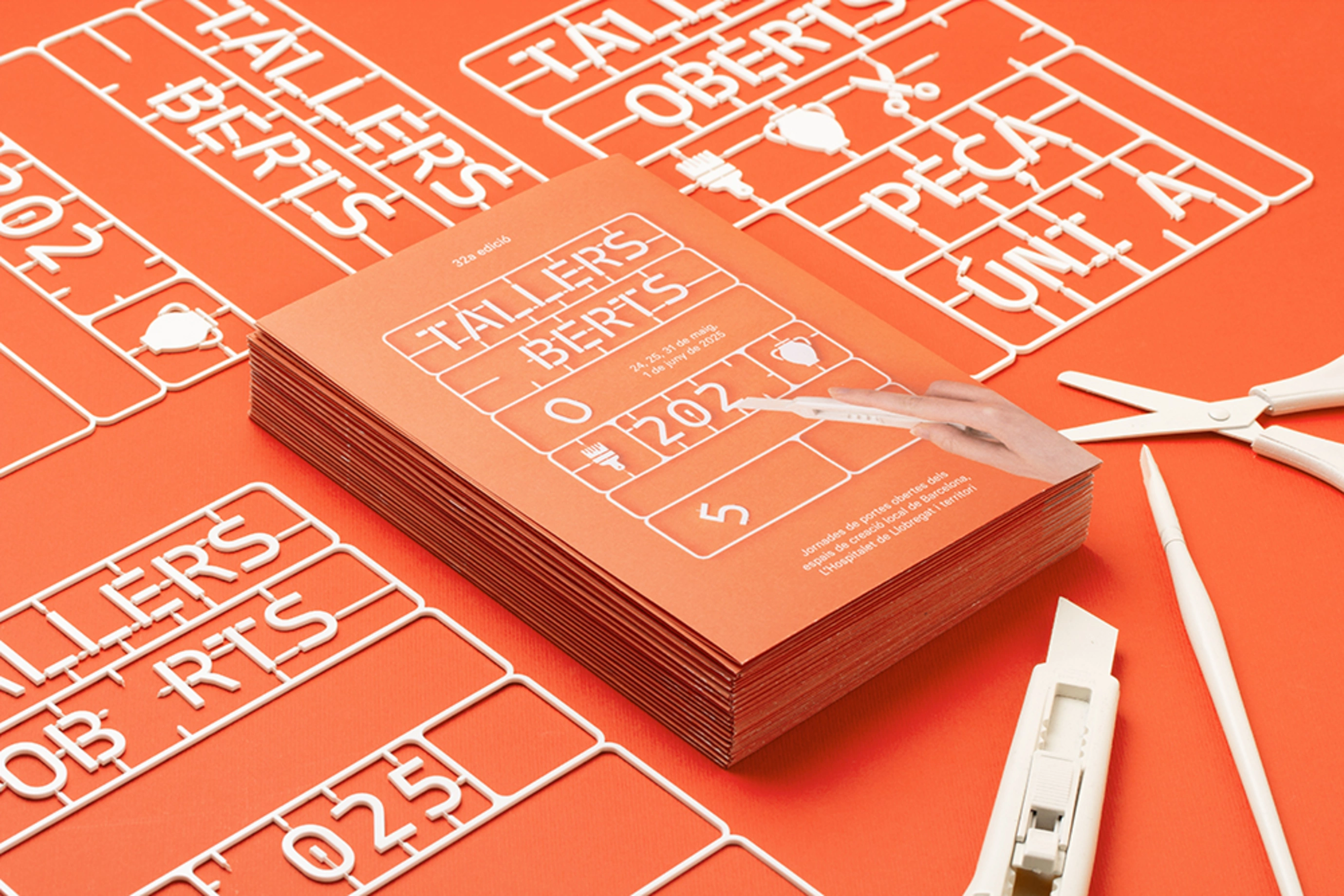
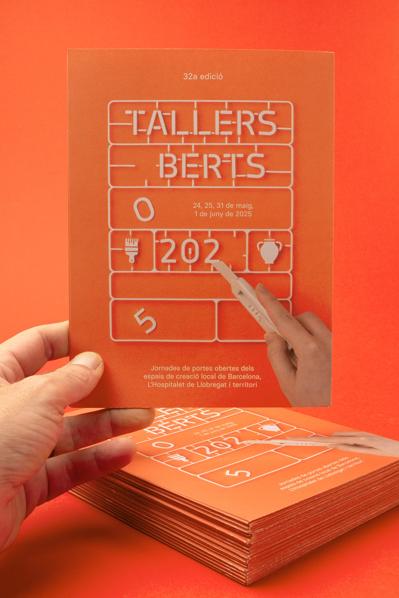
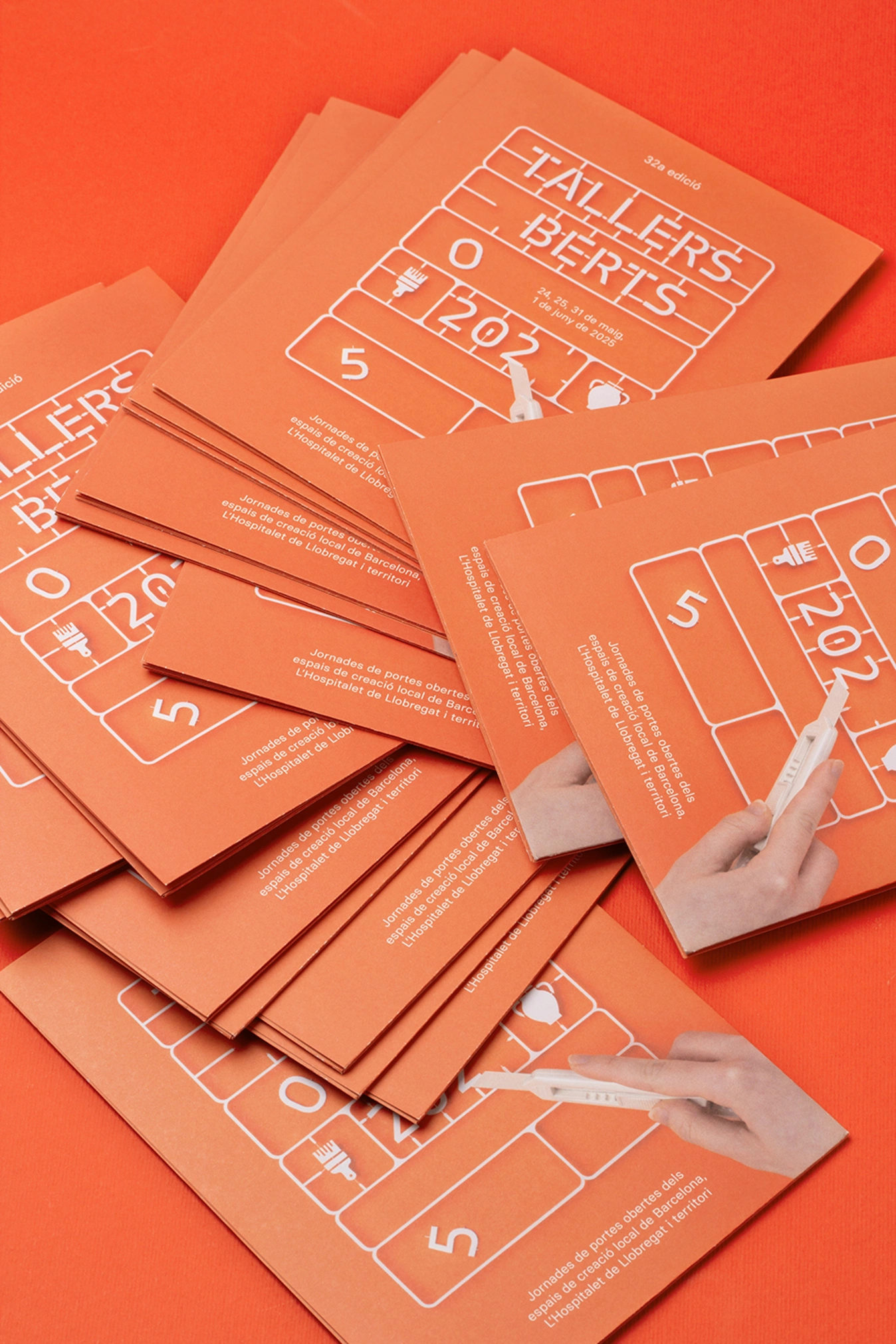
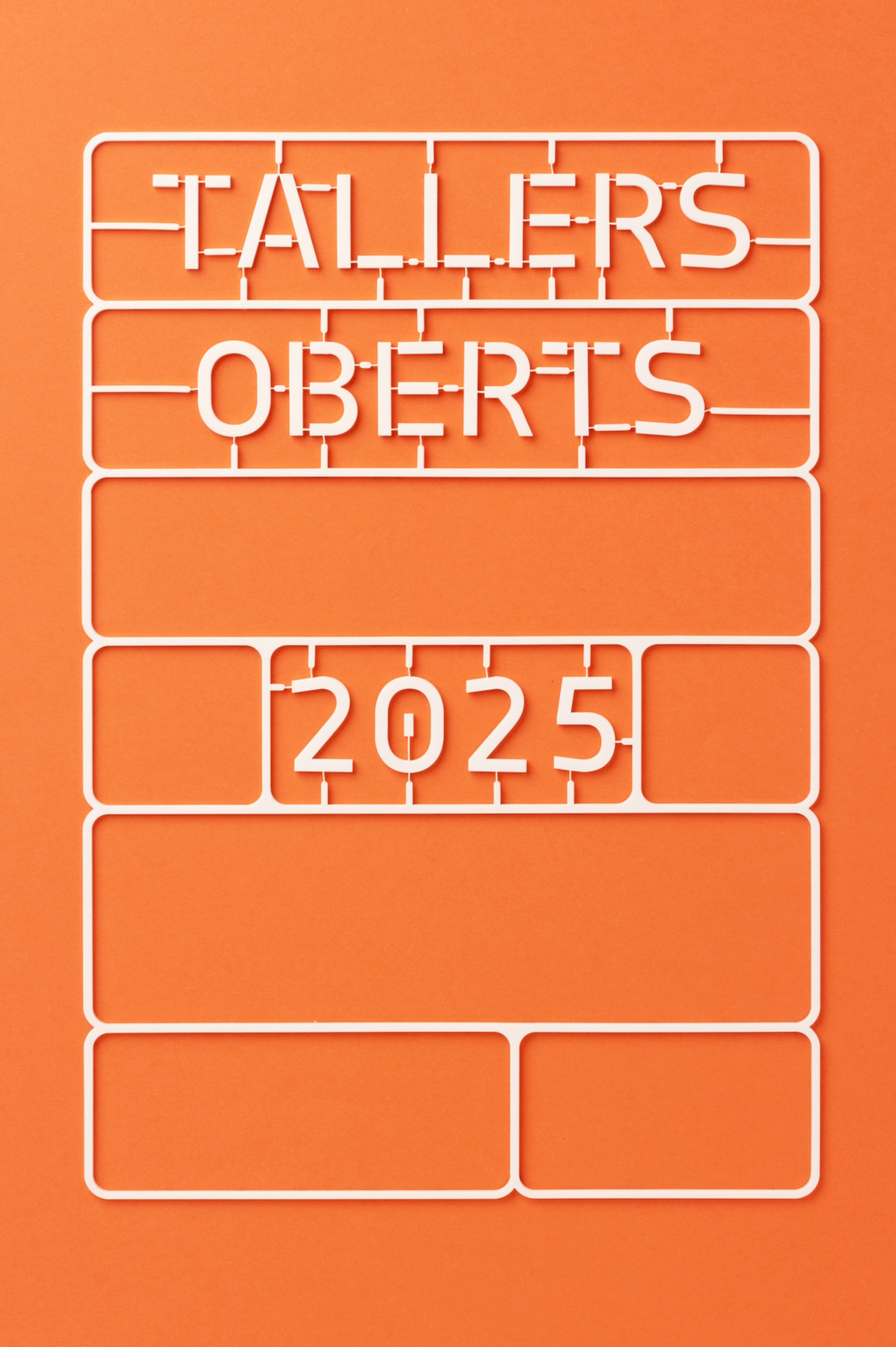
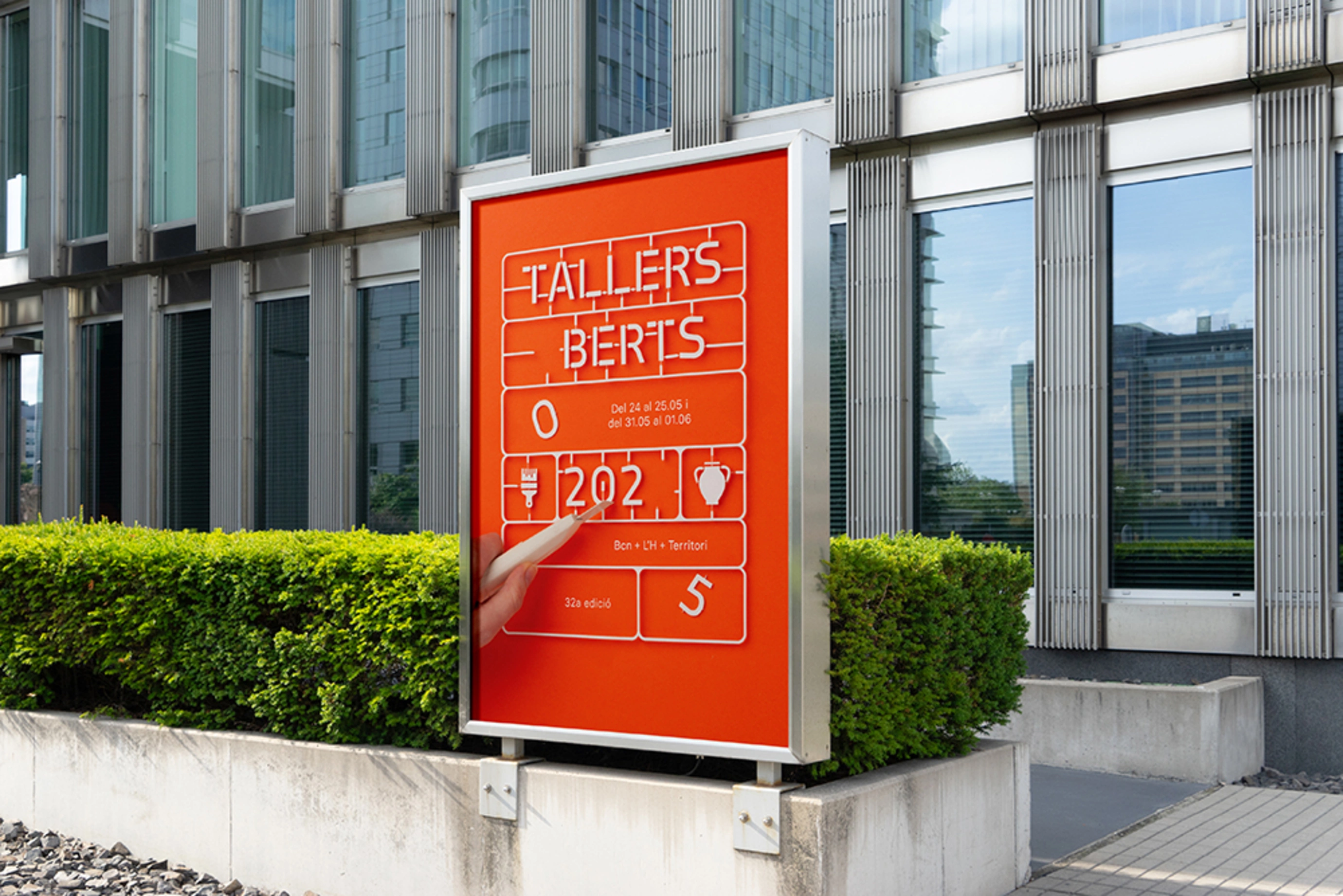
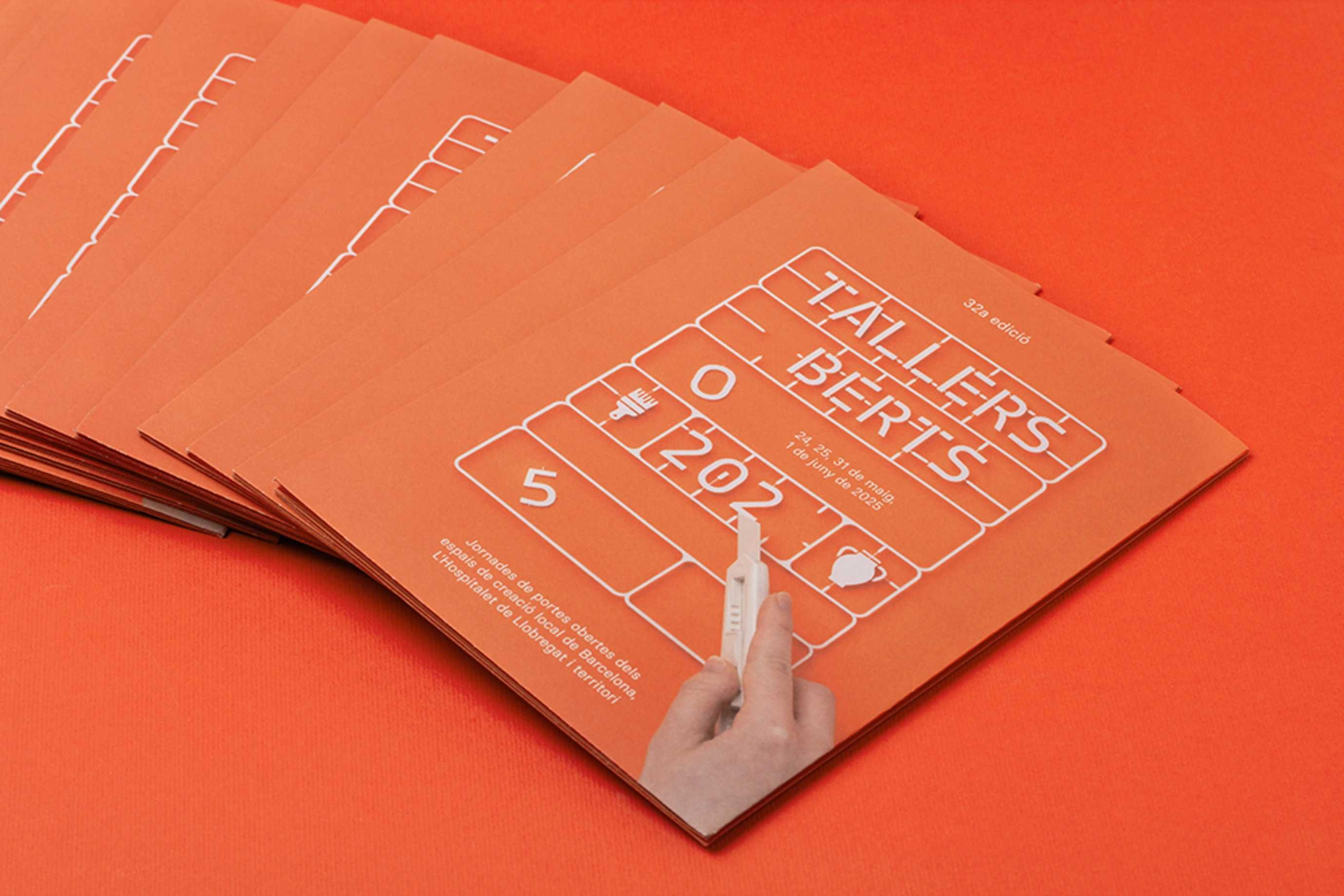
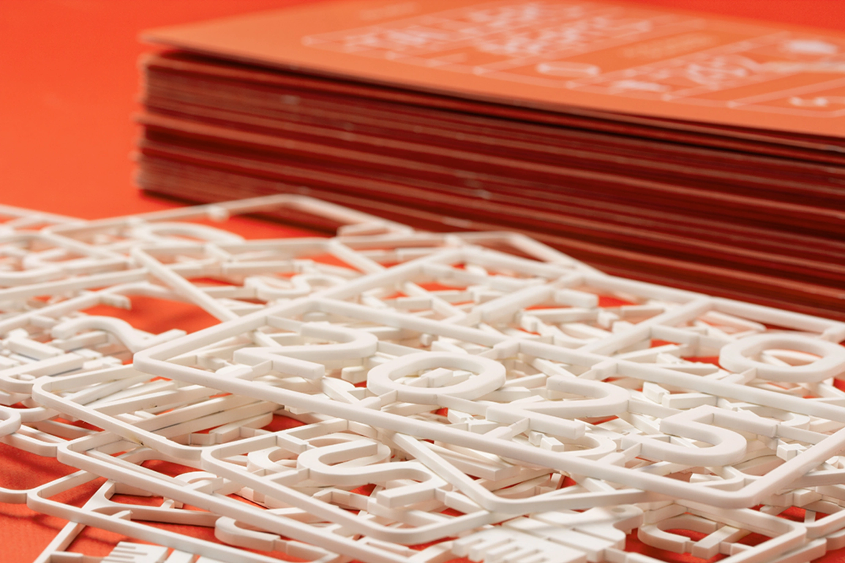
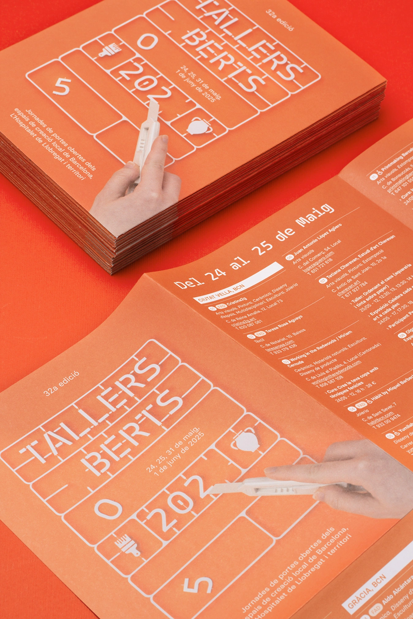
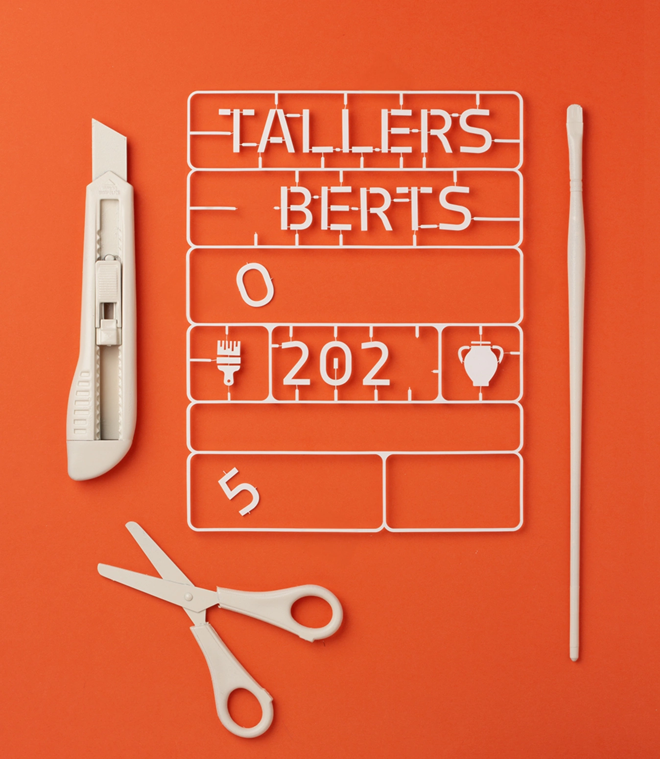
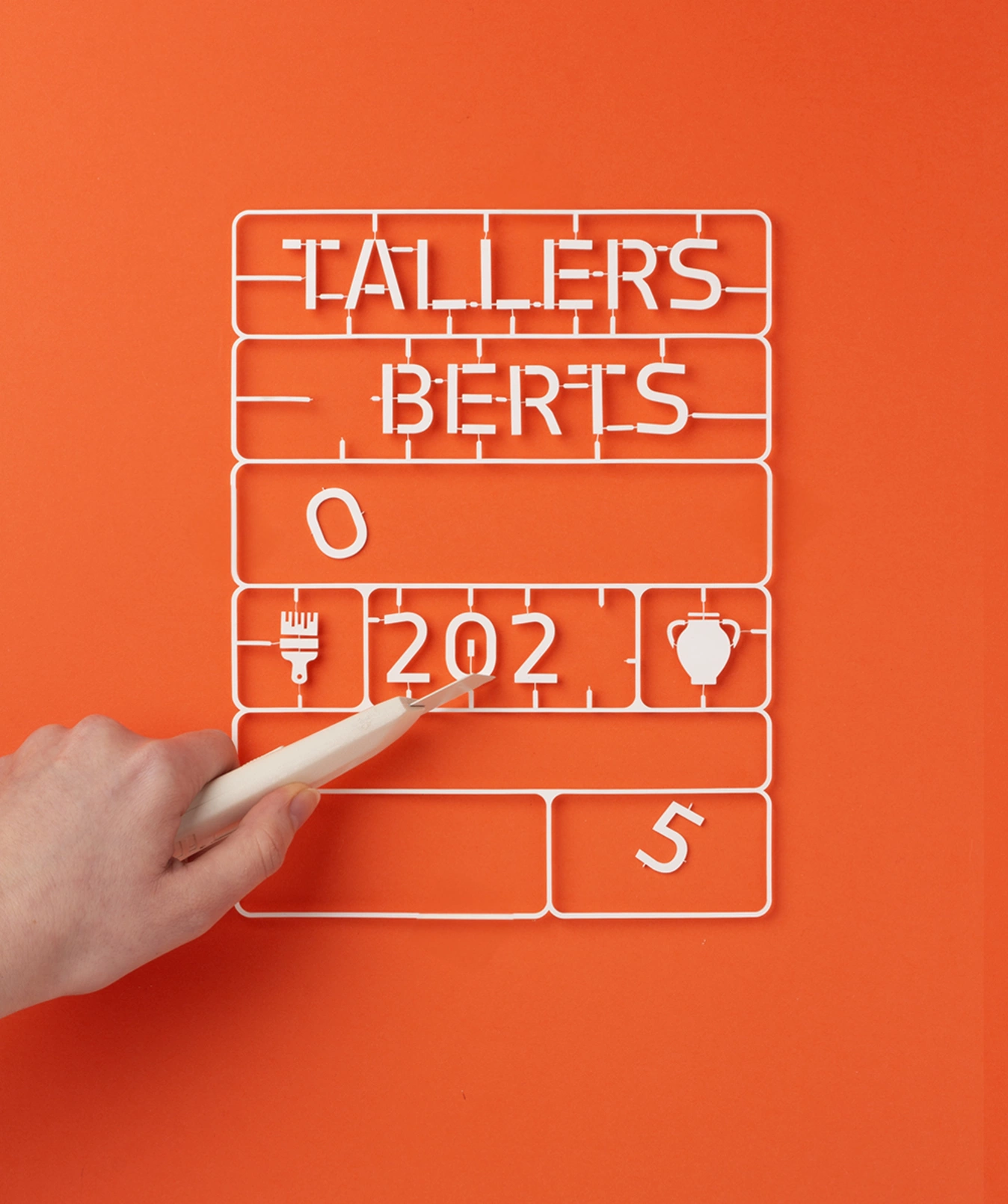
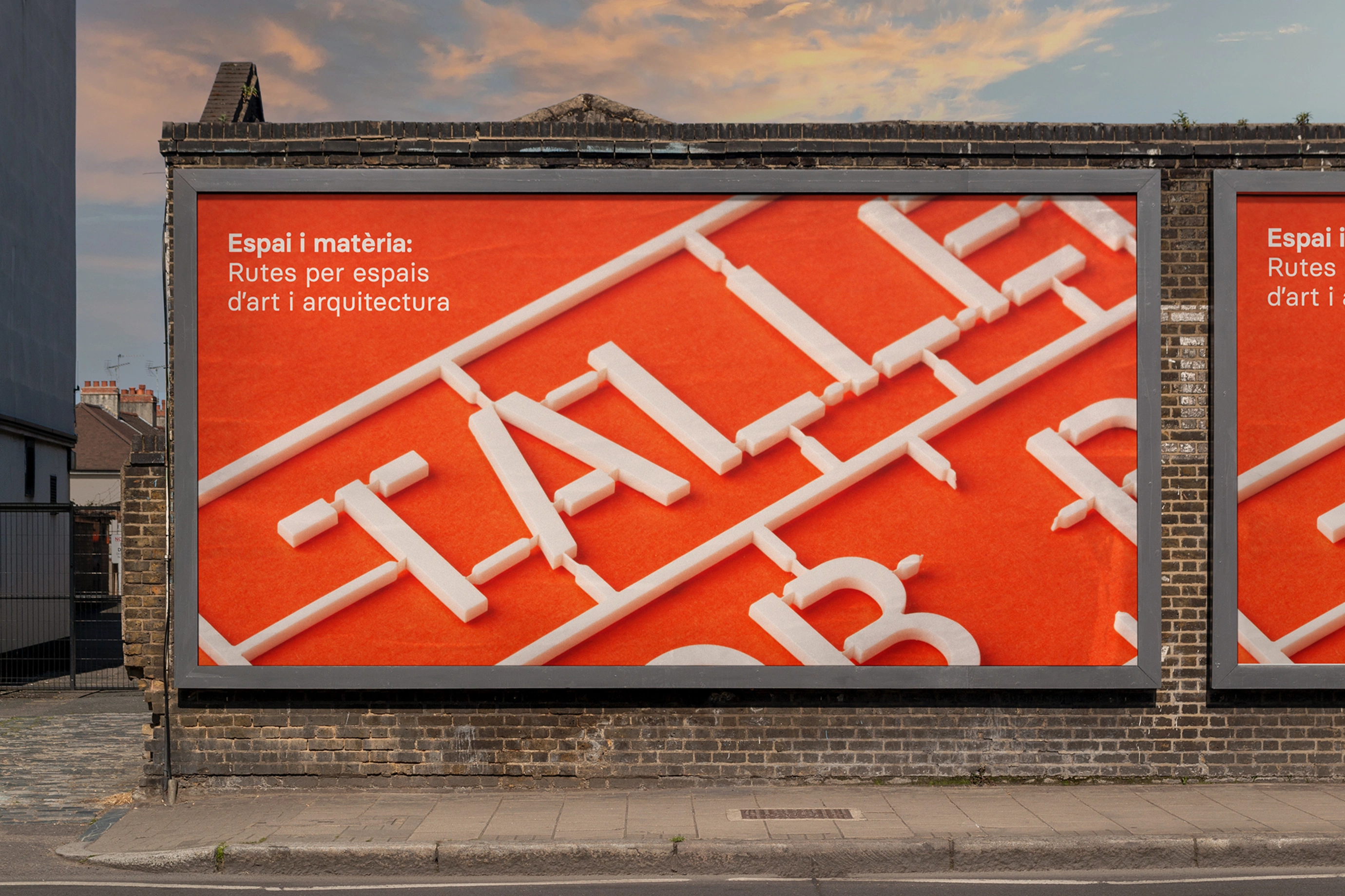
The design takes as a visual reference the matrices of assembly parts -such as scale models- to build an identity that speaks of process, assembly and creative potential.
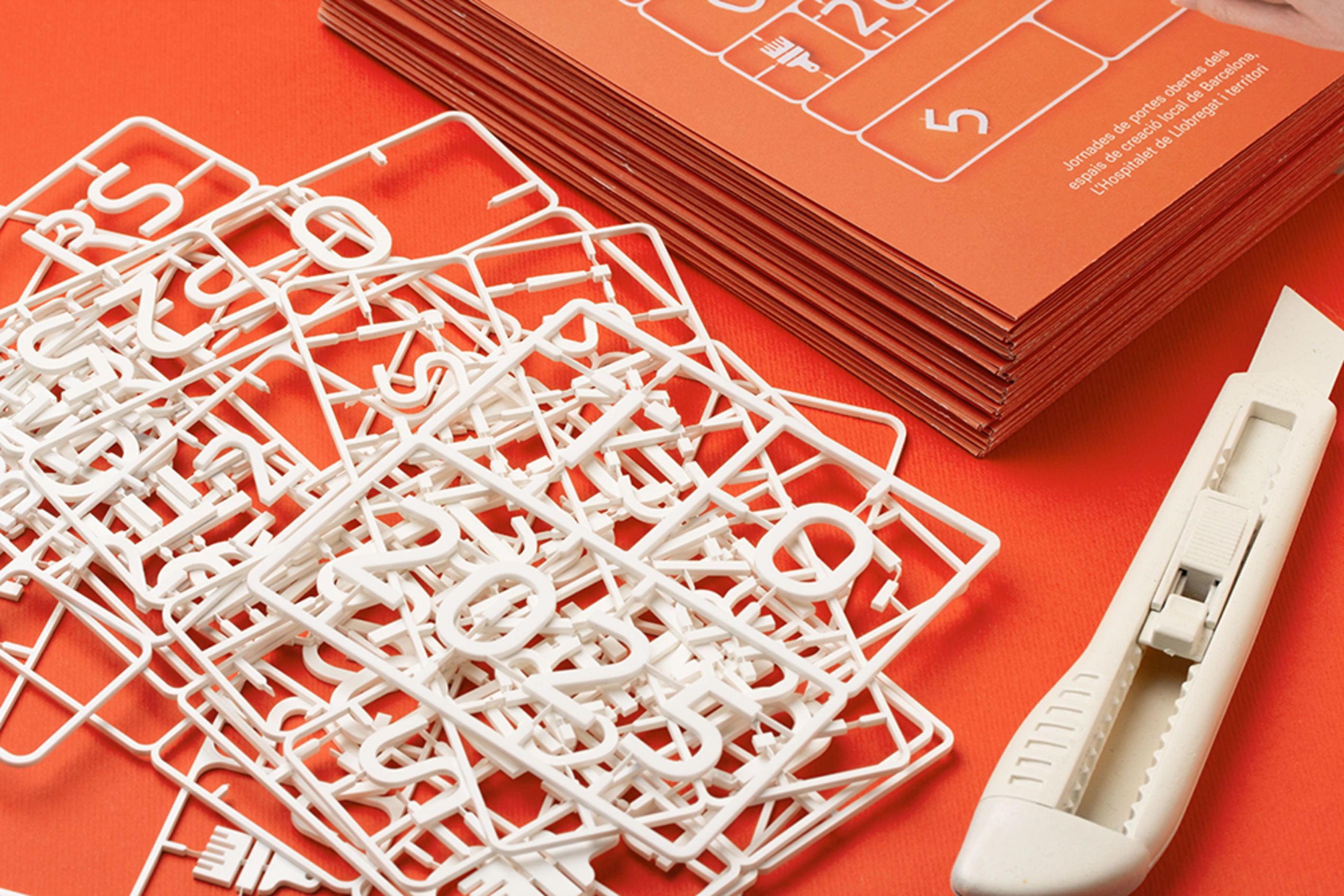
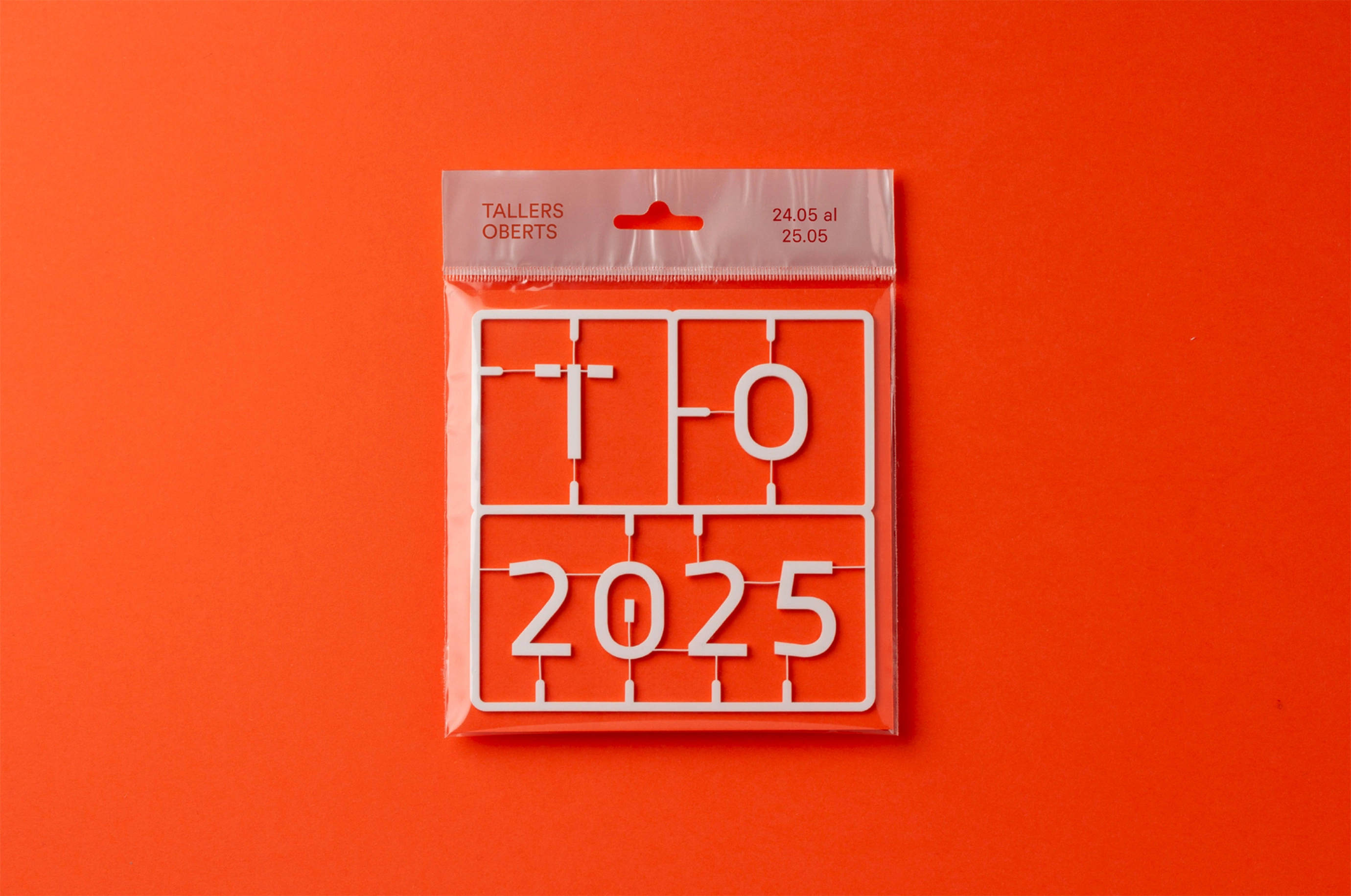
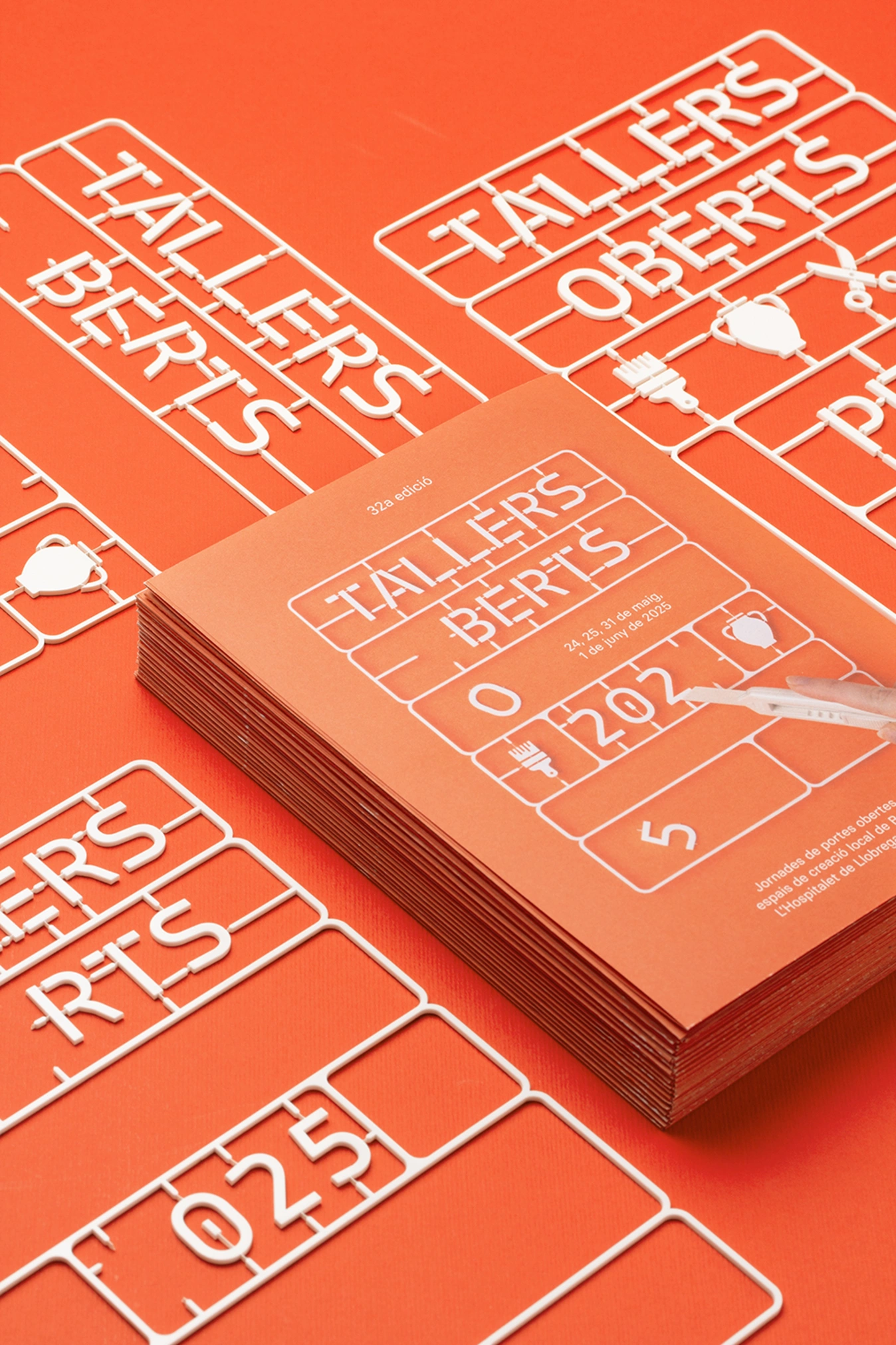
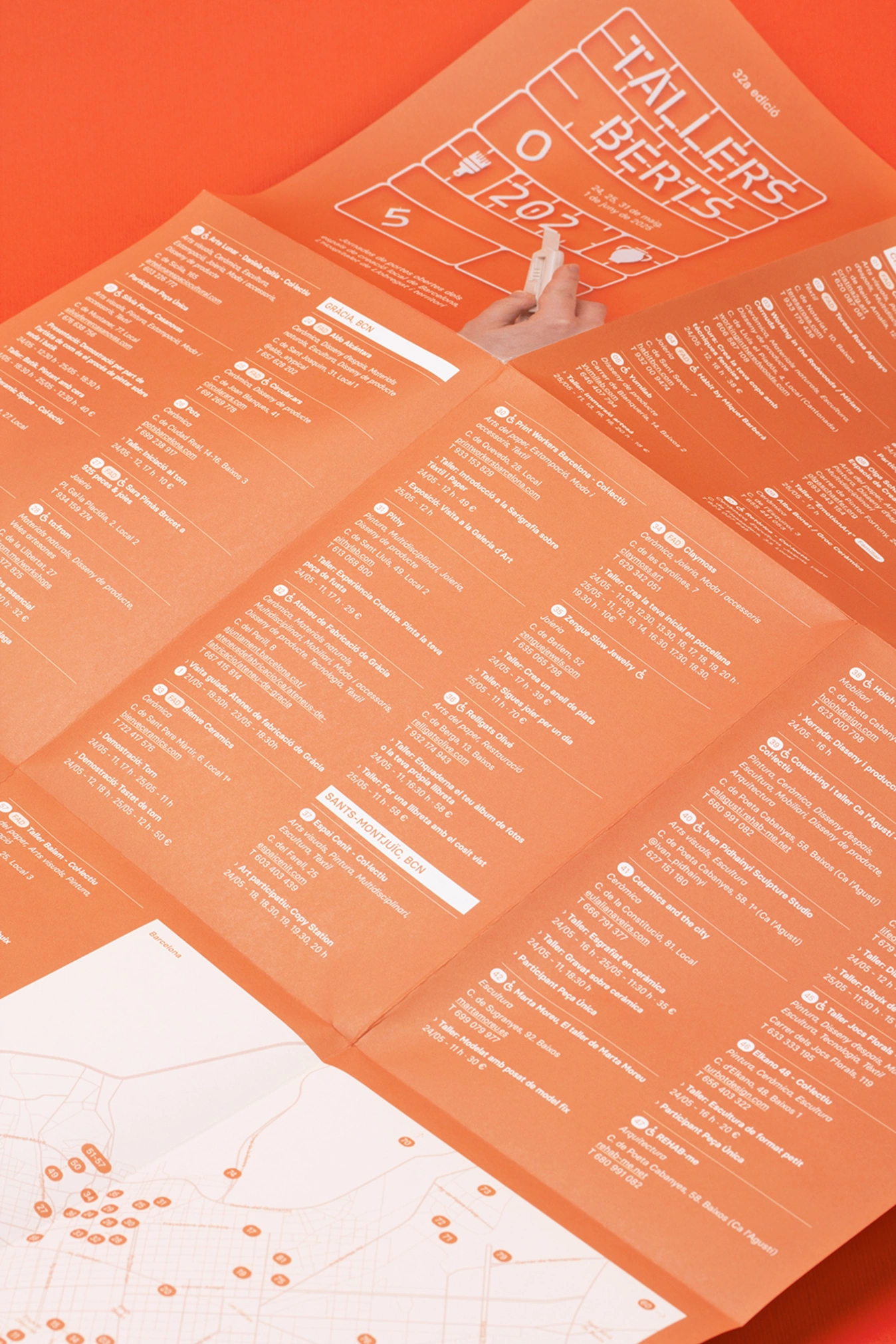
The graphic elements appear ‘on standby’, as if they could be detached and activated by the hand of the artisan. This visual metaphor - reinforced by the image of the cutter - suggests that each workshop is a space to be constructed, moulded and personalised, and that each creator is the protagonist of this transformative gesture.
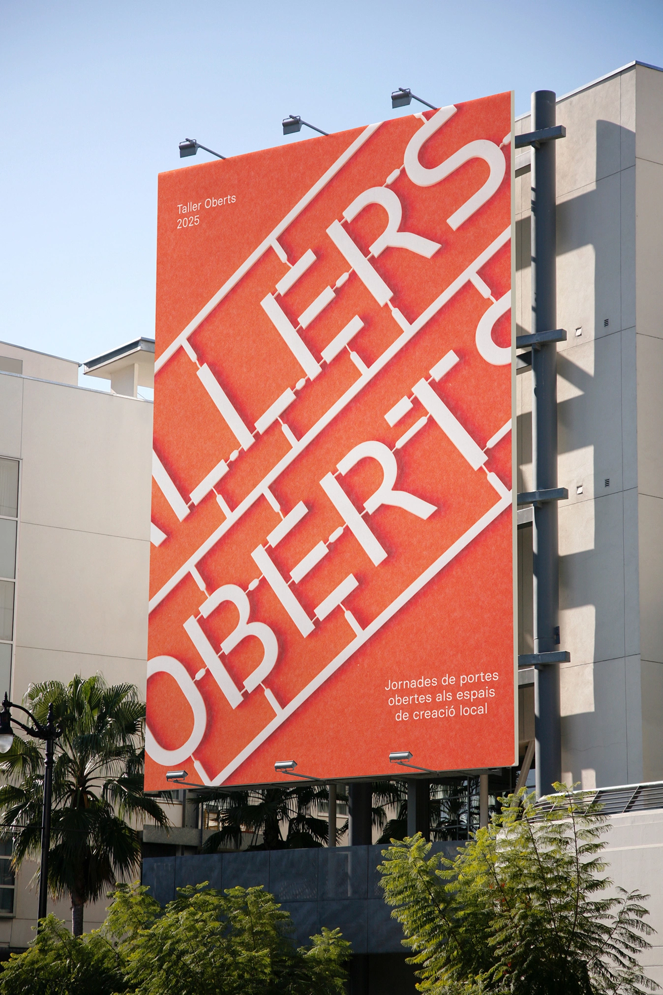
The use of saturated orange acts as a powerful, energetic and optimistic visual appeal. On this vibrant background, the white lines of the ‘die-cutting’ simulate a technical, almost industrial structure, which coexists with the idea of the manual, generating a suggestive contrast.
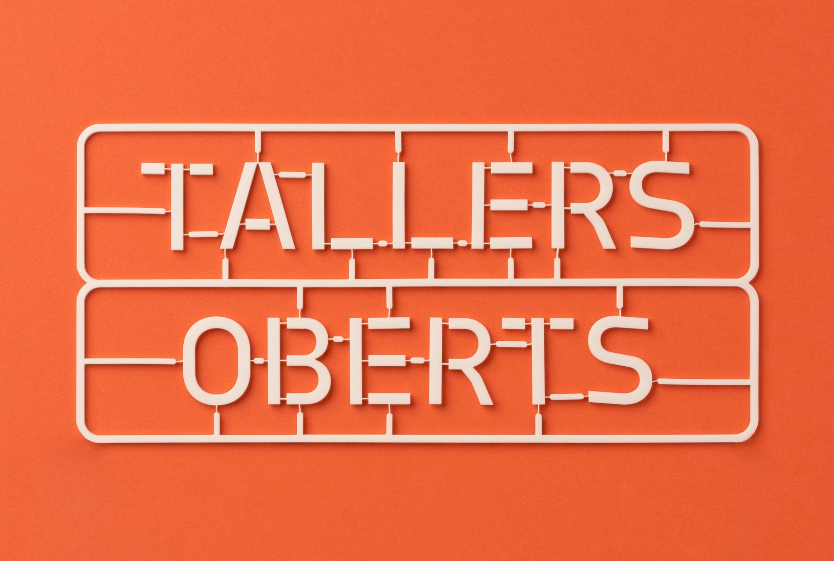
The typography used refers to the language of functional signage, but reinterpreted in a plastic and open way, evoking the game, the model and the work in process. The visual system adapts easily to print and digital media, maintaining its graphic power and evocative capacity.
Credits
Client
A-FAD
City
Barcelona
Year
2025