
The Coaches
When THE COACHES arrived at our studio, it brought with it a clear mission: to transform leadership within organisations to make them more human, more creative and, above all, more aware of the people in them. His approach is not based on universal recipes, but on integral and personalised solutions that respond to the specific needs of each client and each moment.

Through leadership development programmes, executive coaching and diagnostic tools, THE COACHES not only accompanies companies, but also becomes their strategic partner, helping them to unleash the internal potential of their teams.


The challenge they set us was to create a visual identity that would reflect not only their practical and experiential methodology, but also their transformational purpose. They spoke to us about a more human world, about companies that prioritise people over results, and about the importance of inspiring teams to work in environments where they really want to be. All this had to be reflected in a brand that spoke of union, creation and connection.
The solution: Formulas that add up and multiply.
Our proposal focuses on a powerful idea: THE COACHES does not work alone, its value lies in what it builds together with its clients. We translate this concept of union and collaboration visually into a graphic system based on mathematical formulas.
We use symbols such as + and = to illustrate how THE COACHES adds tools, methodologies and strategies to help companies achieve a more human leadership. These signs speak not only of solutions, but also of processes and tangible results, reflecting the practical and ‘learning by doing’ approach that characterises the brand.


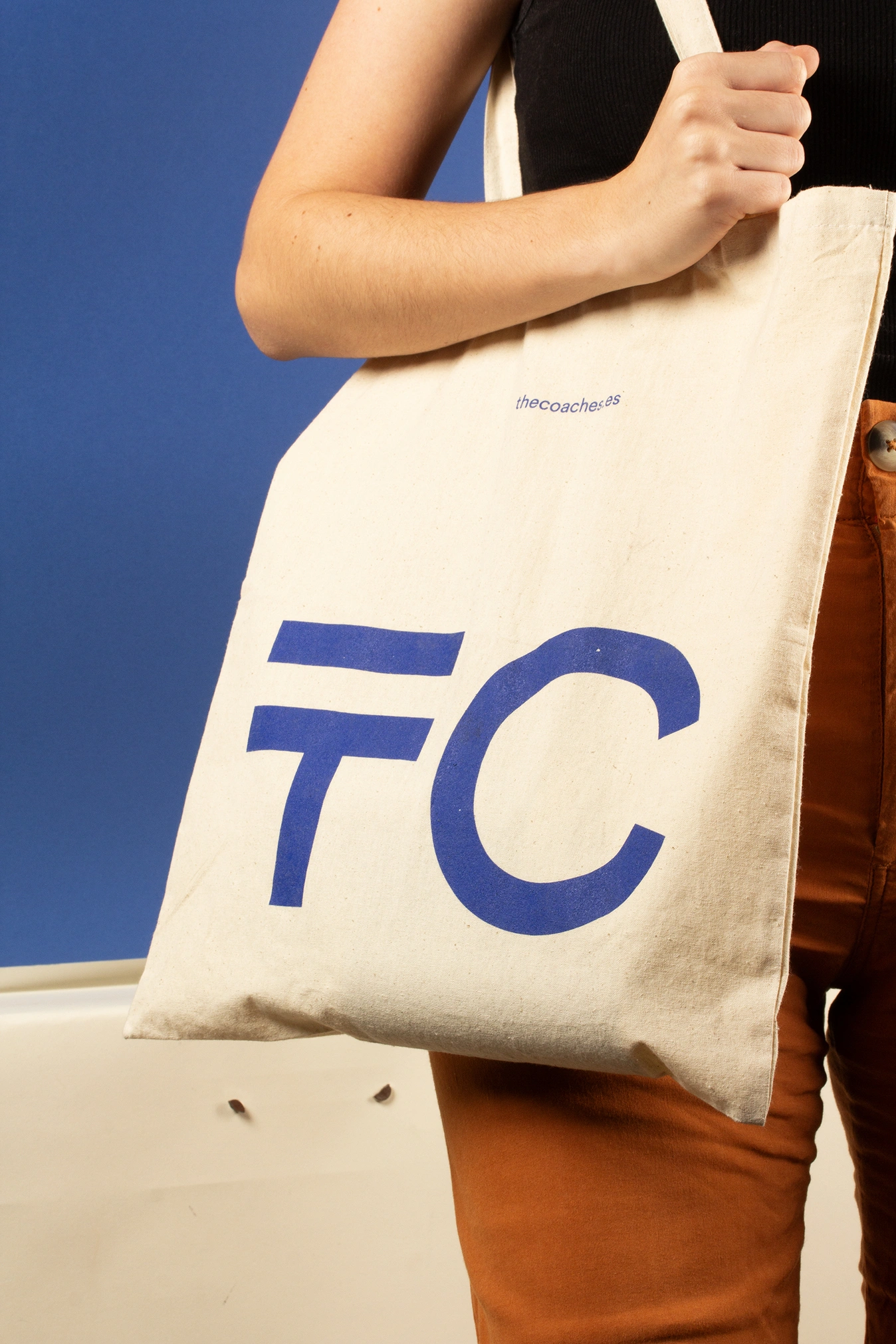
The logo becomes the epicentre of this idea. We hide the = symbol in the letters ‘E’ of THE COACHES, or in the T of TC, their brand symbol, as a visual wink that reinforces their essence: they have always been there to balance, connect and create results. This detail is not simply an aesthetic element, but a symbolic statement of their transformative purpose.


A coherent and human visual system
To give the brand a strong and consistent identity, we chose a main colour that conveys professionalism and warmth, creating a clear and recognisable visual impact.


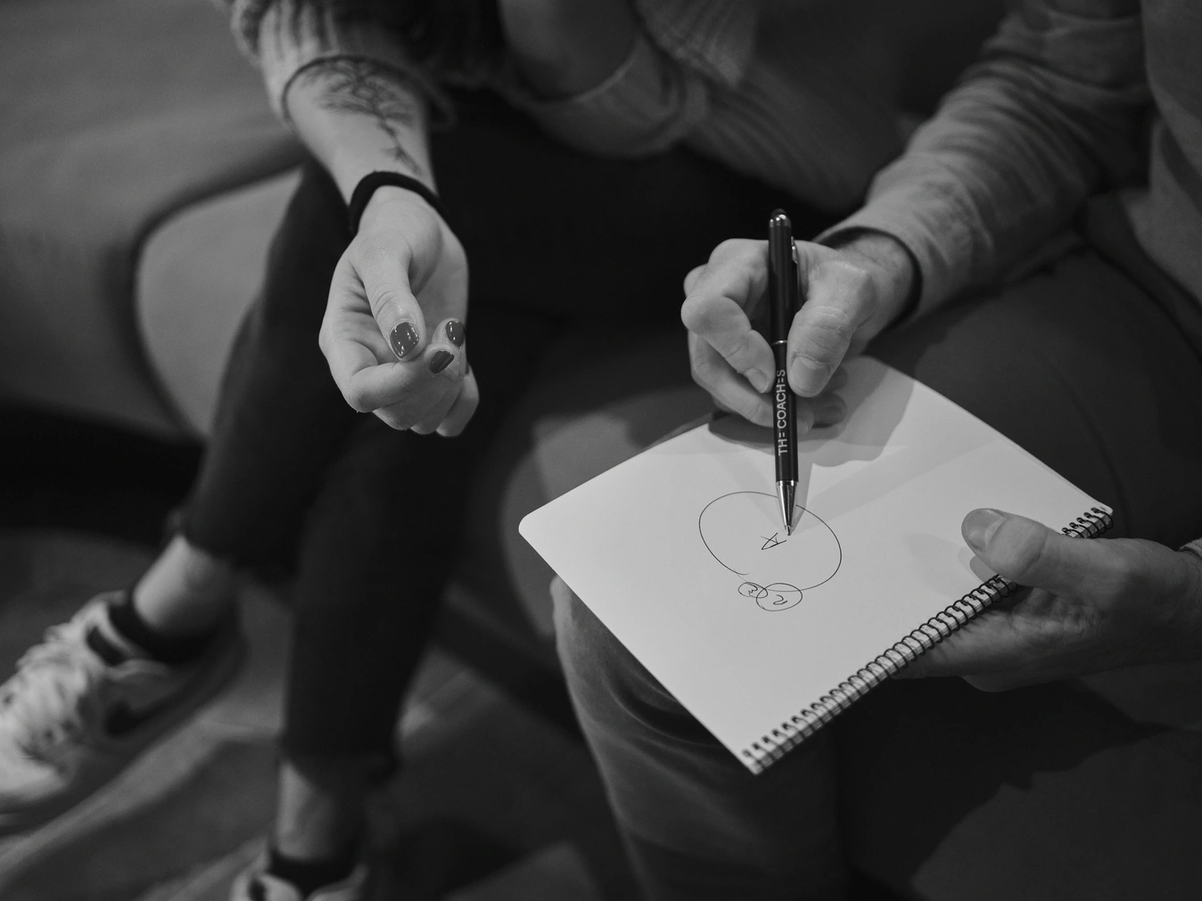
The palette is complemented by black and white photographs, which capture real moments of interaction, leadership and collaboration. These images do not seek to idealise, but to show the authenticity of people and teams in action.
In addition, we developed a series of graphic applications that reinforce the identity: Corporate stationery with clean, functional designs that reflect clarity and structure.
The end result is an identity that not only reflects THE COACHES' methodological approach, but also communicates its mission to empower people and organisations. It is a brand that speaks of formulas, not as something cold or calculated, but as a metaphor for what happens when the right tools are paired with the right people.

With this project, we have created more than a design; we have materialised a philosophy. THE COACHES is now a brand that not only connects with its customers, but also inspires organisations to imagine and build a more humane future.
Documents and diagnostic tools, designed to be visually accessible and reinforce the narrative of the bespoke solutions and the website, where the visual identity translates into an intuitive digital experience that is consistent with the brand.


Credits:
Client
Alex Galofré & Javier Garriga
Photography
Mariano Herrera
City
Barcelona
Year
2023