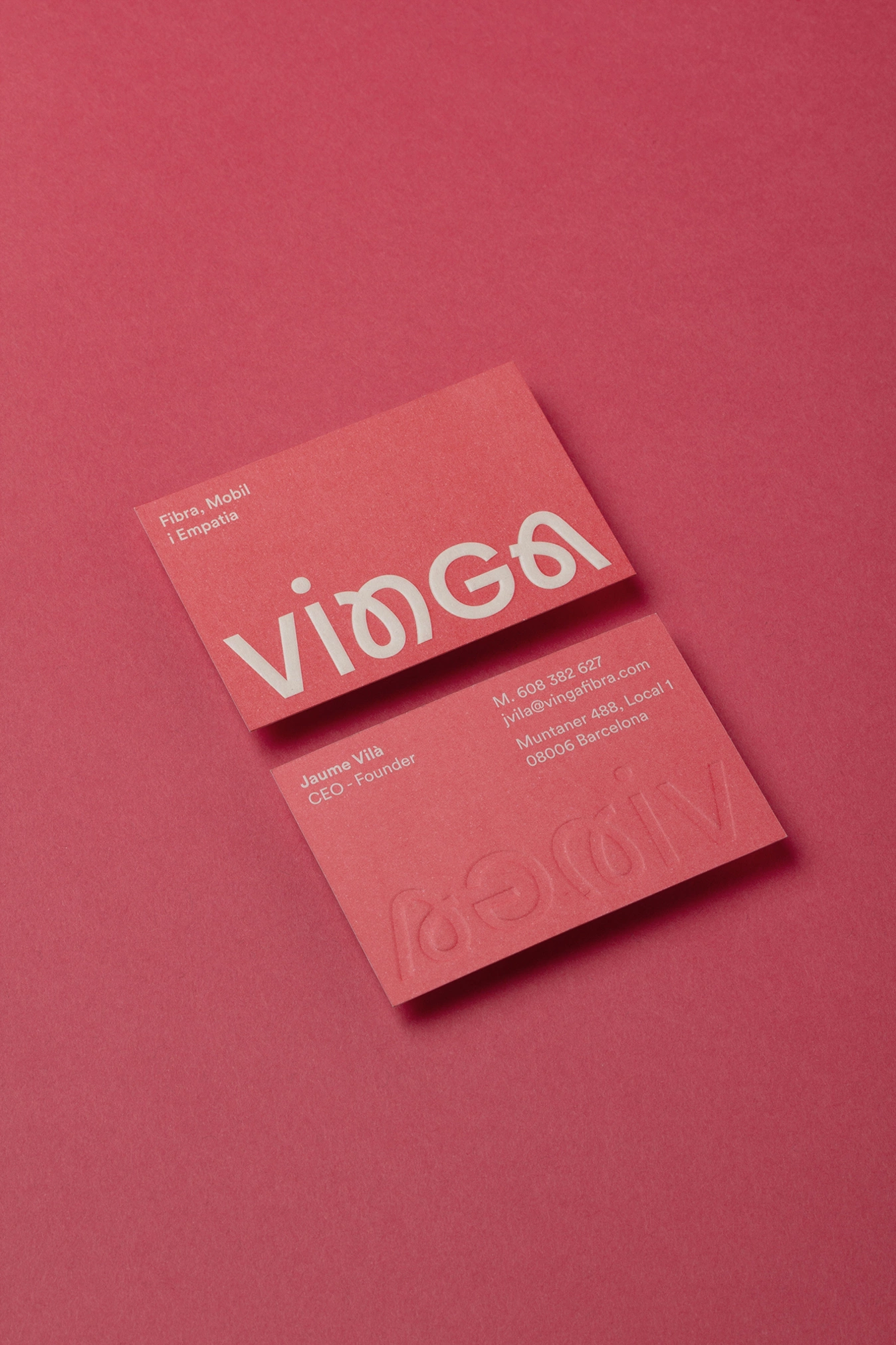
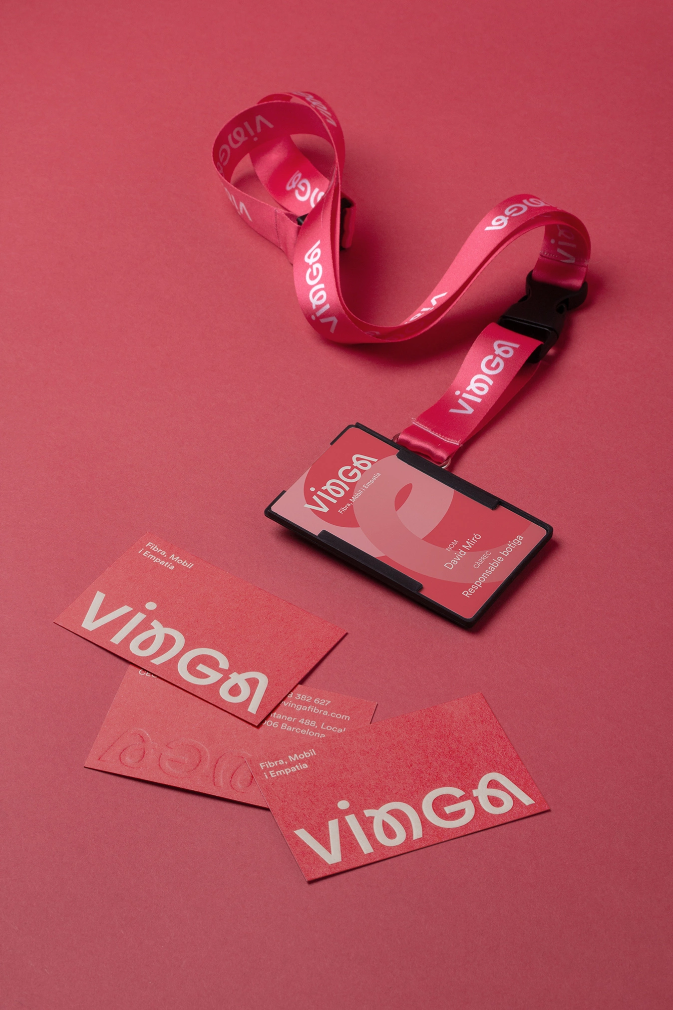
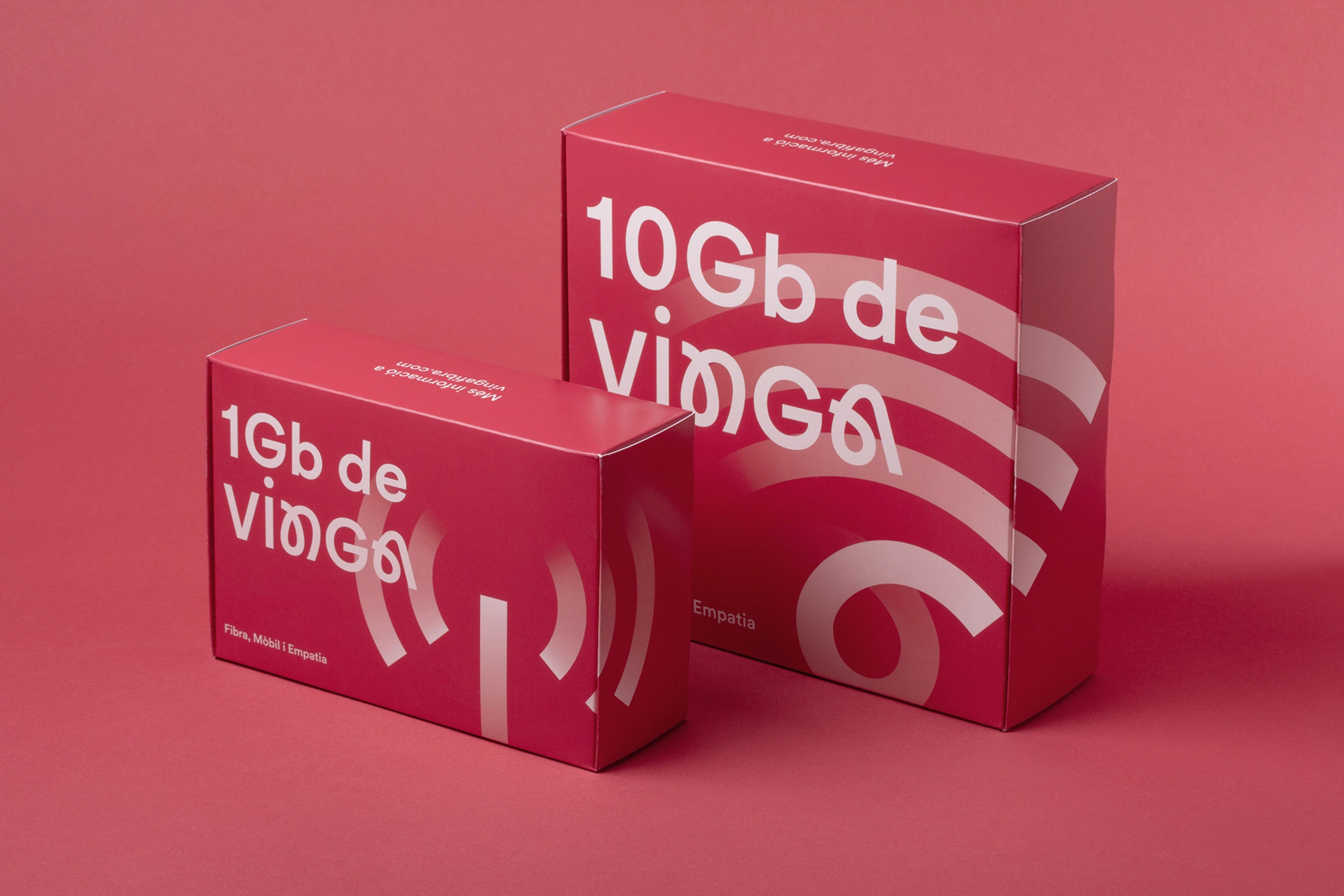
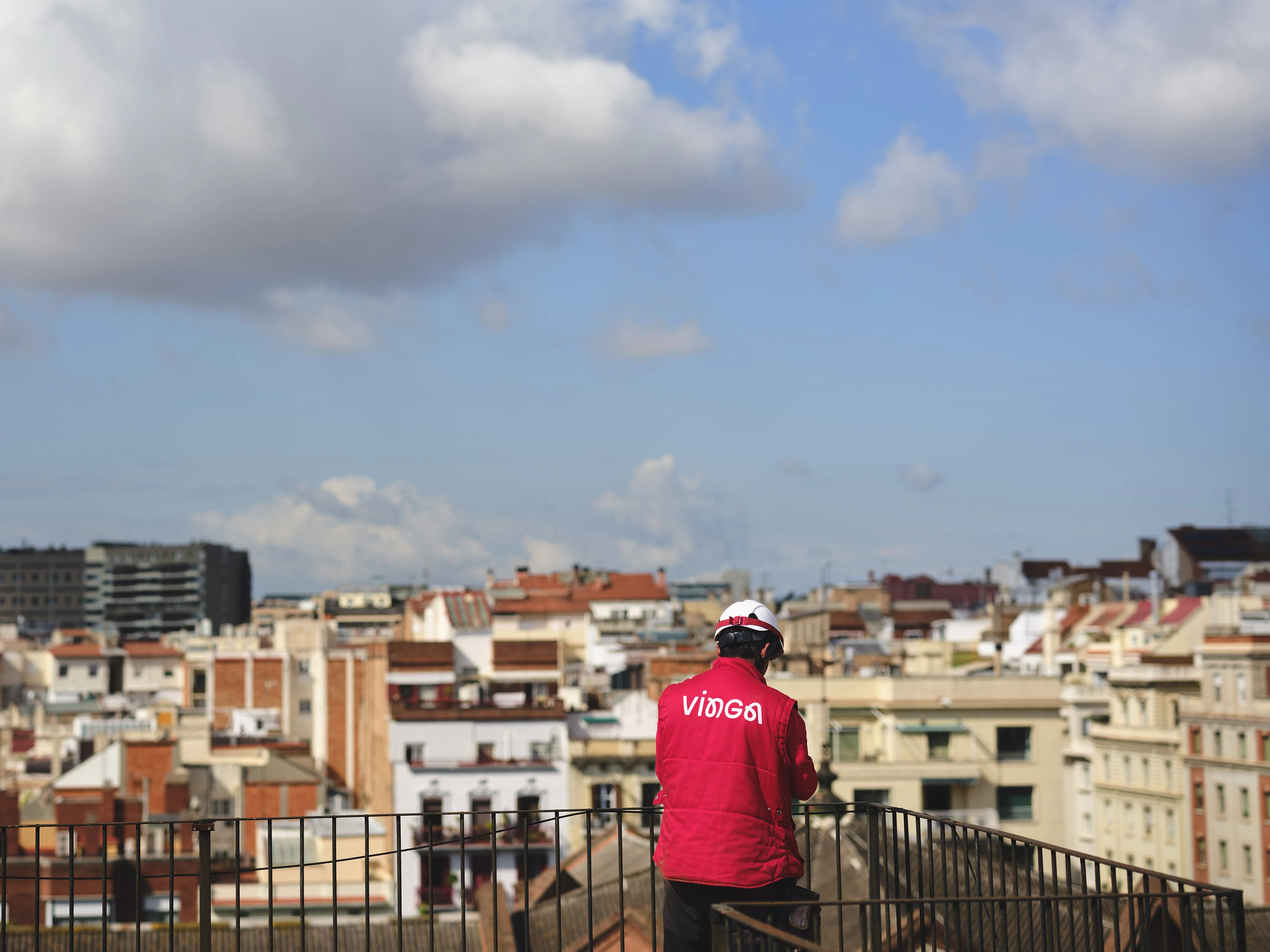
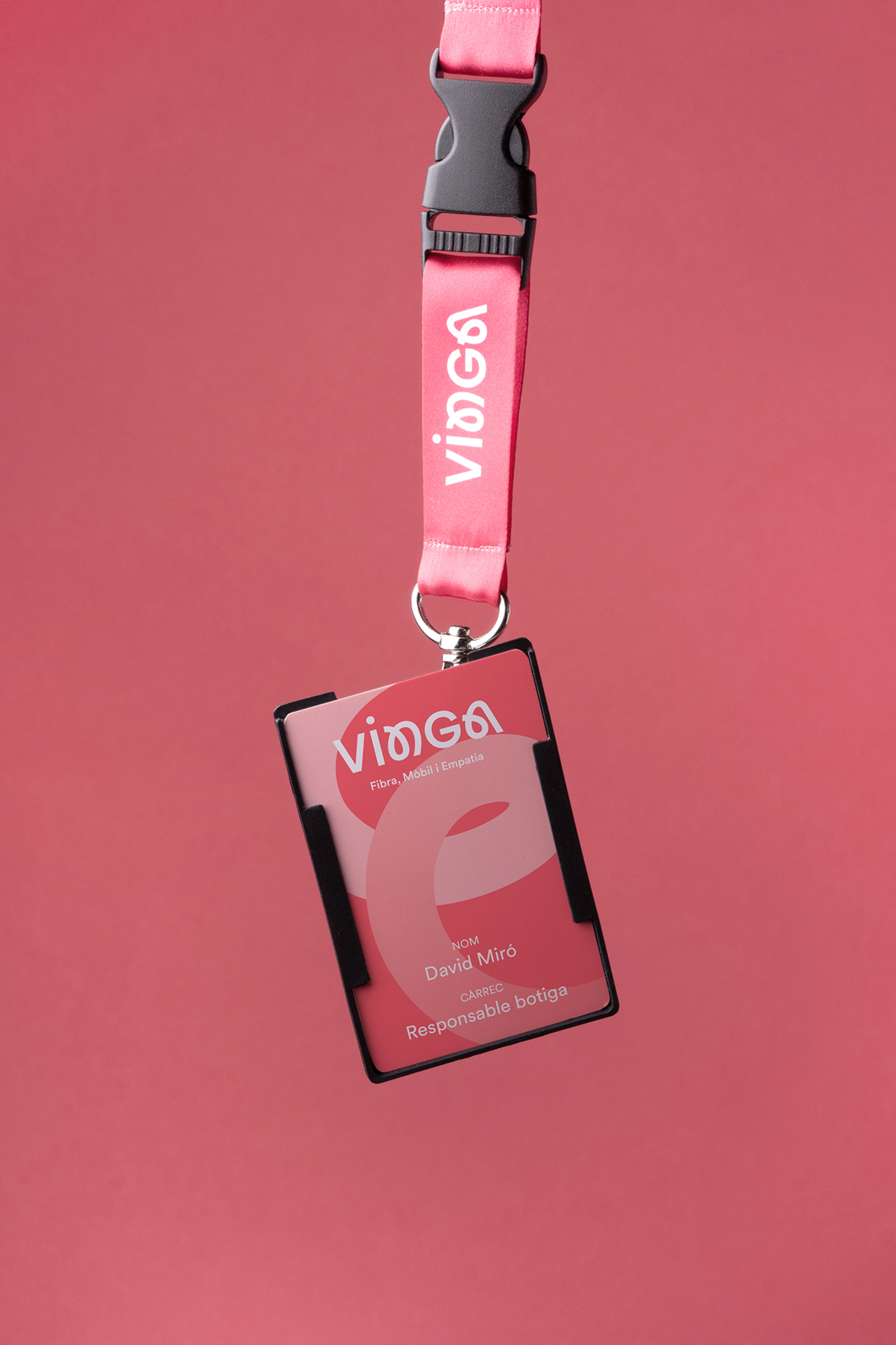
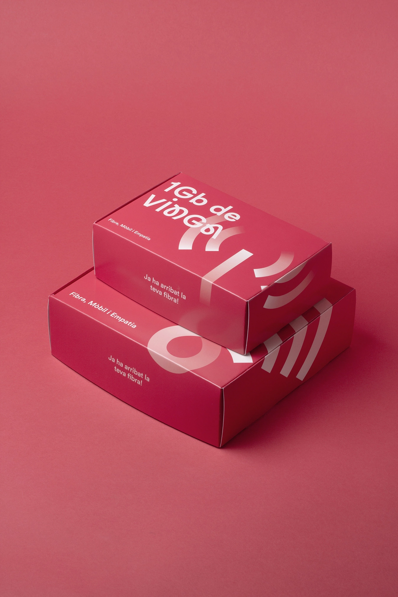
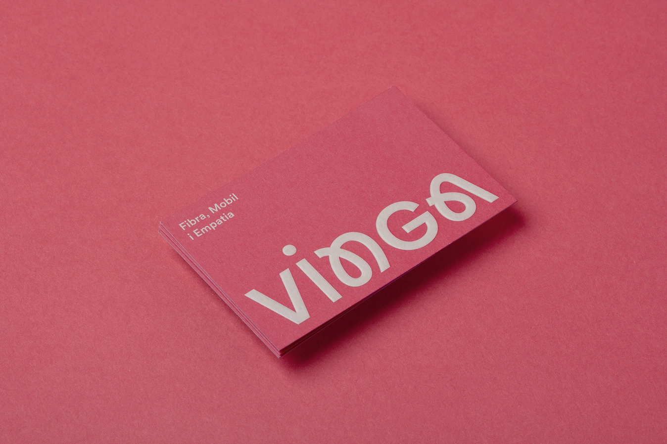
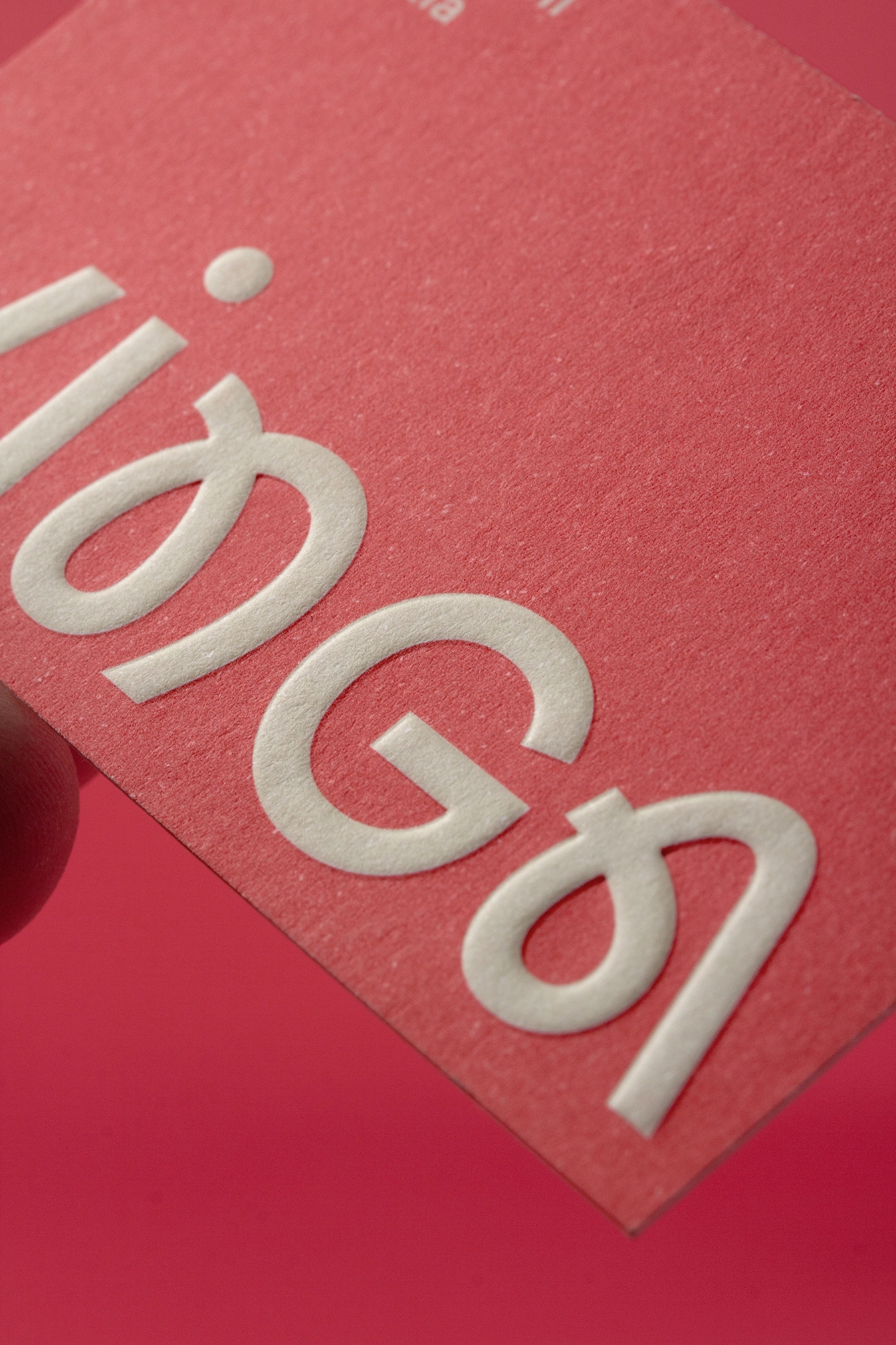
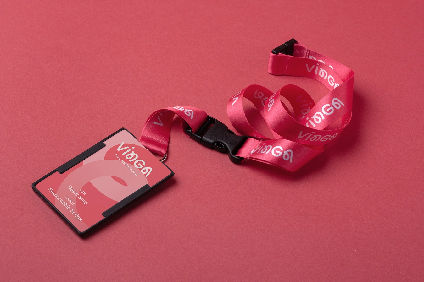
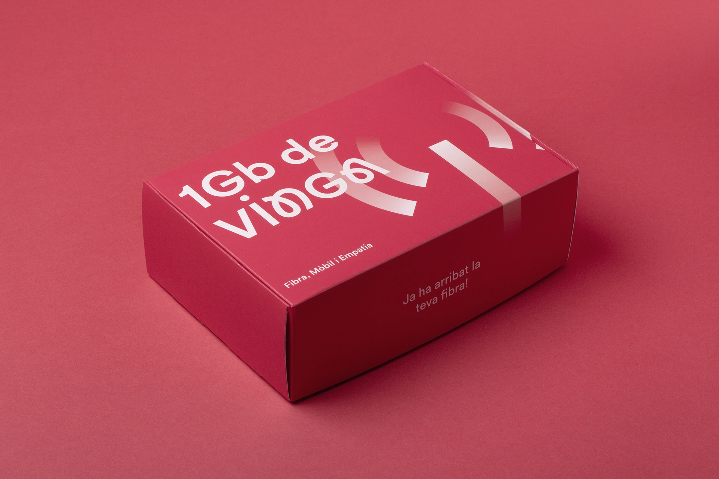
Vinga

Vinga, it's not a conventional commission. It's not just about designing a visual identity for a phone company, it's about shaping its philosophy: to be close, to connect, and to be more human in a world saturated with algorithms and automated responses. From the first contact, it is clear that Vinga wants something that breaks the mould; a brand that speaks from people to people, that removes the coldness and brings warmth back to technological interactions.

Sector
Retail
Tech
Services
Brand Identity
Visual Identity
Branding
Art direction
Brand Strategy
Typography
Motion
Digital/interactive
Verbal identity
VINGA | Lo Siento Studio

The concept of "bonding ’ emerges as the central focus of our work. The main typography of the brand is not only readable, but seems to intertwine, as if the letters were connected by invisible threads. This typographic detail seeks to evoke the idea of union and closeness, reminding the user that, behind the logo and the services, there are real people who listen and care. Every curve and every space between the letters is designed to convey fluidity, humanity and empathy.

The logo is accompanied by the tagline ‘Fibre, mobile and empathy’, a constant reminder that Vinga is not just technology, but a company that puts emotions at the forefront. To reinforce this message, we opted for a personalised red, which stands out but does not invade and, combined with soft gradients, conveys warmth and dynamism. It is a colour that embraces, that invites, that feels close without losing the strength needed to stand out in a competitive market.

VINGA | Lo Siento Studio

The visual identity includes a system of custom-designed icons, which are not simply functional graphics. Each icon has character, rounded lines and harmonious proportions that reinforce the sense of dialogue and connection. This system helps the brand maintain consistent, adaptable and, above all, personal visual communication across all its platforms.

VINGA | Lo Siento Studio

In graphic applications, the design does not seek to impose itself but to accompany, whether on the website, in a greeting card or in the messages users receive. The words ‘You talk to people, not algorithms’ come to life in the branding pieces, reinforced by a design that feels warm and human. The gradient texture in the backgrounds adds depth and an emotional touch, reminding us that behind every interaction, however digital, there is an effort to connect in an authentic way.

Vinga is more than telephony; it's a promise to be there for its customers, not just technically, but emotionally. As designers, our mission has been to translate that vision into a visual identity that not only communicates, but truly connects. It's a project that shows that design, when done with empathy, can be a powerful bridge between brands and people.

VINGA | Lo Siento Studio

Credits

Client
Jaume Vila

City
Barcelona

Year
2024