
Pilma
PILMA, the iconic Barcelona furniture and design objects shop with almost half a century of history, commissioned us to redesign its visual identity, an important challenge for us. PILMA is not only a reference in timeless, minimalist and sober furniture, but also an emblem of the balance between aesthetics and functionality.


The goal was to honour this history and vision while projecting itself into the future with a renewed and solid identity.


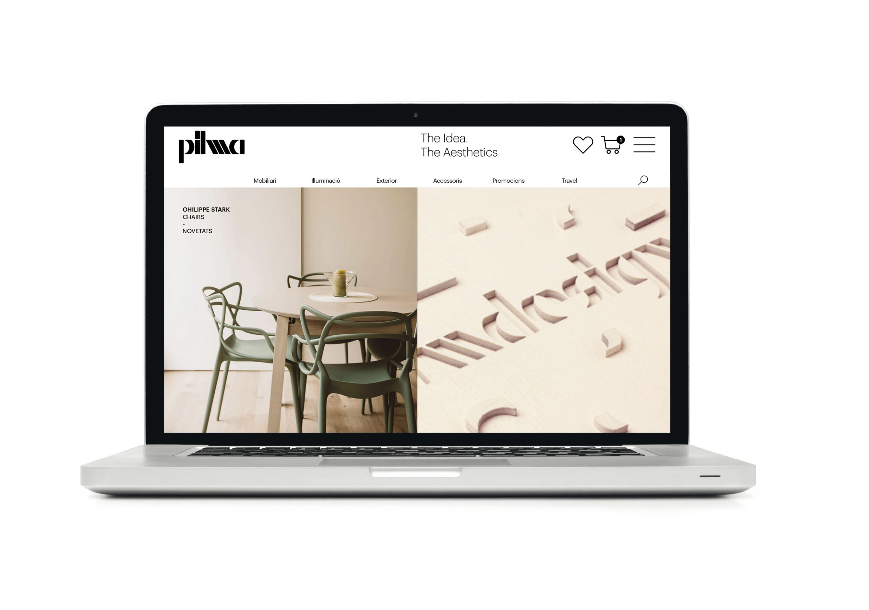
The key to our proposal was to focus on the visual heart of the brand: the original logo designed in 1974 by Josep Baqués. Starting with the five letters of the logo, we began by subtly retouching the original logo and then developed a modular alphabet, respecting its morphology and unique characteristics.


This approach allowed us to maintain the historical essence of PILMA while providing the brand with a versatile and contemporary tool for its communication.

The new alphabet will serve to revitalise the logo, but rather become a central axis of the visual identity. We integrated it into all applications, from catalogues and furniture master boxes to stationery, the website and in-store and out-of-store communication pieces.


Each element designed sought to reflect PILMA's core values: idea, aesthetics and balance, values that are also underlined by the strategic claim developed by the agency: Usted


The result is a visual identity that respects PILMA's legacy while giving it new life, positioning it as a brand that has not only endured over time, but continues to lead with a design that is as timeless as it is innovative in Barcelona and Madrid.

Credits
Client
PILMA
Brand Strategy
Usted
Typography
Extra Type
Awards
LAUS - Silver - Visual Identity
LAUS - Bronze - Typography
LAUS - Bronze - Alphabet
Talks
Madrid Design Week
City
Barcelona
Year
2018